
Design submitted by Matt from the USA.
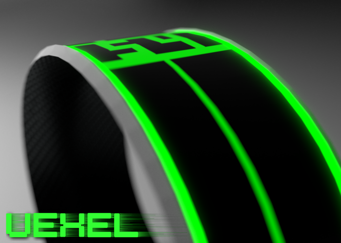
The inspiration for this design comes from the idea of having a simple futuristic watch that isn’t overly complicated.
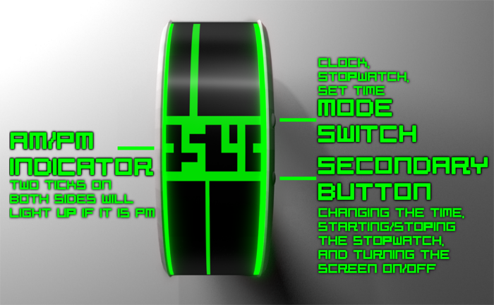
It isn’t too difficult to read, but it can be a bit confusing.
The hour hand is the large vertical line at the top, and is determined by what block it lands on (1-12). The minutes are clearly displayed in the middle, and the second hand is the vertical line at the bottom. If it is PM, two dashes on both sides of the minute display will light up.

The watch face is flush with the strap, with a white bezel going around both sides of the watch. There are two buttons on the right side of the watch, and a latch in between the two buttons where you can plug it and charge it via usb.

Vexel has 3 modes, with the top button changing between the three. The first mode is just the clock mode. If you press the secondary button while in clock mode, the screen turns on/off. The second mode is the stopwatch mode. For this mode, the hour hand becomes the minute hand, the minutes become seconds, and the second hand becomes the millisecond hand.When the time on the minute hand is at 12, it goes back to 0 and continues, but the pm indicator lights up representing 12 minutes has past. On this mode, the secondary button starts/stops the stopwatch. And the last mode is simply to set the time, with the secondary button adding the hours, minutes, seconds, etc.


Excellent design work. The lines & digits have a cool aesthetic combined into clever reading with minimal fuss.
The hours/second lines add interest to concept, sometimes offset, sometimes symmetrical, but not just for looks ~ they are the time telling. This, for me, is a golden concept.
LikeLiked by 1 person
Thanks, I’m really glad you enjoy it!
LikeLike
Very nice concept! It’s a simple and good looking combination of lines. Also nicely explained and presented. The digits could look less traditional and more futuristic for me 😉
LikeLiked by 1 person
Fantastic looking design, Matt.
I thought, initially, I would struggle to read the hours, but your fourth image with the screen dimensions solved that.
Sam’s comment about the digits is right though – a more unusual font would make it even better.
LikeLiked by 1 person
Umm sorry to ask this but what software do you use to design (and render) this?
LikeLike
I used Blender to model it and the Cycles engine within Blender to render it ^-^
LikeLike
loving the neon look and full round wrist displays could never be a negative. Give me green or blue and carbon fibre and i’m in 🙂
LikeLiked by 1 person