Design submitted by Patrick from France.
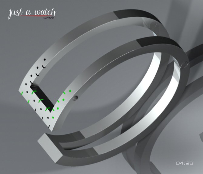
Patrick says: I wanted to imagine a watch extremely simple design.
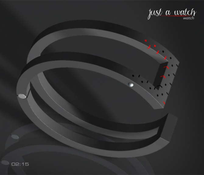
The “Just a watch-Watch”, is a watch with Led which functions in 12 X 1 hour, 5 X 10 minutes and 9 X 1 minute.

There are two activation buttons, one on each side of the watch, the left to set the various functions and the right to activate the LEDs and confirm the selection. A system of adjustment of adjustment to the wrist and locking/unlocking is active when both push buttons are pressed simultaneously. AM – PM. Displays the time and date. Alarm mode.

The “Just a watch-Watch” is intended to the women and to the men “Geek”.
The “Just a watch-Watch” stands out from other watches, thanks to its disconcerting form.


Wow Patrick! This is something new! I like the concept, though actual execution of the design as it
stands may be difficult as far as the inner workings go…
BUT, if the lower half were made into a solid form, it could house the brains, and then just wiring could follow the bars outs to the LED locations… though it would lose some of the cool aesthetics of the bracelet look. Great idea!
LikeLike
Hi ALinCAL, thank you for your comment and your vote.
Recharge the watch can be done via USB cable and computer programming, so, the technical aspect should not be a problem?
LikeLike
Thank you at Tokyoflash for this new publication and I want to wish “Happy New Year 2014” at all.
LikeLike
Wow my friend, a very new look. I love it very much.
LikeLike
Thank you very much Lola.
LikeLike
Looks very nice Patrick! I think there will be technical issues like ALinCAL mentions regarding space for the elcectronis but even if the “frame” had to be filled in to make room I think if a contrasting material was used it would keep the feel.
My only other suggestion which is totally subjective is, as you have three areas created by the lines that make up the l_l shape I would have put the hours one one face, the 10 x mins on another and the single minutes on the third. This would look cleaner and more ordered IMHO but maybe less unique. Either way like I said its a subjective thing. 5/Y Best of luck sir! 😀
LikeLike
Hi Pete, thank you for your comment and your vote.
The distribution of the hours and the minutes resembles an analog reading (except the minutes X 10), which justified my choice.
LikeLike
i would like to see the sharp edges softened with some fillets. I think this will help the design immensely, right now it looks a little sharp. Keep up the good work!
LikeLike
Hi Gordon, thank you for your comment and your vote.
The edges are not really sharp, they have small chamfers, a little like the elements of a Macintosh (keyboard or turn), I think it brings a modernity in simplicity, but it is only a matter of taste.
LikeLike
Love it Patrick. 🙂 5Y Any chance of some seconds to bring it alive? Maybe that would spoil it tho.
LikeLike
Hi Lloyd, thank you for your comment and your vote. One day perhaps we will have the chance to have one of our projects done?
LikeLike
I would like to see a simulation on an human wrist before judging… both Man and woman.
LikeLike
I wonder about the positioning of the informations to read the clock when the clock is on your wrist?!?!?!
For me, it seems that something is wrong here?!?… I fear that the leds will be on the side of the wrist and not on the top. (ergonomy!?!?) Therefore I am curious to see a simulation on an human wrist
Cheers
LikeLike
The LEDs are positioned like a “drivers” watch. So you would look at side of your wirst rather than the top. This is especially useful when your are driving as the time is clear from the natural position your hands are in on the wheel.
LikeLike
Thank you Pete!
It is a ring/jewel, and a ring is never stuck to the arm, nor a watch besides and if you want to have the LED opposite your eyes, since it is necessary to press on a button to activate the LED, at this time there, you will be able to direct them where you wish it.
LikeLike
Hi Berenice, just for you.

LikeLike
Hi Patrick,
very nice indeed! As a girl, I like it pretty much! Why have you not shown this picture earlier in your presentation, it is by far 10 times more interesting and more lively than the usual cold 3D pictures!?! (I am not talking about you specifically).
I would have seen this picture in your project presentation before you would have gotten my vote 😦
Well done!
LikeLike
Berenice thank you, I’m glad you like this project and I thank you for your vote.
LikeLike
It’s not really my cuppa tea, but for inventiveness I give you a solid 5!
LikeLike
dzign555 thank you very much. This is a watch aimed primarily at girls.
LikeLike
fantastic I Love it
LikeLike
Thank you very much Mustapha, I’m glad you like it.
LikeLike
5*/YES for the ladies 😉
LikeLike
Thank you for it.
LikeLike
I like the overall look. I would prefer 12-11-4 over 9-12-5. I like Pete suggestion of placing the hours one one face, the 10 x mins on another and the single minutes on the third. It would be like TF Twelve 5-9 C version.
LikeLike
It look like a double handcuff.
LikeLike
I had not thought of that, but the imagination is free to navigate where she wants and what is good.
LikeLike
Hi Makkovik, I understand your suggestion, you read of my response to Pete, so you understand my choice?
Thank you for the comment and the vote.
LikeLike