Design submitted by Andrew from the UK.
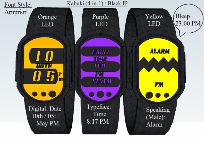
Andrew says: Kabuki (4-in-1): is inspired by the LED Helmet masks worn by the french electronic music artists: Daft Punk. But instead of using LED’s this display uses a touch screen LCD or E-ink Display & is constructed various bracelet materials each with up to eight LED colors options each to choose from: Blue, Cyan, Green, Orange, Pink, Purple, Red, or Yellow.

This wristwatch will display the time,date or alarm in one of four ways: 12 hour Analogue, 24 hour Digital, Typeface time,alarm or date presented as words instead of Digits, or Speaking: a vocal diction of the current time, alarm or date.

Each Bracelet Material uses a different Font/ digit style for the Word / digits use on the Display: See Diagrams Provided/
This concept is aimed at people who want to change their watch like they change the clothes or mood.
The oval shape of the watch face & plus curved links used to create the watch bracelet strap give it a futuristic & organic feel.


I like the idea and the inspiration Andrew. The LED helmets in the Daft Punk videos are cool. I like the idea of the different display styles and backlight colour, would be cool if you could have all of them on one watch so you could choose. Nice work sir 5/Y Best of luck! 😀
LikeLike
Thanks Pete the idea of multiple LED Back light colors plus multiple time movement plus font style combined in a single version of this concept is inviting. Perhaps but this could be achieved by have the wristwatch having Application movements & fonts / digits which could be updated via a USB port & data Cable.
Each edition could sold as shown in the diagrams above, but further updates could be downloaded directly
from tokyo flash some free: basic updates: Font: Typeface / Digit styles: Digital & some charged: Movements
Analogue / Binary or Guest Voices for the Speaking Mode,
LikeLike
I would like to add an explanation of how the 12 hour Analogue Movements have created work:
PI Discs & Twin Rings: Inner Ring/ Disc Hour Hand Outer Ring Minute Hand. The inner disc / Ring is divided in to twelve hour segments & the Outer Ring in to fifty nine minutes sectors.
Twin Rings indicate the current hour / minute via a blank gap where the end of each hand should be.
Therefore the user only needs view the position of each gap in order to read correct time.
PI discs: Works by displaying the portion of time that has elapsed. Only the amount of time that has past is visable
For further info on PI Discs copy & paste the Following Link:
https://blog.tokyoflash.com/2012/10/%E2%88%8F-pi-watch-design-divides-time/#more-17607
LikeLike
If the Kabuki (4-in-1) was consider for constructed the 12 Hour displays would be :
Analogue: Carriage: Clock Twin Rings & PI Discs
Type Face:
Time, Date or Alarm presents as words in various font styles (See Diagrams Provided) instead of Digits.
24 Hour Display Movements:
LCD Digital: Various Font / Digits Styles: See Diagrams
Spoken: where the alarm, date or time vocal dictated to the user in a male, female or Robotic Voice.
So that the user would have two 12 hour display & two 24 hour displays to choose from.
LikeLike
I really love the designs, but when I first read the post I thought the watch would change based on your mood, like those novelty mood rings! I think that would be a great idea
LikeLike
Mm… Good Idea. Perhaps the: Kabuki 4-in-1 wristwatch could be equipped with sensor that is sensitive to movement or light. Information of from the sensor/s would alter the brightness or colour of the LED Back light.
Motion Sensor: Brighter light colors: When the user is involved in energetic activities: Running & muted colour when dormant.Or Light Sensor: Brighter Light LED Color in dark light conditions: Night & Muted LED colors in bright sunlight.
LikeLike
My favorites modes are “typeface” & “Digital”.
LikeLike
Thanks for the input. The Typeface concept was idea i had some time ago. The style of the digital face was suggested to by the Tokyo Flash design team after I sent a previous version of this concept to Tokyo Flash.
Furthermore they suggested that I use a different style of Text / Font other than: Times New Roman.
I then applied these changes & re submitted my design.
LikeLike