Design submitted by Sam from Germany.
Sam says: I was sketching for a watch, that uses a two storey display that can be read best from a certain perspective.

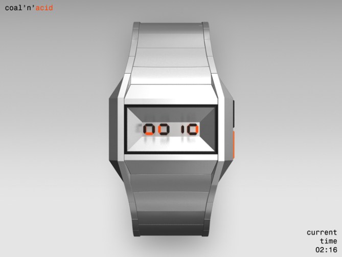
The four digits of time (or date) are shown in the well known LCD numbers. But they are split into an upper and a lower half. Both halves are stacked above each other while the lower half is below the upper half – easy to keep in mind.
If you look orthogonally at the display, you cannot read it. Any other angle might be good with some practice but the only perfect point of view is from about 45˚ below.

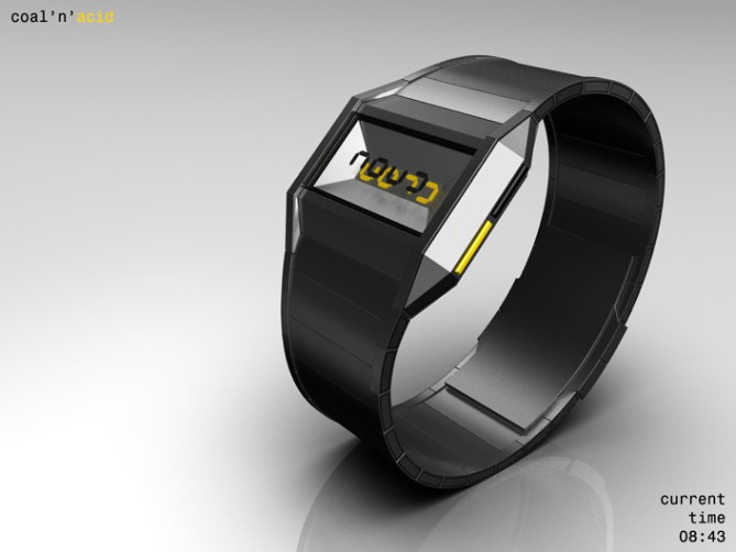
From there the two layers are visually aligned and you can recognise the four numbers. This perspective is reserved to the wearer so the display looks cryptic to others. The lower layer is the bottom face of an upside-down truncated pyramid and is therefore always visible.
The edgy design of the watch is based upon this geometric shape. The lower half of numbers uses coloured LCD while the upper one uses the traditional black LCD. While working with the split LCD parts I came up with the title “coal and acid” standing for the black and the coloured numbers. That name is as strange as the watch itself, so I kept it.

This is a watch for people with a sense for breaking traditions. The LCD style is known but has been transformed in an artistic way so arts lover might like this watch. The cryptic looking display encourages deciphering and so I also address the homo studens mirus (the common geek).
This is a sharp remarkable watch with a tricky and stylish display that looks familiar but is actually unseen like this before.


Thank you Toky for posting this one! I like the silver blue version most 😀
LikeLike
I’ve been waiting for this design to land! So simple but so effective! and more angles than Cryton’s head! (red dwarf) I hope this one does well! 5/Y Best of luck Sam! 😀
LikeLike
Thank alot Pete! Yeah it’s been 9 months until this baby made it xD
LikeLike
I am really impressed by the imagination of Sam! oufff
Now, I must save, to buy about ten his projects, to start.
This watch is great and the note is expected to rise sharply.
5 * / Yes, but it deserves still more!
LikeLike
hey sam this one i REALLY like (:
LikeLike
Thank you Brent!
Hehe Patrick! This is nice 🙂
LikeLike
Me gusta 😉
LikeLike
Hey Fir, did you know your fb account has buggered up?
LikeLike
Yeah Fir, what happened?
And muchas gracias 🙂
LikeLike
hey sam. you know i’m a big fan of your work.. this is an awesome idea – a new interpretation of an idea of mine that was posted a while back – http://www.tokyoflash.com/blog/2010/10/split-time-watch-design/ . i really like how the two screens are just one on top of the other – at the time i submitted my idea, i had not thought of making the front screen transparent. the dual colors is a nice touch too. for myself, of course, i would prefer if the styling of the case and strap were a little more feminine, but beautiful work, as always — and especially awesome animation! 🙂
LikeLike
Good point Heather.
This design would work well as unisex & probably only needs some subtle changes – slightly rounding off some of the corners & having a leather strap option might be enough.
LikeLike
Sounds comfy 😀
LikeLike
Thanks for the comment Heather! Hehe, it’s interesting how minds work :° Yes, the unisex thingy is still something I have to learn 😉
LikeLike
Nice one, Sam! Can I eat the strawberry one?
5*
LikeLike
Thank you DZ! It’s the “acid bath” version… but… you can have it
LikeLike
Just so long as the acid is strawberry flavoured, haha.
LikeLike
Me likely the blue LCD one, so retro futuristic. My only concern is, is there a chance you sell this in Venezuela? Whats the cost of watch in Venezuela money? Eehe
LikeLike
löl Fir, what country is it tomorrow 😀 It would be cool to see, where Tokoflash watches made it around the planet. Thank you for the comment.
LikeLike
Thats a really nice idea, bit like how you can have a map of your friends on FB, arrows showing the path of watches from Japan to all the customers around the world. woooo
LikeLike
Yes, the act of selling one of his watches in only one region of a single country fully satisfy me!
LikeLike
love the design….i only worry if you would be able to tell time in the sunlight.
if you can, then i would buy for sure 🙂
LikeLike
Hehe, as for any other device, a quick turn about 10° is easy to make 😉 The Kisai 3D Unlimited seems to be properly readable, so I cheekily assumed this for my concept too. We will never know for sure before the watch is getting sold hehe. Cool you like the design diclo, thanks for commenting!
LikeLike
Thank you all for coming and leaving some love :3
I can only recommend to stay tuned. This block rocks!!!
Crystalline cheerios,
Sam from Germany
LikeLike
Why this end so quickly? This deserved more attention than it got imho! Best of luck Sam!
LikeLike
Thanks Pete!
LikeLike
I love the overall look, especially the upside-down truncated pyramid and the red one. ( the last pic )
I love the idea to split the time, but I’m not sure about the angle you have to use to read the time.
LikeLike
Thank you Makk for commenting! The angle is perfect, believe me. You just don’t have to turn the wrist to perfectly face your face (which noone really does actually I think), just a little lower than normal and you have it 🙂 Cool, the last one was a happy addition some days after I finished the concept. I’m glad I made it!
LikeLike
“You just don’t have to turn the wrist to perfectly face your face (which noone really does actually I think)”
You thought wrong because I do that, pretty much all the time, lol. ( 95% + ) I have a few watches that I need to do that to be able to read the time correctly.
But, I guess, TF will try and choose the best angle. I would need a video of the actual watch to consider buying it.
I have a suggestion, for another similar design : use the 1st layer to show the full time & keep the pyramid as a special effect.
LikeLike