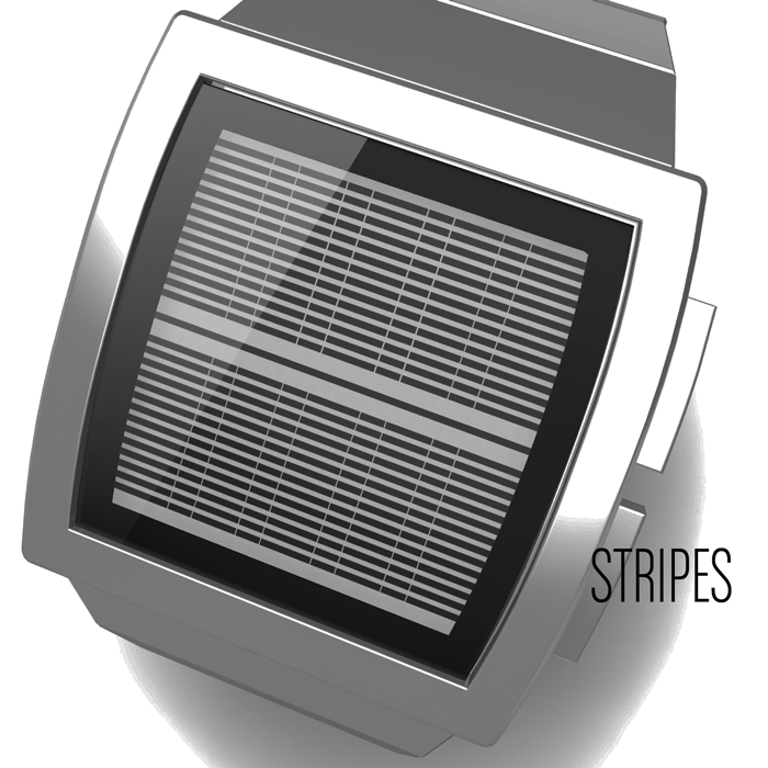
Design submitted by Laszlo from Hungary.
Laszlo says: Stripes. LCD display steel case and strap.
There are three available levels of difficulty (easy – normal – hard).
Automatic day and night mode + backlight.


Design submitted by Laszlo from Hungary.
Laszlo says: Stripes. LCD display steel case and strap.
There are three available levels of difficulty (easy – normal – hard).
Automatic day and night mode + backlight.

Comments are closed.

Click on the image for animation…
LikeLike
Aside from the layout, reminds me too much of Sam’s Shift concept:
https://blog.tokyoflash.com/2012/11/26/shift-lcd-watch-has-a-cool-retro-3d-effect/
LikeLike
Yepyep 🙂
LikeLike
One of the reasons I liked shift so much was the fading at the edges, reminding me of illuminating something on the sea bed under the ocean. I have no issue with the horizontal orientation of the digits.
LikeLike
I loved this when I first saw it, Laszlo. A fantastic watch. Hard mode is the best.
LikeLike
Great looking display a nice much simpler alternative to optical Illusion, I imagine much easier to make too! Like Xian, I can see the only issue being competition from Sam 🙂
LikeLike
This is a fantastic looking display. The concept is quite similar to Shift, but personally I prefer Laz
LikeLike
I jumped the gun on the post button, but I was saying was
I prefer Laszlo’s execution. No question I’d add this to my collection, even as is.
LikeLike
I’m biased so all I can say is: good luck to each of us and Toky: you know what to do 😉
LikeLike
I have to admit, I like this square format better than the Shift’s very rectangular size.
sorry Sam 😉 … maybe it helps, that the format reminds one very much to your Rorschach.
I would buy this watch, to replace … ahm, no … to add it to my (hard to read) Optical Illusion.
LikeLike