
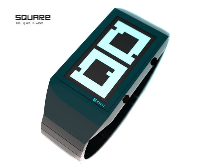
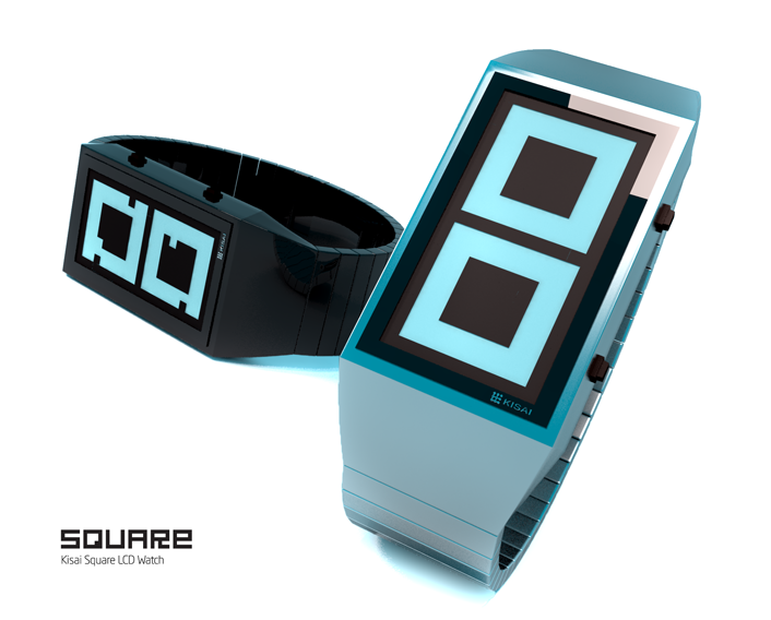
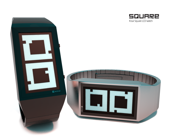
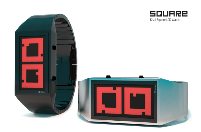
Design submitted by Timur from Kyrgyzstan.
Timur says: It is too easy to see the time in this watch. The screen is divided into two parts. Each part of the screen consists of two squares.

We have external square and internal square, which are imposed at each other. External (white) squares designate minutes, while inners show hours. For example, when it is midnight 00:00 all geometrical figures turn into squares, that`s why we have given the name “Square” to this watch. The lack of some fragments in the screen gives us stylized numbers. Use of minimalism in the display adds an unusual look and charm to this watch.


I love the simplicity & sheer minimalism of this watch. Easily something I would be proud to wear.
I wish you had given better explanation of the time reading with different time examples though. Although I now completely understand (& it is easy) at first I just couldn’t see it.
LikeLike
I must admit it took me a few minutes to see the inner numbers. Once you understand its very simple and effective. I like the images where the watch is on its side, it looks like some kind of robot eyes. Nice work Timur 🙂
LikeLike
I’m always going to have a soft spot for blocky, single color graphics thanks to the Atari 2600. Easy to read once you get the hang of it!
LikeLike
It took me a few moments to see the inner numbers too. At first it looked like two big zeros. After realizing how it works I must say the number system is pretty ingenious. It reminds me somewhat of Stencil. Very cool, great job.
LikeLike
Guys , good to see you again! Thank you for the positive words 🙂
LikeLike
Really like it Timur. 🙂 Very cool and very easy to read. 😉 I hope TF make it for you. If they did, I’d buy it for sure. 😀
LikeLike
Thank you 😉 mu5hroom
LikeLike
Absolutely yes! Ok the look is a bit tame and calm. But the reading method is fantastic. First I thought it’s analog inspired but those are actual numbers! Really cool!
LikeLike
Thanks a lot Samukun!, glad you likey
LikeLike
Reblogged this on timursha6.
LikeLiked by 1 person
I usually dislike digit in digit watches, because remembering the reading order is always a problem. Having a few blocks cut-out in the borders of the squares make me like it.
If the case height is too much, It would be nice to have a rotated version to get a vertical reading.
It could be nice to have the same “choosing between horizontal or vertical reading” feature as the Adjust.
LikeLike