
Design submitted by Peter from the UK.
Peter says: This is “Hybrid 3” a redesign of a re-design of “Hybrid” which featured on the blog back in March 2012.
The original design combined both LCD with a mecahnical analogue movement. The design utilised a metal disc with the LCD hour blocks mounted into it. The disc rotated to highlight the mins. The seconds were shown by LCD segments in a ring around the disc. The metal disc proved to be too expensive and required a heavy duty and most likely expensive movement to power it. Also packaging both technologies into one watch would have been tricky.
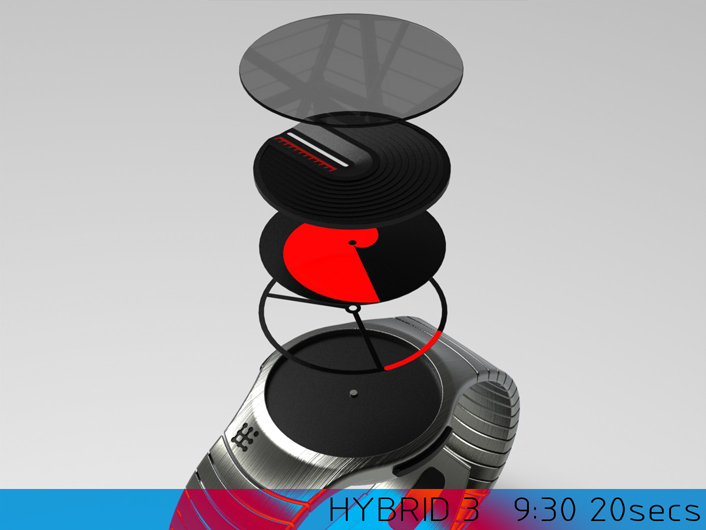
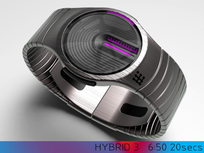
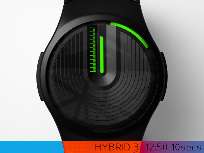
This version does away with the LCD element in favour of full analogue, the metal disc is replaced by a much lighter moulded plastic item (could be flat plastic or laser-cut/laser-etched thin metal) The time has changed subtly too, the top disc now tells the hours and features a narrow window cut into it which displays the minutes. This is done by a spiral shaped disc (similar to the ones used in “Swirl 1 & 2”) beneath. This spiral shape travels up the narrow window to display the minutes (in a similar way to “Swirl”). The seconds are displayed by a partial ring of colour around the outside of the dial. All of which would utilise illuminesent paint for that electronic look. I imagine that the gearing of the minute hand would need to different to a standard analogue movement as the minutes chase the hour disc around the dial. Hopefully this would be an easy mod to a standard movement x^^x

Like the original design the simple visual language is traditional in its form and proportions so shouldn’t scare off traditionists. The time telling is very simple and intuative but clever in its methodology.
This design will hopefully stand out due to its simple time reading method created in an unuseal manner. The form also lends itself to pre-existing watch housings, again adding to the viability.


Ahhh. It feels good to be back!
Check out this tricky analogue design Pete sent in from Sept 2014.
Analogue discs rotating & fill up the gauge. It has a more electronic appearance like that.
Clever use of the analogue movement with ‘discs & masks’ is quite inspiring don’t you think?
LikeLiked by 2 people
Nice to see the blog back in all its new and shiney glory! Cheers for the first post of 2015 🙂
LikeLike
Welcome back Toky!!!
LikeLike
We don’t have the old ‘Stars’ rating anymore. What we would like to see instead is people Liking, Tweeting, using the share buttons above. That way it promotes the design for others to see & also doubles as way to stamp your approval.
LikeLiked by 1 person
Welcome back TF, and Pete as well of course! =)
Looks like a return to form, this. Cleverly designed and with sober styling; what’s not to like? One small gripe I might have is that the seconds chasing the hours could make them (the seconds) a bit difficult to read at a glance. I don’t know how many people need to know the time down to the second, and I’m well aware that I’m throwing stones in a glass house since a few of my own submissions have had similar quirks.
Now I’ll just need to get my half-finished concepts done so I can submit something as well…=)
LikeLiked by 1 person
The hope is that the movement could be tweaked so that the minite disc moves 65incruments per hour which would allow for the changing position of the hour disc. I’m not sure how that would effect the seconds tho. Fingers crossed such technicalities can be sorted. Cheers Anders! 🙂
LikeLike
Welcome back Toky and nice submission Pete. Very clever use of discs and markings etc. looks like a lot of thought has gone into this and the whole, overall package looks great.
The styling is my kind of sci-fi too. This is one you wouldn’t be ashamed to show off!!
It certainly does feel good to back!!
LikeLiked by 1 person
Nice comment Justin! It’s great the blog is back indeed and it’s great to be back on it! Cheers again 🙂
LikeLike
Hi Pete, of return in form. I always appreciate your designs and it is not this year 2015, which I will change opinion.
Good luck my friend.
LikeLiked by 1 person
Cheers for the positive words Patrick, nice to see you blog side again! 🙂
LikeLike
Really cool design! I’m very intrigued!…
…mostly by the math/design required. The main concern I see in making this real is that you would need a custom analog movement–the minute “hand” (minute disk) will need to rotate at 1+1/12 rotations per hour instead of the usual 1 rotation per hour.
But I would love, love, love to see this real. Just pointing out one challenge I see.
Cheers!
LikeLiked by 1 person
Hi Injust29, yeah you are totally correct about the movement. I don’t know how easy it would be to make the minute hand travel more increments per hour than a standard movement. If you were making a bespoke movement I imagine it’s simply a gearing ratio, but to modify an existing movement maybe tricky. I’m hoping there is a way to add secondary gearing to a standard movement to achieve the result. The effect could be achieved digitally but it would be nice if it was analog. Cheers for the support and interest! 🙂
LikeLike
Crazy Pete’s 2015 models are in, and they are going fast! So glad Toky is back to showcase your stuff, Pete. As with your original concept, I Like this!
LikeLiked by 1 person
Cheers Xian, let’s hope 2015 is a fine vintage 🙂
LikeLike
I like the scaled minutes. Inverting the hour & 5 minutes is nice & give a better “animation”.
I like that the seconds are used. It give another nice animation. The segment wideness can be anything too.
LikeLiked by 1 person
Cheers Mako for liking and welcome back to the blog sir 🙂
LikeLike
Great to have the chance to review wonderful designs again, and a great start!
As always another professional entry from Pete.
I love it, but suspect my poor eyesight may not be able to read the individual minutes. Not a problem – it fits nicely into my watch category for ones that are too hard for accurate reading: it’s a weekend watch for me, and I’d love to have one!
LikeLiked by 1 person
I’m sure the watch could be fitted with a magnifying lens for clearer display, I’d be happy if it was enjoyed as a weekend watch or even as jewellery, so cheers very much! 🙂
LikeLike
Stylish, minimal, cool. Luv this Pete!! Very good flagship for the restart of the blog! Each 10 minutes could use a thicker indicator line or a number next to them to visually help counting.
⭐ ⭐ ⭐ ⭐ ⭐ Oops, I mean, I like it 🙂
LikeLiked by 2 people
The stars are hard to forget but hopefully the new likey system will be less corruptable.
Im glad you likey sir, yeah there a few tweaks that could be made to aid clarity without losing the feel. Cheers again! 🙂
LikeLike
This is an excellent Evolution of Hybrid Pete. Transforming it in to a mechanical movement & plus luminous element s make easy tread Day & night. Surely this will make it more likely to be constructed in reality. Andrew Joy
LikeLiked by 1 person
Cheers for the great comment Andrew! I think the technical sides would make this a tricky watch for TF to make but I cross my fingers that they would want to try. That said it is possible to get the same look in a digital tech I’m sure. Cheers 🙂
LikeLike
This would look great in either digital or analogue forms, though I agree the analogue would be that much more special. I really like how the pattern on the face is repeated through the band and vice versa. Im usually not too big on analogue watches but this fantastic, No question I’d add this to my collection.
LikeLiked by 1 person
Cant ask for a better endorsement than a possible purchase, and if we could convert a non-analogue fan over to the dark side even better. Cheers for the support and the comment! 🙂
LikeLike
Nice analog/digital trick, well done !
LikeLiked by 1 person
Thanks a lot Nico!, glad you likey and nice to see you blog side again! 🙂
LikeLike
First, thank you very much Toky for open the Blog early 2015, for me is great news.
Furthermore congratulate the master Pete, for its clever design, though (I do not know why), reminds me some of the designs of another (for me), master Laszlo.
As always, dear master the best of luck 🙂
LikeLike
I had to take a look through Laszlo’s rather extensive back-catalogue to see which design this reminds you of. I can find one specifically so I presume me it has a similar look or feel. Either way I can only take the comparison as a compliment! Cheers for the feedback Jose! 🙂
LikeLike