Design submitted by Anders from Sweden.
Anders says: I was on the tram about six months ago when I caught sight of a concrete buttress of some sort, which was shaped like a number of intersecting blocks. It was an interesting shape that I thought might make an interesting watch face, so I sketched out a few ideas. None of them worked, however, but I kept coming back to it.
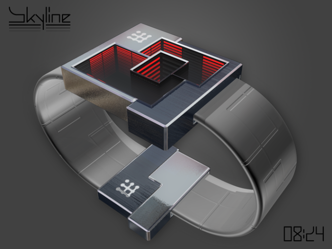
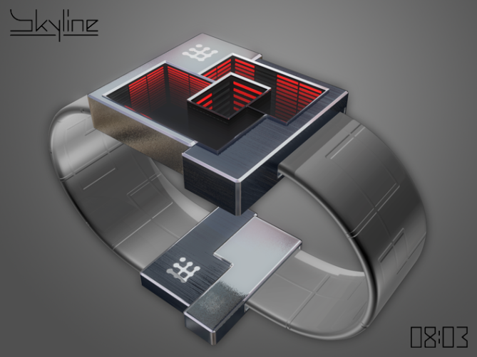
At some point during this process I remembered the infinity mirror and it struck me that it should work very well with this concept. Last week I had another go at trying out some shapes, and I finally managed to simplify it enough while still keeping the visual interest. It seemed to have an urban quality; as skyscrapers with their glowing rows of windows rising into the mist and blocks of houses partly obscuring each other, creating new shapes.
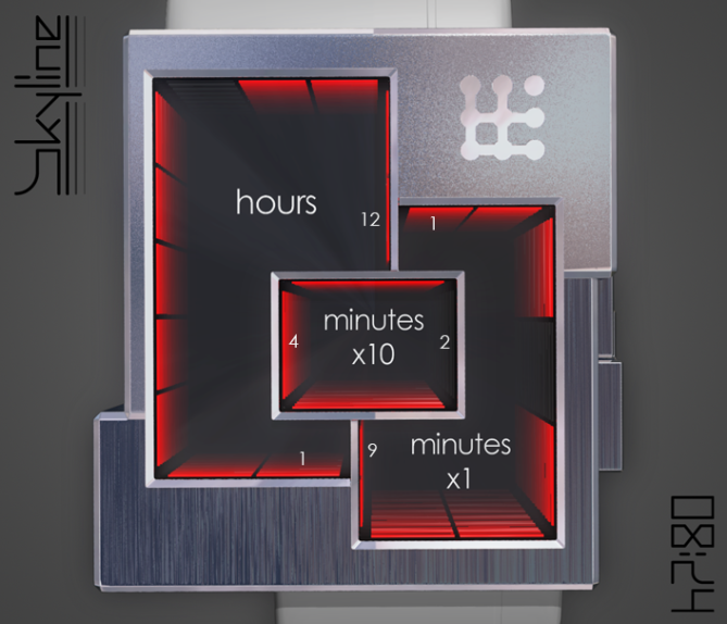
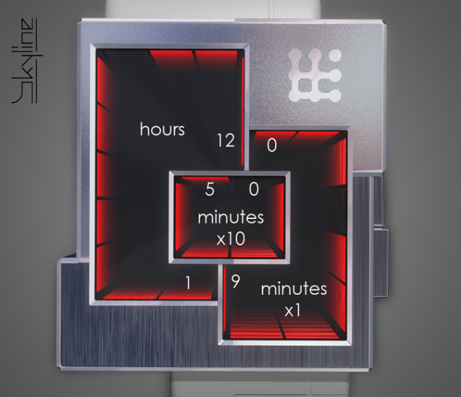
The display is a fairly straightforward 12-5-9 variant, with a separate display section for each group. The first of the hour segments is in the bottom right of that section, for the single minutes it’s in the top left, and for the 10s of minutes it’s at the top. To maximise the mirror effect the display is negative, that is, all segments are on except for the current one. The only tricky part is the 10s of minutes section, which only has 4 segments. Zero could be shown by no segments being lit but that would be boring, so I decided to show it with two segments off and two on. Five is shown with all segments on. This could of course be easily altered if some other option is preferable.

The mirror display does have one major drawback, which is that the effective viewing angle is quite narrow. I have tried to remedy this by letting the indicators protrude a little distance from the edge of the display, which is an improvement but not a complete solution. The ‘mirror tunnel’ tunnel effect could be altered by making the bottom mirrors slightly pyramid-shaped. If the display is used in ‘always on’-mode battery life might also be an issue, but re-chargeable batteries should sort that out.
Styling is restrained, with an 80’s flavour. The shapes are quite simple; intersecting blocks of varying size that hopefully create and interesting whole. Material options are many, both metal and plastic would work. Colour-changing LEDs would give almost endless variation to the display.
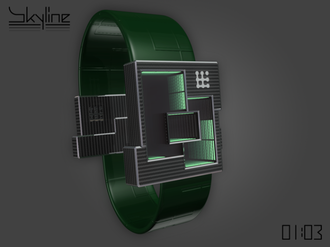
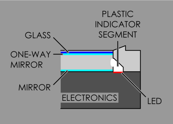
The strap is also simple; an embossed rubber/leather strap in two widths which are joined with a buckle that echoes the shape of the watch body, with a single release button replacing the display sections. Skyline should be fairly easy to manufacture as the elements of the mirror display essentially sits on top of a standard, flat LED display.
The target audience for this design would be urban, probably fairly young and with an eye for the elegant. People with a geometric bent should also get a kick out of it. Material options, colours and so on could steer the appeal toward the executive or the street end of the spectrum.

I’ve updated the display slightly, adding one segment to the single minutes and two to the tens of minutes. This way the symmetry of the latter is retained and both minute sections begin with a ‘0’ segment, the singles in the top left and the tens in the upper right. This means there are always one segment off for these sections. The hour section is unaffected but could be adjusted to also have a ‘0’ segment, showing hours 0-11.
As you can see from the images this update hardly changes the look of the design at all, and I hope the readers agree that it’s an improvement in readability. It’s almost embarrassing that I didn’t think of it in the first place, but I guess I was too busy ‘simplifying’. =)


Brilliant.
The way you’ve themed it with a city scape feeling is just perfect for the infinity mirror effect & neon lights. It would be a fascinating watch to own & probably blow a few minds – ha ha.
The only negative comment I have is the 10x minutes part. I think a more elegant way could be found – perhaps if you had some of the lights going around the corners, or one of the long sides being 2?
LikeLike
Thanks for the high(rise) praise! =) Please excuse the pun, I couldn’t resist…
I agree that the tens of minutes is the achilles heel. I’m not sure letting the LEDs wrap around the corners would be the way to go, it’d contrast (too much I think) with the other sections…
Dividing one long side into two might work, I’d have to try it to see. Maybe dividing both long sides into two, and having a dedicated ‘0’ segment?
That’d match the look of the other sections, but not the function of the single minutes which show 0 with all segments on. However, if you went that way you could do the same there and have three segments on the bottom edge (the two current ones are a bit long compared to the other 1x minute segments). That would also match the hour section, which has 12 segments…
I think we have a solution! =)
I’ll have to so some tweaking and rendering, and I’ll send an update…
LikeLike
I submitted a couple of updated images and a short description late last night of a slightly different display layout (for the benefit of the minutes x10), I hope the good folks at TF are kind enough to append them to this post.
LikeLike
Hi Anders, OK thanks, it is updated.
For reference, anyone submitting updates please email blog@tokyoflash.com directly. If you use the submission form for an update we might not see it right away due to the volume of submissions.
Nice update. Yes you’re quite right, its hardly different in appearance but helps a lot with readability.
LikeLike
Thanks very much! For the update and the email tip both. Once I’d submitted it I realized it might not have been the best option, but by then it was too late. =)
Glad you agree with me re the new display, by the way!
LikeLike
this watch is dope!!!! 5******YYYY
LikeLike
Thanks Gordon! I’m glad you like it. =)
LikeLike
Stunning! 5y
LikeLike
Short and sweet, cheers Dz!
LikeLike
Officially too cool for school! I think this has to be one of the most awesome looking designs to hit the blog in a long time! It’s annoying cos it’s right after one of my designs which now looks very ordinary! Hopefully this design will finally make you a member of the successful designers club (catchy name huh?) my only minor gripes are the 10 mins like Toky, but easily remedied. Maybe where the box overlaps another there could be an intersecting line, which would create another edge, or an open side with a inward facing line like an open door so the box would be a “G” shape. My other one would be the border thickness around the outside could be thicker, but I think this would naturally happen in the development process to allow room around the modual. Minor details either way. Now we just need TF to make so I can throw my money at it!!!! 10/y best of luck sir! 😀
LikeLike
Thanks for the support and ideas Pete!
As you might see from my reply to TF I’ve got a solution lined up, and I’m hoping to get an update sorted out tonight. Fingers crossed…=)
Cheers mate!
LikeLike
New updated time telling/Images are sweet. Gotta be a winner! 😀
LikeLike
Cheers mate! Luckily the changes were small, but it’s a marked improvement on redability, I feel. =)
LikeLike
Outstanding Anders! This is thinking outside the box, using boxes haha. No really, it’s not close to existing watches or blog entries I think, it’s fresh. For me it could be a bit less clumsy but aside from that I like the cluster-ish shape combined with the similar display and the tunnel effect. Skyline is a nice topic. It could be a futuristic control device too (for the kiddies) or a weird type of arts (for the cubists). Whatever the flaw in the way of time telling is, it can be fixed. Such a watch must be! A definite YES and 5*
LikeLike
Thanks very much Sam, it’s always pleasant to get that kind of reaction…=)
I agree that it is a bit blocky. Partly due to the styling, but I also wanted to keep it (the thickness in particular) realistic. I’d have liked to make it maybe 40% thinner, but then there would have been no space left for the battery… And this’d need a pretty big battery, I’m guessing.=)
Thanks again for the support!
LikeLike
Hi Anders, for my part, I would not change anything in the shape of the case, for fear of dimibuer the magic of this very beautiful watch. The closure of the bracelet does not require a special form, because she practically does not see herself on the wrist, therefore a bracelet of constant width would be very well.
All this gives us a very nice 5 stars and a big Yes!
LikeLike
Hi Anders, for my part, I would not change anything in the shape of the case, of fear of decreasing the magic of this watch really very beautiful.
(I do not reread me, rrr)
LikeLike
Merci beaucoup mon ami! (I hope re: spelling =)
I see what you mean about the buckle; having a completely custom one isn’t strictly necessary. But the difference in the ends of the case lends itself very well to having the two strap halves in different widths. That way the ‘intersecting rectangles’ theme of the display and case carry over through the strap as well. Plus, it’s a detail I’ve been wanting to include in a design for some time now, so when the opportunity arose I seized it! =)
Thanks very much for the support and vote!
LikeLike
Ja Anders, du skriver franska bättre än mig.
OK for the strap, but it’s more for the asymmetric closure, I think unnecessary and certainly more expensive option?
LikeLike
Hehe, din svenska är inte heller så tokig! =)
It probably would be more expensive, I suppose the question is whether it’s too expensive… Perhaps the good folks at TF could enlighten us?
The mechanics of it shouldn’t be that complicated (think car seat belt buckle, aren’t there watches that use something similar?), at least the internals shouldn’t have to be as bespoke as the exterior looks.
The trickiest thing about it that I see is how to adjust the length, but that could be solved by cutting the straps roughly to length and clamping them inside the buckle with a little bit of possible adjustment retained…
LikeLike
Anders of course, this is just a detail, I like this watch much.
LikeLike
Great Work Anders! love how you’ve given some thought into the construction as well.
LikeLike
Thanks for the enthusiasm Lewis! I try to give the makeability some thought as I have a tendency to let my imagination run a bit too wild otherwise, as evidenced by some of my earlier submissions… =)
LikeLike
Awesome design 5Y!! I love the mirrored tunneling effect, very cool and unique!! Congrats!
LikeLike
Cheers Pelly! Yeah, I was happy as a pig in muck when it struck me that I could use an infinity mirror…=) I remembered another concept that used it years and years ago, actually. But this is far enough removed not to be problematic, I felt.
LikeLike
one more comment, I think this is the first watch i have seen where showing the Kisai logo actually complements the design. Maybe its just me, anyone else?
LikeLike
Surely you’re forgetting the 24-carat solid chunk of awesomeness that is Relativity? Right? =)
Seriously though, thanks, I did spend longer than I’d planned to place it, glad to see it didn’t go unnoticed. =)
LikeLike
the RGB version is awesome
LikeLike
This is a stunning design – a definite ‘must have’.
The challenge around getting the right angle of view is not a drawback, but adds to the fun of the watch. If the strap closure could work, it is also a great continuation of the watch design.
The update does fix the problem with the 10 minutes, so the watch is now perfect.
I really hope this does get made.
Good luck and 5*/Y.
LikeLike
Wow, thanks Nev! I’m happy to see that you see the angle thing as a plus, I wouldn’t have…=)
I think the buckle needn’t be that complex, mechanically speaking, so fingers crossed!
Many thanks for the support, I hope you’re not hoping in vain. =)
LikeLike
Really nice design Anders! 5Y Hope they make it for you. 😉
LikeLike
Cheers! =) I hope so too, and for as many other people as possible…=) You support is most welcome!
LikeLike
I like the idea, the “1 light off”, the simple styling, that it’s a 12-5-9 read from left to right, even if I 1st thought it was a 12-11-4. While reading, I thought that the 5×10 minutes was using a modified binary system. All on = 0; top off = 1; then clockwise until 4; finish with 2 connected sides off = 5.
I’d prefer if the single minute would stay at 9 lights. I’d I’d be ok with 5 lights for the 10’s minutes, dividing either the top or bottom.
I would buy.
LikeLike