Design submitted by Patrick from France.
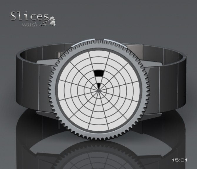
Patrick says: Seeking a reading with concentric circles, I arrived on a pattern approaching darts or share a cake. With technology “e-paper”, that allows the use of an extremely flat case and contrasted drawings for reading.

The “Slices-Watch” is an analog watch. From the center of the first circle indicate the hours (1, 2, 3 …), then the following is minutes “5, 10, 15, 20, 25 …” and the 4 circles remaining, indicate the minute alone; added, they go from 1 to 4 minutes additional. There are two buttons of activation, to program the various functions and the other to validate the programming. Always on – Displays the time and date – Alarm mode – E Ink display – Positive or Negative display mode.

The “Slices-Watch” is for women and men looking for watch thin and light with technology “e-paper”.
The “Slices-Watch” ultra flat housing, cryptic at first, is very easy to read after a quick explanation.


Love the design work, Patrick. I’m guessing this sort of thing has been done before, but you have my vote! 5y
LikeLike
Hi dzign555, thank you for your vote, but I do not think this project has already been done? If so, I am sorry and apologize.
LikeLike
Magnifique, c’est une montre comme celle ci que je voudrais discrète et avec un design vraiment sympa. En plus c’est un francais !!
LikeLike
Merci Minijus pour ton commentaire et ton vote, je suis content que les Français regardent ce site et qu’ils me soutiennent.
LikeLike
Hey Patrick,
It took me a couple of looks before I understood the time tellling, but one you see it, its really straight forward and intuative. Maybe making the different rings different colours or shades somehow would make it clearer still and maybe add more depth to the display. Nice work sir! 5/Y
LikeLike
Hi Pete, thank you for your comment and your vote.
I thought put color in the manner of a target set of darts is an option, why not.
LikeLike
It looks nice Patrick. Reminds me a bit of a lighthouse sending out a beam of light. 😀 5Y
LikeLike
Hi Lloyd, it is true, a lighthouse light, it’s nice!
Thank you for your comment and your vote.
LikeLike
Hi Patrick! It’s a very minimalistic design here. I think I would like a bit more complex watch with more going on on the display. For a minimalistic watch the grid lines are too much I think. So many empty segments… You have stronger ideas monsieur 🙂
LikeLike
Hi Sam, thank you for your comment and your vote.
With a programmed animation, maybe this would be less empty?
LikeLike
Good idea! There could be an animation that keeps the display busy but still readable.
LikeLike
Simple but very effective. I like the minimalist approach to the watch face and the overall design looks good. For some reason, some of the images remind me of radar sweeps – maybe that could be used in some animation.
I think this is great as it is and doesn’t really need any changes.
Good luck and 5*/Y.
LikeLike
Hi Nev, thank you for your comment and your vote.
Initially, the design of this project came from a set of darts, but it may look like a lighthouse or a radar, it’s true.
LikeLike
Cuanta imaginación! !!! Bravo! !
LikeLike
Alma muchas gracias.
LikeLike
I was going to forget, thank you at Tokyoflash for this new publication.
LikeLike
For sure, I would like to buy it. I love it as well as the other watches you design.
LikeLike
Lola, thank you very much appreciate my work.
LikeLike
We think alike, Patrick! Unfortunately, TF thinks of it first:

Here’s mine:
https://blog.tokyoflash.com/2012/07/devhour-lcd-watch-consumes-time/
You addressed a problem people had with my concept, showing the divisions between cells. I was aiming for a geekier math centric target consumer that recognizes angles without them. Personally I don’t like a single cell representing multiple cells (5, 10, 15 min), but I respect your unique approach.
LikeLike
Hi Xian, this resemblance is unintentional and far be it from me to copy a project already thought. Thank you for putting the links to see similar projects, because the interest here is to think of unique projects.
LikeLike
What a marvellous object!!
LikeLike
Thank you very much Tixidor.
LikeLike
Slim is good. The thinner the better. This is a great looking watch.
LikeLike
Peter Hall thank you for the nice comment and vote.
LikeLike
I like the look of the display (dart board/sonar screen, even if the 2nd would have the lines aligned directly at the –o’clock) & the bezel (gear) & the hidden buttons. I like the reading order: simple & effective.
But, like your “NEAT LED” project, I feel like the min 1-4 should start at 12 o’clock to not have a big jump while passing from 04 to 05. Except that being “always on” & the grid might balance thing out.
I like that it can be change from black-on-white to white-on-black. It can be useful depending on the surrounding lighting & what we wear. I would buy.
LikeLike
Hi Matt, thank you for your comment and your vote.
For the X1 minutes, I answer you the same thing as for the “Neat-Watch”, I prefer to group them with the X5 minutes, to directly read the hour without looking at the 12 hours or elsewhere, it is a deliberate choice.
On the other hand, if TF publishes my new project, you will see that the minutes alone are arranged the four cardinal points, because design so ready.
LikeLike