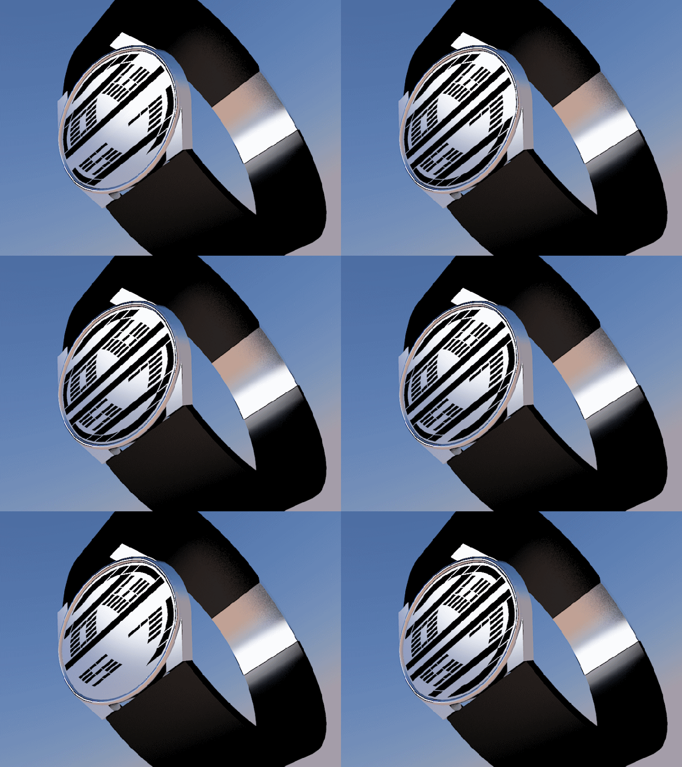
Design submitted by Heather from the USA.
Heather says: I wanted use a new case shape, so I decided on an oval display. I also wanted an LCD display with constant movement that catches the eye, so I made the seconds very prominent.
The hours and minutes of ATLAS can easily be read in the center portion of the display, neatly packed inside of the quasi-semicircular digits for seconds.

This is read-at-a-glance unisex design. It is not hard to read, but the unique layout and placement of the seconds digits, as well as the oval-shaped case help it to stand out.


There is certainly plenty going on with this display, it would never look boring. I like the seconds digits and how the rest fit inside. The only concern is that it could look cluttered at times. I support it but its not strictly for me, would make a nice gift tho 😉 5* best of luck! 😀
LikeLike
Cool, Heather! I like that the two hour digits and two minute digits resemble the outside and inside of a ring. You could have a cool animation sequence by blanking out each line of the right hour digit starting from the top and working down to the bottom of the right minute digit, then give the illusion of clockwise motion by continuing the blank line from the bottom of the left minute digit finally up to the top left hour digit, completing the cycle. I would even suggest this as an option for the seconds instead of showing the 2 second digits, if you could make each digit 15 segments tall. 5*/y!
LikeLike
Another great design, Heather, making full use of the available space. The animation definitely shows off the eye catching movement of the seconds. The oval shape is also an interesting alternative to the usual ones TF have in their range – would be good to this addition.
I like the black/white one, but I think there could be additional colour combintions that would tempt me more.
All round, another winner. 5*/Y.
LikeLike
Great job as usual and a very interesting concept.
My support. Good luck!!
LikeLike
Well… I actually like it… looks quite good to me…
LikeLike