Design submitted by Peter from the UK.
Peter says: Since my participation in the blog I have had a few ideas for watch design inspired by cube like forms. 3D Unlimited is one of my favourite TF designs and I love the simple but cryptic looking geometry. I have often thought it would be great if it was possible to create an analogue version. “Anacube” was the result. This design also takes a few cues form the internationally recognised puzzle “Rubik” cube.
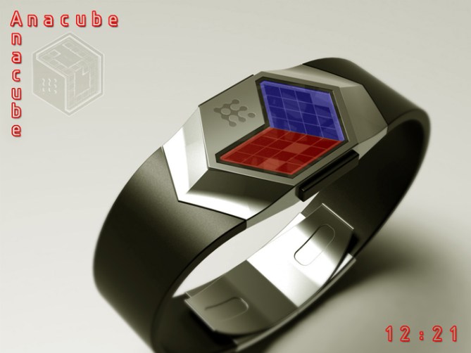

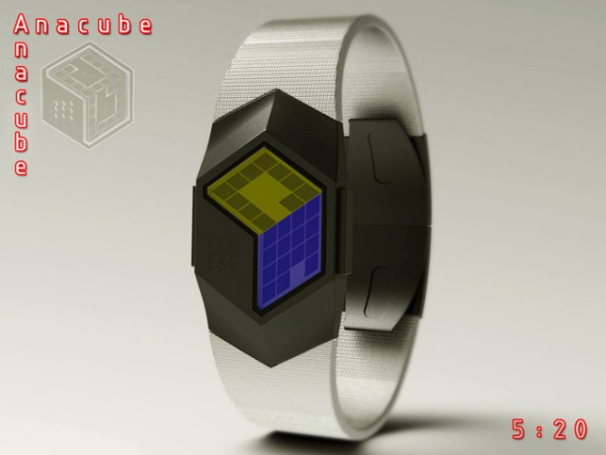
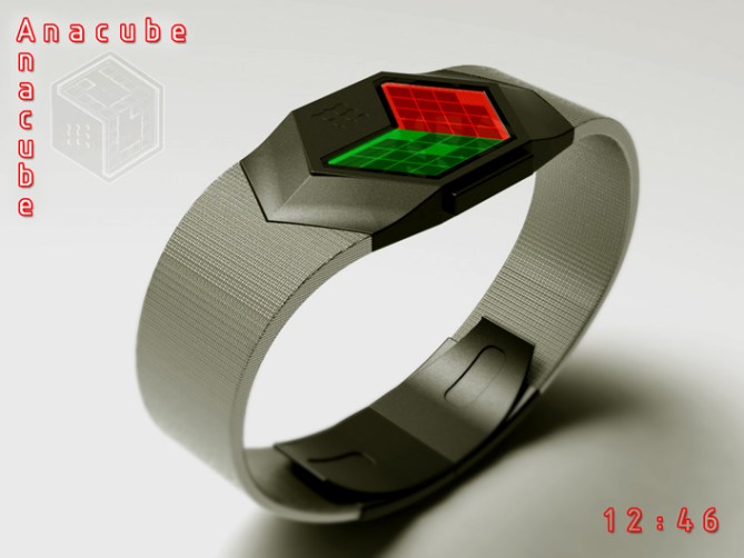
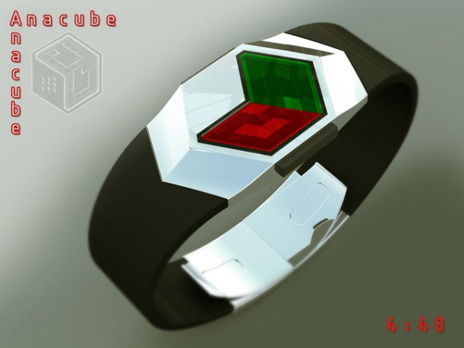
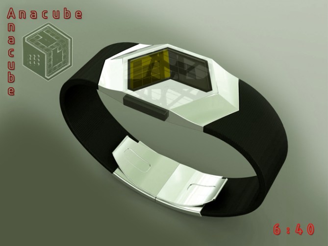
Anacube tells the time in an analogue format using two (could be three) faces of a digital cube.
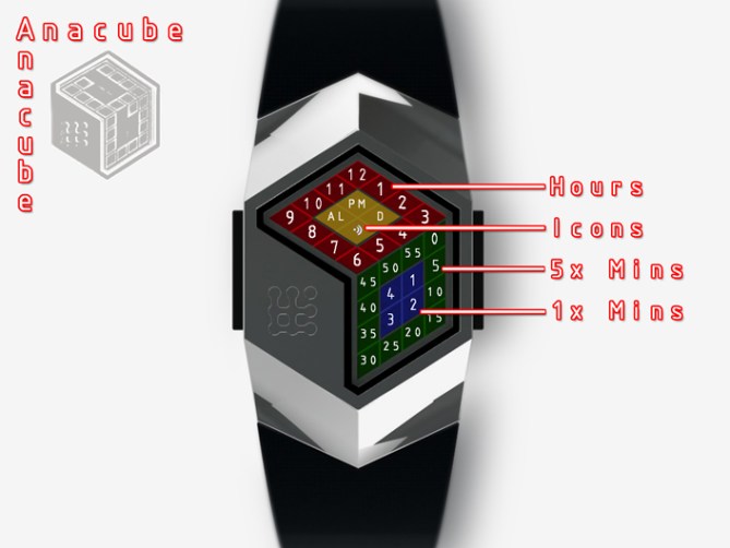
The top face displays the hours in a ring of squares, the centre of the face contains an extra four squares which could be used for mode icons (PM, Alarm, Chime, Date etc).
One of the front two faces displays the minutes, the outer ring of squares of the face displays 5 minute groups, the middle four squares displays single minutes.
If the third face was utilised this could display seconds.
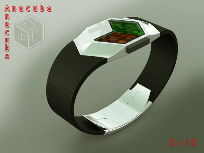
The faces can be illuminated using multi-coloured backlighting. These colours change intermittently to add to the “Rubik” cube look.
This design has a simple and easily recognisable analogue format which should give the watch mass appeal. The clean and clutter free geometry gives the watch a stylish and unisex appeal. This design should be suitable with old school TF fans as well as people who are new to the brand.
The cube like form combined with an intuitive analogue format displayed by a LCD with multi-coloured backlighting sets this design from others.
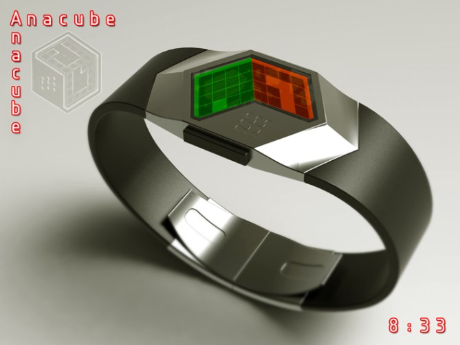



I truly love everything about this watch. I think it’s a very creative cryptic watch that will be easy to read. Cool to look at and overall just awesome! I especially love the look of the band! It’s so sleek and cool looking.
LikeLike
Great comment Bryce! I’m glad you likey! Cheers for the comment and the support! 😀
LikeLike
Hi Pete, this is a very beautiful project that deserves 5 * and Yes!
Pete, you speak to us about a third face for the seconds, but would it be possible to face for the hours, a aute for the 5 minutes and would the third for the minutes only, that make it possible to increase the boxes?
But this project with two face, gives him a look more “mysterious” I really like!
LikeLike
Yeah there’s no reason that the third face could be 5 min groups and have a more conventional 12-5-9 layout. For some reason I just preferred the a-symmetric look for this one. Plus I did another design based on this case which uses all three faces called “hexahedron” so keep you eyes peeled for that in the coming weeks. Cheers for the great feedback and vote Patrick! 😀
LikeLike
It is true Pete, asymmetry this design is attractive.
LikeLike
Cheers TF for adding this concept to the blog! 😀
LikeLike
Lovely design Pete. 🙂 I like that the face is asymetric too. Do you think the TF logo could be made to suggest the cube’s third face? Anyway, 5Y. 😉
LikeLike
I did look at filling that face as if there were a third face to the cube but couldnt get it to look right but I didnt try filling it with the logo. I could try it when I get five. Maybe if the logo was made of squares like the display it would tie in. I see what it looks like. Cheers for the feedback and vote Mushy! 😀
LikeLike
Hey Mushy, check out this latest version with enlarged KISAI logo filling the 3rd face of the cube as suggested and inverted display:
http://www.facebook.com/media/set/?set=a.432931880121878.1073741826.159423137472755&type=1#!/photo.php?fbid=432935413454858&set=a.432931880121878.1073741826.159423137472755&type=3&theater
LikeLike
Top work Pete! I’ve tried sketching cube displays, but never really got off the ground with it.
I think the idea of using just two of the faces is a great one, I think it brings something new to the basic concept. At least something I haven’t seen or thought of before. For that reason I think it should keep its assymetry; adding the third face would in my opinion make it less unique and lessen the impact.
Thumbs up and good luck! =)
LikeLike
Yeah I ave played with a couple of cubey like displays, Im a bit obsessed with making the display look kinda 3D for some reason. The other cube one which hopefully will hit the blog in the not too distant uses all 6 faces of the imaginary cube (may be a step too far lol) The two faces on this one just looked kinda cool and didnt have anything that wasnt needed, sometimes less is more. Cheers for the great feedback and the much apreciated vote! 😀
LikeLike
All 6 sides? You interest me strangely…=) I look forward to seeing it!
As I’ve read somewhere; less isn’t always more, but more if very often too much…
LikeLike
Amazing! 5/*!
LikeLike
Thanks a lot for your amazing comment alex322! 😀
LikeLike
Wow! Pete, I love the concept (that you did not use digits) and the renderings–this looks like I could pick it up (SolidWorks right?)! I would have a tendency to want to balance things out by adding the third face (as seconds), but I think it’s way too cool in the current assymetrical form. One question: isn’t the 11:54 pic showing “11:50”? Just want to make sure I’m understanding your method. I gave you 5* and thumbs up. Good show!
LikeLike
My mistake, I was inversely thinking the 1x minutes would be filled. I should know better than to question you 😛
LikeLike
Hehe no worries Xian, to be honest the display could work in negative too. The way I have it is not nesesarily the most optomised, buts as long as it can be understood thats half the job done 😉
Im glad you likey and cheers for the compliment.
Yeah I use Solidworks, I wouldnt say these are my best images but they are ok.
LikeLike
pete, the shape of this watch is uh-mazing – love it. beautiful, beautiful render. I love the idea of using multi-coloured backlighting and letting them change intermittently — personally, I think all backlights should do that 😉
as you know, i’m not really a fan of analog time-reading, but i’m not 100% against it (i did make the “droplet” design which used analog reading)…this one is done very nicely, and is quite intuitive to read, so i give it 5*/yes. good luck!
LikeLike
Yay! great comment, thank you Heather! Yeah you mentioned a couple of times that Analogs are not really your thing so Im really chuffed that this doesnt make you cringe! Im glad you likey and cheers for the support and vote! 😀
LikeLike
WTH – only 3.3 stars? I’m baffled – this is a screaming 5!
5y5y5y5y5y5y5y5y5y5y
LikeLike
Hey DZ, Cheers for the mulitple vote! hehe
The last 4 or 5 of my designs seem to take a hit with low scores at the begining, most have recovered and just about scraped into the 4s, so hopefully this will do the same.
To be honest I pay the score little notice these days, TF tend to choose what they like and what gets good comments rather than basing their decisions purely on an easily manipulated number. The important thing is you like it and that is good enough for me sir! Cheers 😀
LikeLike
Yes, I agree with you Pete, TF is justice and if it suits them, it’s all good!
Benefit from the present moment, right before the dream, the day when you will have your produced Watch, the dream will be reached and it will be necessary to find another of them…
LikeLike
I’d like to see TF produce a watch from the “low-rating-but-great-idea” category – say 2-stars or something. (And I’m not saying this just because my designs are average rating!) I still TF are influenced by the presentation to a large degree, even if they say “don’t worry, we’re more interested in the idea.” Prove me wrong, TF!
Cheers, and hopefully this shiny piece of genius will get produced one day. (Hint: I like shiny!)
LikeLike
Lol I wonder why too. But don’t worry, most of real customers don’t really bother voting and spending time here. Where were fans of Kisai Upload the concept lol.
LikeLike
The time telling is SUPER cool and feeling tokyoflashy really.
The design also very unique and modern, not too cryptic like one I’ve seen in my computer, this is more modern. The fact that the lens is multicolor makes the watch more attention starter and give such unique identity to this watch versus any other watches out there. I like the face allot.
LikeLike
Hey Fir,
Thanks for stopping by and cheers for the support. Im glad you likey sir! The multi-colour aspect I was envisaging as a colour changing backlight. So the design looks diferent each time you turn on the backlight. But if that wasnt doable a coloured lens would be the next best thing (maybe a interchagable lens so you could pick your favorite colours etc) Cheers again for the feedback 😉
LikeLike
All that needs to be said is 5/Y 🙂
LikeLike
Most kind sir! I thanky! 😀
LikeLike
Black Body and Strap with Silver Face. 😀
LikeLike
I like this concept. I don’t like the idea to use the 3rd face for the second, because I like the asymetrical effect. I prefer dual-color screen.
For a rare time, I like dual-color band, like this one :
http://www.facebook.com/media/set/?set=a.271593092922425.63864.159423137472755&type=3#!/photo.php?fbid=441005185981214&set=a.271593092922425.63864.159423137472755&type=3&theater
LikeLike
Cheers for the feedback Makko. I totally agree with you about the third face. I really loved the a-symmetry of this design. I like the fact it’s incredibly simple, nothing unecessary added etc. yeah I really like the two tone strap on the hexahedron watch (this watches sister) cheers for the comment and the support Makko! 😀
LikeLike
This one terminates soon so will quickly wrap things up.
The general feel and comments seemed positive although this was not reflected by the disappointing score.
I think the general concept is good and intuitive. Maybe there is improvement to be found for a future version.
Cheers to everyone who voted, commented and shared this design.
Thanks to TF for adding this design to the blog.
Cheers everyone,
Pete from the UK! 😀
LikeLike