Design submitted by Peter from the UK.
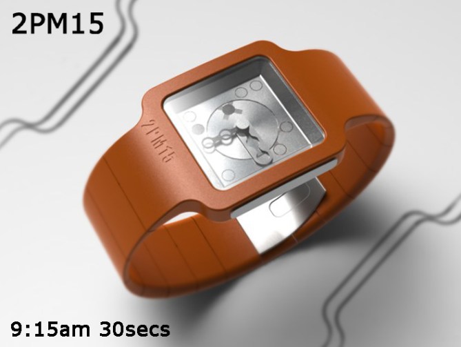
Peter says: This is “2PM15” which is a back to basics analogue with a subtle twist.
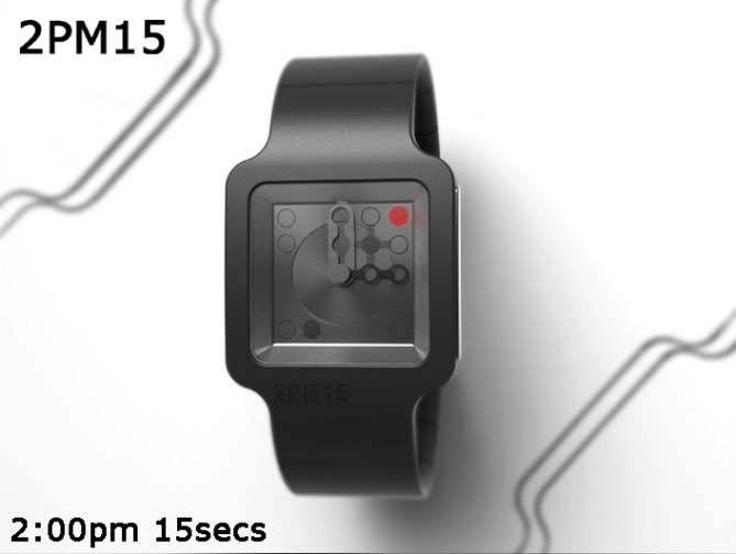
The time telling method is very conventional and uses a disk for the hours and two quirky shaped hands for the minutes and seconds. There is a red LED in the top right corner to indicate PM.
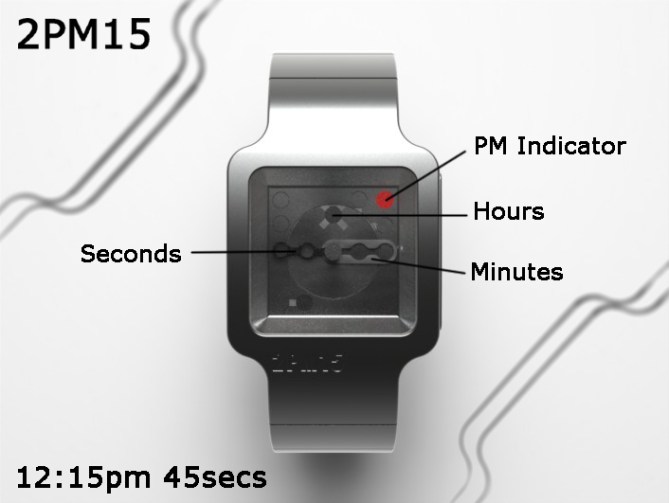
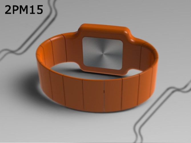
This design is clean and simple and will appeal to the more style concious but less adventurous. The simple slim lined geometric case looks modern and lends itself to a multitude of materials which will give it mass appeal.
The good looks and subtle twist will allow this design to stand out. The conventional construction will make it cost effective and viable.
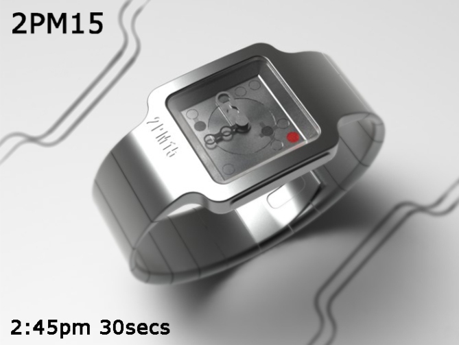

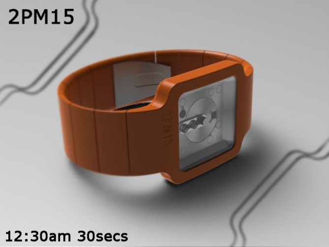


Oh yeah the twist, when the watch displays the time “2:00pm 15sec” it reveals its iconic brand!


love it. would probably buy even though i’m not so good with reading analogue without indicators. seconds are definitely a plus. logo idea is BRILLIANT. beautiful. 5*/y (white or silver for me)
LikeLike
Yay! It’s not often you think my designs would be suitable for yourself so I really appreciate it when you do! Thanks for the feedback and brilliant comment! 😀
LikeLike
Beautiful. The ratings are rubbish. 5/ Y
LikeLike
Thanks DZ, one man or women’s treasure is another’s rubbish I guess. Im glad you see treasure tho! Cheers and thanks for the vote! 😀
LikeLike
Thanks TF for posting this design. And thanks to Pete to design this watch! Hope the people like it!
LikeLike
Thanks Firdy! You are very kind sir! Cheers for the vote! 😉
LikeLike
BYUUUU
TEEEEE
FUUUUL
★★★★★
OHYES!
Hehehe, I wondered where the style of the hands comes from, 02:00:15 shows 😀 Appealing geometry – so smooth and simple. Orange…. looks great combined with metal. I’ve got a very nice impression of this concept’s presentation. Good luck!
LikeLike
Hehe I’m glad you like it Sam! I was worried it would be too tame for the blog but so far so good! I’m beginning to think that my personal taste is generally a bit OTT lol.
Cheers for the positive comment and vote! 😀
LikeLike
Thanks TF for adding this design to the blog! 😀
LikeLike
Another lovely design! very cool ( ^.^)b
LikeLike
Thank you very much Sarah! 😀
LikeLike
Nice way to present the brand.
What do you think led function change PM to AM? (light can be used to read the time to emit light at night).
Well presented.
Good luck!:)
LikeLike
Yeah that would make sense, cheers Jose. The light could perhaps also change colour blue for PM, red for AM ect. I dont know how much power that would require but it wouldnt need to be uber bright. Im glad you likey! Thanks a lot for the feedback! 😀
LikeLike
This looks like it would be a fun watch to wear Pete! 🙂 5Y.
LikeLike
Thanks Mushy, could also be frustrating waiting to the time to turn to 2.00PM and 15 seconds and then missing it cos someone distracts you at that precise moment! lol
LikeLike
Hehe yeah I noticed the logo. 😉
LikeLike
Very nicely executed clean simple design, the kisai logo is a nice touch 🙂 5/Y
LikeLike
Cheers very much KV! Im glad you likey and thank you for the vote! 😀
LikeLike
Nice job Pete
LikeLike
Thanks a lot Gordon! I saw your comment on the blog report, does this mean we can look forward to a Tokyoflash Gordon design on the blog in the not too distant future?
LikeLike
Mmmaybe
LikeLike
This one is soo amazing ! 6* and I would buy. ( I prefer black case with gray display )
LikeLike
Black and grey is a fine choice sir! Thanks for the amazing comment and super six! 😀
LikeLike
http://gadgets.9square.net/2pm15-stylish-analogue-watch-with-a-hidden-secret
LikeLike
This ends pretty soon so I would just like to give a big shout out to every one who voted, commented and shared this design. Cheers to TF for posting it here and gadgets.9square for mentioning it on their site.
Cheers everyone!
Pete from the I_I I<
LikeLike