Design submitted by Peter from the UK.
This is “Hypercube Analogue” an analogue version of the original Hypercube design that featured on the blog back in July 2012.
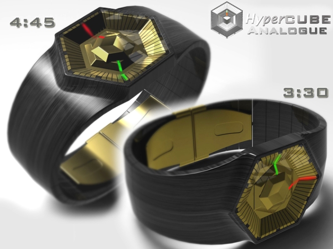
Peter says: I wanted to keep the same kind of faceted geometric cube shape that looks somewhere between architecture and jewelry, but this time with an conventional analogue time telling format.

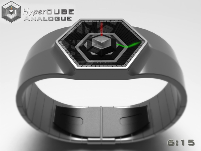
This design would use a conventional analogue movement to power two faceted watch “hands”. The lower hand displays the hours and the upper displays the minutes. I imagine the hands to be make of coloured transparent plastic with a coating or capping moulding over the top, this allows them to be illuminated by an LED mounted in the watch face underneath them, this light would shine out from one of the corners of the faceted hands to help highlight the time. The facets around the outside of the display have this time been divided into 60 markers. The hour markers are highligted to aid time telling.

The form of this watch is inspired by the simple geometry of a cube, using 3D facets to display the time giving the watch a jewelry look. The proportions should suite all wrist sizes and are aimed at the unisex market. This design suites a multitude of LED colours and materials giving this watch a mass appeal.


Nice job there pete, do you gift wrap? hehe 🙂 5/Y
LikeLike
Thanks a lot KV, yeah I do gift wrap! Hehe 😀
LikeLike
★★★★★/YES Wow the golden one *.* Nice work Peter!!
LikeLike
Thanks Sam, yeah the gold one looks like it should be a prop in a James Bond film! lol
Cheers for the vote and the comment! 😀
LikeLike
Thanks TF for adding this design to the blog! 😀
LikeLike
5*/Y Silver/black for me!
LikeLike
Yay! Coming right up sir! Who would you like the gift tag making out too? lol
Cheers very much 😀
LikeLike
SUPER!!!!!!!!!!!!!!!!
LikeLike
Super doooooooper! Cheers Fir! 😀
LikeLike
Pete, you’re like Sam, you also love honey.
5 * / Yes, it’s good the honey!
The white metal model for me.
LikeLike
Ummmm honey!!!! :O~~~~~ (me drooling)
Me love the steelie one too, cheers Patrick! 😀
LikeLike
5Y Pete. I like the silver version best. 🙂
LikeLike
A fine choice sir, let me just get that gift wrapped for you! 😉
Cheers Lloyd! 😀
LikeLike
hehe ok 😉
LikeLike
Crikey the rating went from 5 this moring to 3.9, then back up to 4.2 in the afternoon and now back to 3.9. Should re-name it “rollercoaster” or “yoyo”! lol
LikeLike
Cool bananas. Gimme, gimme, gimme! 5/y
LikeLike
hehe Thanks a lot DZ! Sold! 😀
LikeLike
I like the first one with the patterned band, it looks classy. The display is easy to read.
Diane.
LikeLike
Thanks a lot Diane for the classy comment! 😉
LikeLike
It looks beautiful Pete.
Mr.Taco
LikeLike
Thanks for saying and thanks for dropping by Mr Taco! 😀
LikeLike
http://techcracks.com/2012/09/hypercube-analogue-led-watch-design-concept-by-peter-fletcher/
LikeLike
I’m not a fan of analog display. But this one = WOW. I still love the overall look and love the dual colored hands. ( I would switch them : red = h : green = m ; to remember them easily [ RGB ] ) I would buy.
LikeLike
Yeah your comment about the colour of the hands is comprehensible. I orginally planned to have the hands the other way around as usually the largest hand tends to be for the minutes and the smaller is usually the hours.
But the geometry didnt allow, as I planned on using a conventional movement. So the colour being the more logical and intuative would really help. Cheers for the WOW comment Makko! Keep up the good work sir! 😀
LikeLike
With the nightlight, I realised that the “light” on the 60 markers are reflections. I prefer the HyperCube over the HyperRube. For the hands : Personally, 2 colors are easier to remember than the lenght/shape.
About my work : I’ve sent another design today. ( actually less than an hour ago )
LikeLike
The HyperRube one just kinda suggested itself because of geometry and the movement of the hands. I prefer the simpler colour schemes myself. cheers for the feedback! Congrats on your latest submission! I look forward to seeing it here! 😉
LikeLike
This one ends soon so a big thanks to everyobe who took the time to comment, share and vote!
Cheers to TF for adding this design to the blog and the external sites for featuring it.
Cheers folks!
Pete from the UK 😀
LikeLike