Design submitted by Sam from Germany.
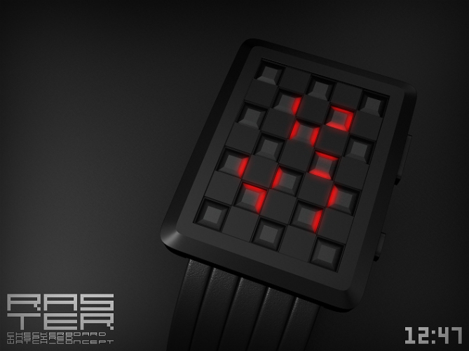
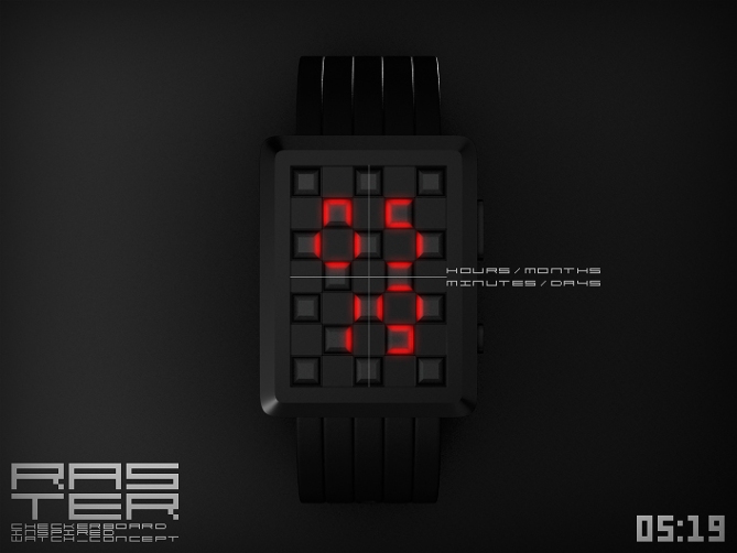
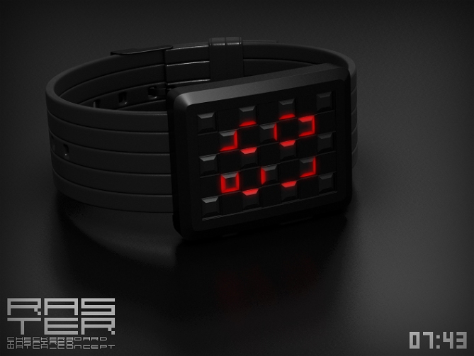
Sam says: “The inspiration for Raster is the checkerboard. There are many ways to handle this inspiration. I chose a subtle way with classical 7-segement digits to tell the time.
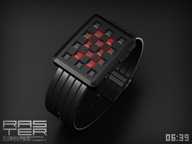
Raster is a fashionable mixture of traditional and geeky elements for those who prefer it subtle and simple but stylish.
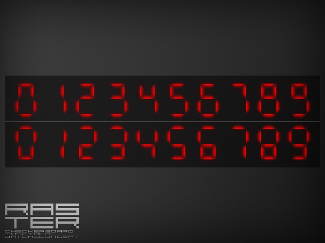
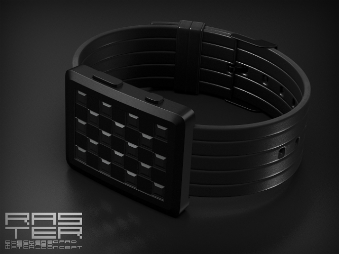
The display consists of a panel of massive squares and hollow ones. Only the hollow ones light up to tell the time. They are made of square pyramid bases covered by glass squares. The trapezoid faces of the pyramid bases represent the classical LED number segments. The resulting numbers resemble their originals, but look a bit different since the massive squares remain unlit. Instead of using different colors for the checkers, I chose the same material but a different geometry so the case looks cool when the time is not told.”


That design is really cool!
congrats Sam!
LikeLike
Wow! Nice one, think someone is getting a chicken dinner fo sure
LikeLike
Sam, I like this idea. With the right material for the glass covers, this could look very nice even when off.
I only have two very minor dislikes, personal preferences: I would prefer a narrower bezel, so the face looks less chunky, and I would prefer a metal strap.
I think this design can have a wide appeal.
How about an aluminum version with dark glass covers and blue LEDs?
LikeLike
Sam … Its really a cool one …
LikeLike
Hey, Sam. This one seems pretty simple compared with your usual epicness, but still very nice. I agree with Logan about a narrower bezel (less chunky is always a preference for me). I actually love the current strap, but Logan may be on to something with the metal strap suggestion as well.
Nice that it is interesting to look at even when off, and that the time can be read quite easily when on. 🙂
And of course I noticed the buttons are very similar to my Stencil buttons. 😉
LikeLike
Thank you everybody for your comments!!
Yeah, I can do simple too, Heather 🙂 I let existing Tokyoflash watches (Kaidoku, Stencil, Nightvision) inspire the way how to embed the display idea I had into a wearable object. The points about bezel and straps are comprehensible and I’m open to alternatives here.
Logan, an aluminium casing with dark glass covers is the checkerboard image, I wanted to avoid actually. But from a material and color perspective, it’s a wonderful combination, so it’s worth a try.
LikeLike
I like the idea behind this watch and how the numbers are displayed. I can imagine the squares adding a nice tectile feel. Im not overly excited about the look, its not my favorit of yours. But with a few tweaks could be awesome. 5/Y best of luck Sam! 😀
LikeLike
Sick! 5*!
LikeLike
Simply, stylish, and elegant concept. Nothing special, nothing puzzling only the time! I like it!
5 stars and Yes!
LikeLike
Thank you Pete, DZ and Laszlo 😀
LikeLike
All you’ve done here is rip off the design of a watch you can get on Amazon.
http://www.amazon.co.uk/Digital-Style-Metal-Sports-Watch/dp/B003U68GNO/ref=pd_bxgy_ce_img_b
LikeLike
Hehe no, it’s a separate development. You can say, that you see similarities though.
LikeLike
Chris, it’s ridiculous to accuse Sam of ripping off the design, because he clearly does not have a lack of original design ideas. On almost every page of the blog, you can find one of his designs that is quite unlike anything else. He doesn’t need to rip off designs, and any similarities are coincidental. There might be similarities, but the fundamental idea here of using the glass blocks and displaying on their edges is really different.
LikeLike
Thank you Logan.
I can say the same about your concepts too. I looked at the old entries today and man, so cool ones there! Isn’t it fantastic how differently time can be told?
LikeLike
How can we compare two incomparable model?
Everyone has their own taste and color, but I much prefer the draft Sat
5 * / Yes, for the subtlety of reading and the overall look of this watch.
LikeLike
I much prefer the draft Sam ! (sorry)
LikeLike
I knew what you meant Patrick. I just wondered how far your finger traveled on the keyboard 🙂
Thank you very much for your support monsieur!!
LikeLike
My finger did not travel on the keyboard, this is the translation that reflects Sam, in Sat, I did not notice right away?
The important thing is that this watch is very beautiful and that the number of projects that you have provided, I expect a model made I could wear.
LikeLike
Ah I see. Patrick, the translation often adds a “?” at the end. I always wonder if you ask something 😉
Oh yes, I made alot of projects – it’s so much fun to see an idea developing! I hope there will be a model of mine in reality some day. Thank you Patrick!
LikeLike
In this case, the question mark “?” means I do not understand and sometimes it’s a typo on the keyboard, eh ee
LikeLike
nice design. 5*. & I love the wristband.
LikeLike
Thanks Makko!
LikeLike
Thanks everybody for coming by and sharing your thoughts!
Stay tuned 😀
Sam
LikeLike