Design submitted by Calvin from UK.
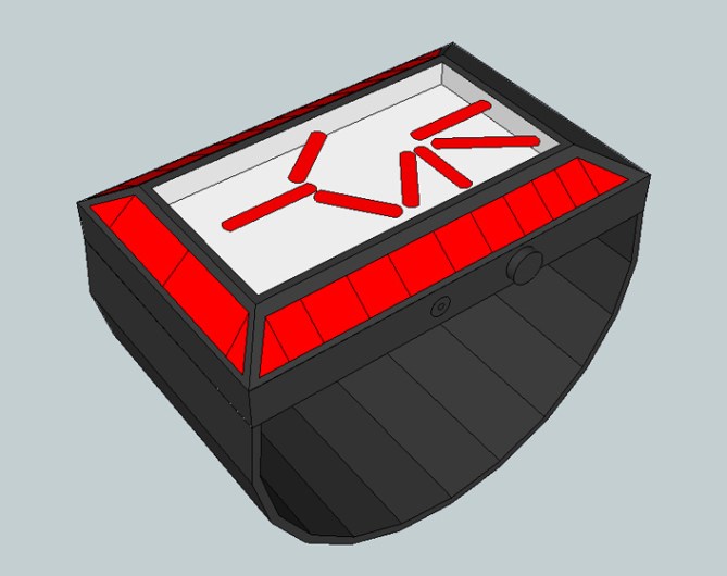
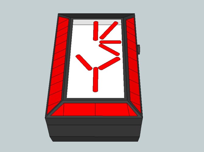
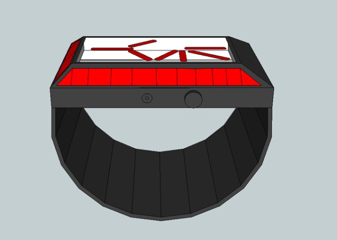
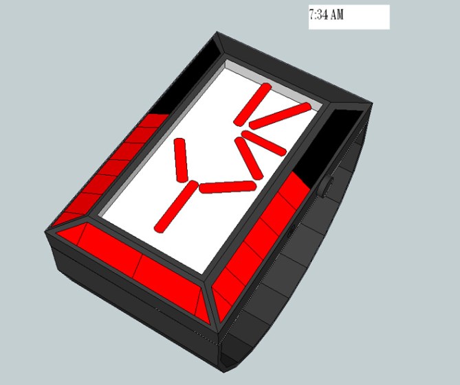
Time on this watch design is shown on the LEDs on the side of the watch and Predator symbols on the front of a see-through glass screen. The left side of the screen tells hours, right side of the watch shows groups of 5 minutes, bottom part shows single minutes, and the symbol in the middle stays whole if AM and cut in half if PM.
The see-through glass face and the LEDs showing time on the sides of the watch makes this watch one of a kind.
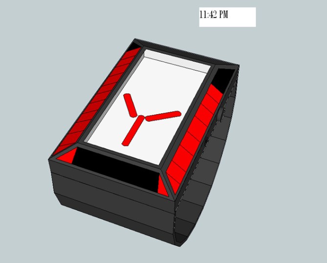


About the concept itself, I really like the idea of using a red predator symbol on a clear display!! I believe it could have been used a better way thought… not only am pm. Maybe a more crazy way of reading the time which would make your watch design really unique!
LikeLike
I designed a watch where predator symbols were used to tell the time, and it looks very much like the real predator wrist device. but i guess tokyoflash didnt like it, so its not on the blog ^^
LikeLike
Can you email me what watch you made please? ftvzimmy@yahoo.com i been trying to make something like this for awhale…
LikeLike
Maybe copyright issues. Tokyo Flashs predator-ish design is green and is called kryptonite, so no problem there i suppose.
This watch is a nice idea. Just imagine it with a cool case 😀 For people who like counting shapes this might be buyworthy.
The presentation influences the rating. its a little shame but natural though. It is hard to change the first impression. I try to kinda see behind the facade and here it works fine:)
LikeLike
heeheheheh
LikeLike
This one is much better than the Japanese flag one. Looks really nice! I like the lights around the edge combined with the face. 🙂
LikeLike
thanks dude xD i appreciate it
LikeLike
Interesting idea. To hard to read for me. But the appearance could be cool if tokyo flash takes care about this.
LikeLike