Design submitted by Matt from Canada.
Matt says: This design was inspired by Peter “Predatime”. I reorganized the lights position, added alarm/date/pm options. I also made LCD’s displays example, since I prefer an always on screen vs. LED lights.


Design submitted by Matt from Canada.
Matt says: This design was inspired by Peter “Predatime”. I reorganized the lights position, added alarm/date/pm options. I also made LCD’s displays example, since I prefer an always on screen vs. LED lights.

Design submitted by Cory from the USA.
Cory says: The watch is a Touch screen LCD/LED hybrid. It uses a dot matrix composed of Triangles instead of squares. I made this design very music friendly, when a track from your playlist comes up, you can swipe right for next, left for previous. The outer ring is not dissimilar to Rogue Touch and On Air, so the functionality will be familiar to Tokyoflash fans.

Design submitted by Andrew from the UK.
Andrew says: Whilst trying to think of a new concept for a wristwatch I though how a Mobius infinity symbol also looks like a number eight. Furthermore I that their not many Solar powered wristwatch added to the tokyo flash design concept blog.
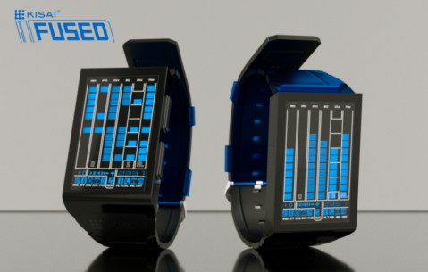
Design submitted by Firdaus from Malaysia.
Firdaus says: A fusion of two couple of elements; usability and style, cryptic and futuristic, bars and numbers, presented in fusion of two material, stainless steel and silicon, opaque and transparent, this is the Kisai Fused, concept design.

Design submitted by Jose from Spain.
Jose says: Always caught my eye, analog watches particularly that do not use hands to tell time.
Furthermore, as a personal choice, I’m very interested in a watch with basic features accurate in the measure of time and datary. This is the basis for the development of this new concept which I share with you: BASIK.
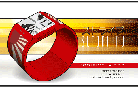
Design submitted by William from Norway.
William says: When I started this project, I wanted to check if I could use the interesting visual effect of the EAN codes in an original time telling system.
I am very interested in concepts that allow to use different kind of graphic designs to reach different kind of groups of people. I think that my concept allows this in a very easy way.
Design submitted by Vincent from the USA.
Vincent says: Once, I was doing my algebra homework and thought about the beautiful simplicity of graph planes. Then, I looked at my watch. And back at the homework.

Design submitted by William from Norway.
William says: This project all started on a sticky note when I saw a QR code in a magazine…
I did not want to create a design with written numbers and I wanted to develop a design with the appearance of complexity but that is very simple in reality.
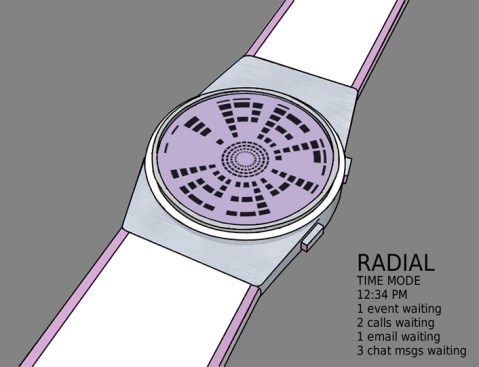
Design submitted by Heather from the USA.
A subtle smart watch design that uses a circular display matrix to display the time & simple text messages & notification icons. The watch informs you of new emails, social chat (such as Skype or Facebook) as well as remaining you of calendar events & missed phone calls. You can also control your music while you are jogging by skipping tracks or pausing etc. The time is displayed in the bottom half of the watch face as regular digits.
The unassuming shape of the watch makes it easy for anyone to wear, but the tunnel-like display adds a touch of uniqueness.
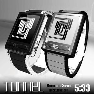
Design submitted by Laszlo from Hungary.
Laszlo says: This is the squared version of my VERTIGO watch.
