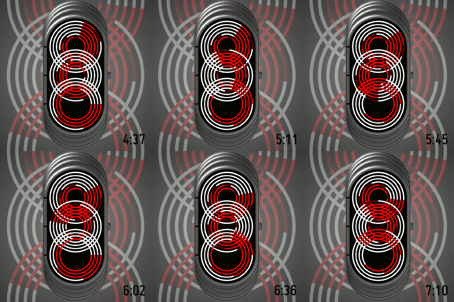
Design submitted by Logan from the USA.
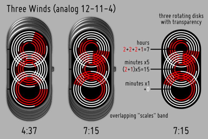
This watch design is an analog 12-11-4 watch. There are three rotating disks that are painted white, bright red, and dark red, but are otherwise transparent.
The disk at the top shows the hours (1-12), the disk in the middle shows 5-minute groups (0-11), and the disk at the bottom shows single minutes (0-4). To read each disk, look at the disk’s color in the 9 o’clock position (in line with the black marks on the case). White = +0; bright red = +2 for hours and 5-minute groups; and +1 for single minutes; dark red = +1 for hours and 5-minute groups. Two bright red marks would mean 4 hours or 10 minutes or 2 extra minutes, and two bright red + a dark red would mean 5 hours or 15 minutes.
If you want an analog watch with a “wow factor”, this watch is perfect. The transparency of the disks and their different rotation speeds make the patterns displayed highly variable.


I wonder how the movement would work in real life but it must be so cool if possibly executed. Overall design is interesting, creative concept for analog movement, but the funny thing is, this design reminds me to someone. A solid design here. 5* from me.
I also interested to see this watch along with its strap.
LikeLike
Thanks, Firdaus! It should be possible to make in real life, but the question in my mind is how good the transparency will look, especially the transparent “stalk” at the center of each disk. My hope is that, with a black background, the center stalk won’t be visible. Notice that, while parts of the disks overlap, the centers are free from overlap, so this should work mechanically.
About the strap…I tried, but failed, I think, to illustrate it. This is an overhead view, and the pieces marked “overlapping scales band” are supposed to show the strap as you would see it wrapped around the wrist. It’s supposed to be like the strap on Kisai Tenmetsu, but curved to match the case and without the split in the middle. I just couldn’t draw it properly from an overhead view, and probably should have added a side view.
LikeLike
Attractive watch, but quite complicated – difficult to read at a glance. 3* and a no from me.
I also interested to see this watch along with its strap. -Firdaus
I completely agree. Seeing this watch in a 3d render – with band – would be very nice if possible.
LikeLike
Thanks for your feedback, Jordan. It is always useful to hear whether people find displays too complicated or too simple.
As for a 3D render, I wish I could, but my 3D skill isn’t quite there. However, as I just replied to Firdaus, imagine the strap of Kisai Tenmetsu, but curved to match this case and without the split in the middle.
LikeLike
First of all 5* for the look, now I’m trying to read it…
Wow clever! About the 7:15: You said the hours are 2+2+2+1=7, ok. You could have said the middle minute are 10+5=15 instead of (2+1)x5 – leaves it all to just counting and adding – way easier to understand 🙂
The movements are as easy as in Firdaus’ Gothic Eye Watch – just three spinning circles. Has to be a ticking movement to avoid additional confusion.
Strap… I’m all excited about this watch, a strap would just fit in perfectly I assume. Tenmetsu strap is good!
I think, I’m the one Firdaus got reminded by this design, cause I submitted an analog watch with a similar appearance (red white black ♥ and segmented ring watch hands). Well, at least I got reminded 🙂 It’s a different mechanics and reading system though, so coincidence wasn’t mean this time, hehehe.
Logan, I really really like this watch, you also get my YES. It’s agreat watch. Relatively easy to make and with a wow factor, just as you said. Want it.
LikeLike
Sam, yes: 10+5 is an easier way to look at it 🙂 Dark red just means half of bright red.
It’s hard to go wrong with red, white, and black — hope we can see yours, too. I was wondering what Firdaus meant 🙂
Glad you like it, and thanks for your support!
LikeLike
Too tiring to read.
LikeLike
Bought! Where do I have to send my money? Logan is back with a hit in my opinion. This is tokyoflash. Looks wow and is challenging to read. Totally underrated! *****/YES!!!
LikeLike
send it to my paypal account 😉
LikeLike
I think this is an astounding watch. The watch looks VERY busy, but that’s only at a cursory glance. The tic marks on the side ground the entire piece, making it no more difficult to read than any other TokyoFlash watch. I could see this working even with a fourth wheel for seconds (The Four Winds?), and with MULTIPLE color palettes. I think the neatest part about this watch is how thin the design could potentially be. If the face was, say, 15mm wide and 35-40mm tall, with the face rounded around the wrist, the whole face could be flush with the strap, creating what could look like a fancy bracelet (especially with a matching steel watch band).
Personally, I love watches that are APPARENTLY difficult to decipher, but are easy once you’ve cracked the code. It keeps people guessing, and that’s the best part. It’s like a secret to everyone but you.
One note that I would suggest is to orient the tic marks to the right, as this would be ideal for wearing the watch on one’s offhand (usually the left). With the tic marks on the left, it just feels like I’m looking at the watch upside-down.
LikeLike
Thank you for your detailed comments and enthusiasm! Interesting that you mention four wheels, because that’s how the design started. The problem with four, though, is that the only way to arrange them so they aren’t too small is in a square, and, if you do that, the tic marks cannot all be on one side, which makes the watch too difficult to read, I think. However, with four, the overlapping patterns are even more interesting.
Watches that look difficult, but really aren’t…that’s what attracted me to TokyoFlash. I’m glad to hear the same from another fan.
LikeLike
You make a valid point. 4, 15mm-diameter wheels with 4mm overlap would create approximately 48 mm in length, which would be a little long. The only way around that would be to make the face prominent and flat (exactly the opposite of the flush design I initially suggested) or to rotate the design 90 degrees and to display the time in the rectangle lengthwise, like TF’s Kaidoku. I was more excited for something flush and fancy like the Denshoku or the Tenmetsu.
I believe that creating smaller wheels wouldn’t matter as long as the colors used on the watch popped against the negative space of the black. In that respect, making 10-12mm wheels with small overlap should help with space constraints.
A shame, but it would still look good if properly constructed. I still think a fourth wheel for the second hand would be awesome. It would be noticeably moving…swirling like wind!
As a side note, for a second design, you could make individual wheels showing through windows without overlap like the tenmetsu.
LikeLike
The optical effect is that cool, it’s worth trying to get along with the reading system. Coolest analog watch so far.
LikeLike
Thank you, AcanthaceousShrike! I’m working on some other analog designs with unusual optical effects, so stay tuned 🙂
LikeLike