Design submitted by Jordan from Canada.
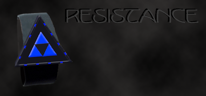
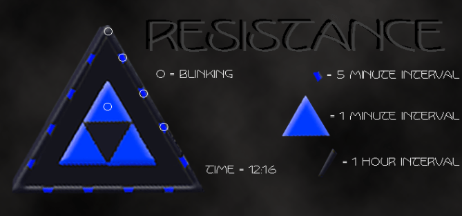
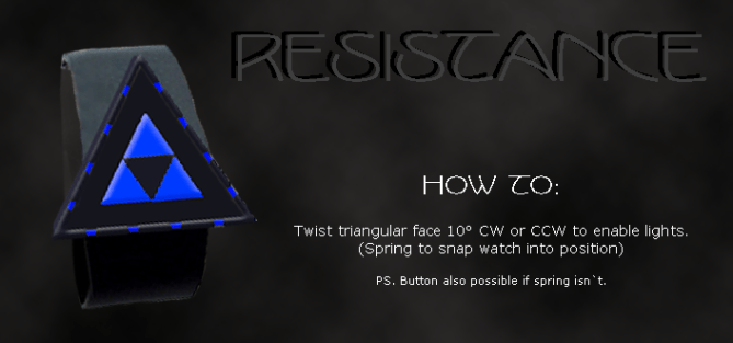
Jordan says: “I was just messing with triangles one day and found that 12 hours and 60 / 5 minutes fit perfectly into a pyramid type idea. It’s designed to be very minimalistic, containing no buttons. The time is read from the segments around the edge – large segments are one hour apiece, the smaller segments are five minutes each, and the triangles on the inside are one minute each.
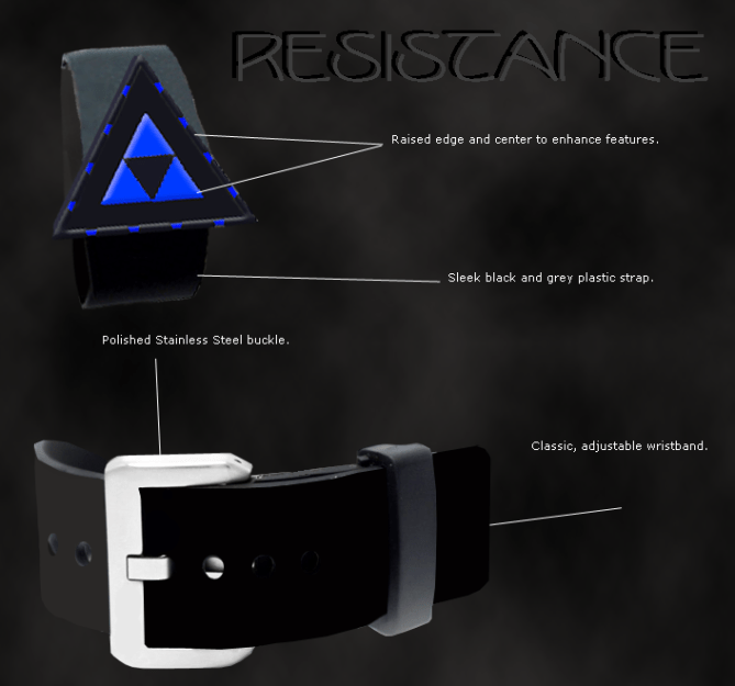
This design is well-suited for anyone but more geared towards men. It’s very simple, yet quite elegant. The dual colored strap and the triangular face set this watch apart from other designs here on the blog. It’s tri-color scheme is made to go with it’s tri-angle theme.”


Oh no!
LikeLike
Something the matter?
LikeLike
Wait, what? Even the explanation was confusing. Blinking? So that means it’s an hour… but not blinking then we have to count by 5’s or something? Forget it. Sorry, it’s too convoluted. Maybe just different colored interior triangles would be better. I dunno. This hurts my brain.
LikeLike
The small segments are 5 minutes, the long segments are hours. You don’t count anymore after some days since the positions are similar to those on an analog watch. You only count the extra minutes. It is like the RPM, but triangular 😉
LikeLike
Thanks for clearing that up somewhat Sam.
You read it as following…
The face is triangular with 24 lights around the perimeter. The smaller, blue lights as shown in the picture are 5 minute indicators. The longer gray lights along the perimeter (including the corner) are hour indicators. Say the hour is 12, the uppermost hour indicator would be flashing. This is where my explanation got confusing…
For every 5 minutes, one of the 5 minute indicators will be flashing. For example, if the minutes in an hour are 30, the first 6 minute indicators would be flashing.
I’ll try to link to an animated image ASAP which will hopefully clear this up for everyone. I’m not good with pictures and I use photoshop for all of my work, so don’t expect a work of art.
Thanks for the feedback Tim. It’ll really help me improve my future designs.
LikeLike
The base idea about triangle shaped analog based display is pretty cool. I “must” say that, because I thought about such thing too, but didn’t develop it. Actually triangles don’t appeal to me that much. But the watch is a solid design. It is easy to read, and unusual looking. Now its up to the peoples’ taste.
One little thing: There is no pyramid here, it is a flat triangle. I will show you a pyramid in the concept after my next 😉
LikeLike
well said Sam. if we want a too easy to read watch then it will lost purpose of being a tokyoflash. and about the pyramid, yeah, well said too. are u doing Egyptian or Mayan pyramid? well I gotta check the sneak peak 😉 huhu
LikeLike
Sorry about the pyramid thing. I was in a rush to finish off this design and get it out onto the blog =)
LikeLike
And this watch is…. do you know helipad??? this one looks like helipad of space ship. And it is cool IMHO. We just need better explanation to this.
LikeLike
I’ll buy it in yellow/gold
LikeLike
Sounds like a nice color scheme. If I’m able, I’ll link to a picture here with some new color set-ups.
Thanks for your feedback.
LikeLike
Looks an awful lot like the Tri-force from Zelda games. HAHA great design and interesting set up. Just hope Nintendo doesnt try to silence you for it HA HA Good work though.
LikeLike
or 4chan.
LikeLike
I have the animations and new color schemes made… Not quite sure how to link to them, but I’ll try this…
LikeLike
Animation – [url=http://www.imagehosting.com/][img=http://piczasso.com/i/5cq2o.gif][/url]
Golden Theme – [url=http://www.imagehosting.com/][img=http://piczasso.com/i/imypc.png][/url]
Red Theme – [url=http://www.imagehosting.com/][img=http://piczasso.com/i/4nhk5.png][/url]
Combo Theme – [url=http://www.imagehosting.com/][img=http://piczasso.com/i/9s5s9.png][/url]
LikeLike
Sorry, that didn’t really work out.
Red Theme –
LikeLike
Red Theme – [url=http://www.imagehosting.com/][img]http://piczasso.com/i/9s5s9.png[/img][/url]
LikeLike
Well now this is getting annoying… I’ll put the URL here instead of trying to make links.
Combo Theme – http://piczasso.com/i/9s5s9.png
Golden Theme – http://piczasso.com/i/imypc.png
Red Theme – http://piczasso.com/i/4nhk5.png
Animation – http://piczasso.com/i/5wkq9.gif
Hopefully this clears things up. Enjoy the new themes =)
LikeLike