
Design submitted by Andy from Ukraine.
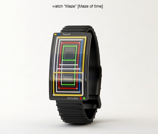
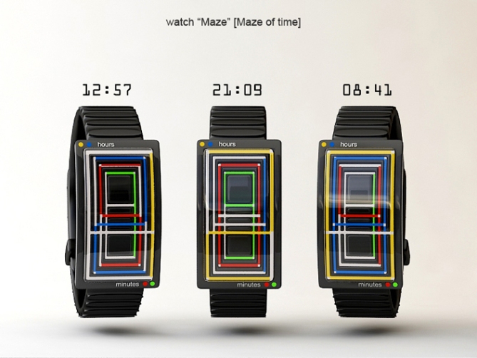
Andy’s idea for this maze watch is based on Greek myth Theseus and the labyrinth. This watch design uses colors in a kaleidoscopic way to represent the time.
Time is displayed in digits but in an overlapping manner than can only be distinguished with their colors. Yellow and blue stand for hours, red and green show minutes. It’s an easy read once you get your eyes used to the different colored lines.


wow.. this is trippy! very clever. i do have to admit that the mixed colours are a bit on the ugly side (to me)… i’d prefer different shades of the same colour or perhaps intensities of light to show a depth effect. either way, i love the idea!
LikeLike
First I saw the display and said wow, I want that. Then I tried to read it ( I already liked the watch, so it had to be haaaard to make me say “it sucks”) and it’s easy! What a clever idea to place 4 numbers like that! Colors can be chosen later. One little thing: the corners of the numbers are cut out, it would look better, if not. Anyway, that’s a great thing!
LikeLike
Mhhhh artwork-ish 🙂 Very clever indeed! Color shades, like cortjezter proposes, would look nice. Less contrast between the numbers though… This watch is pretty tokyo-flashy!
LikeLike
コンセプトは好きだけど、色の組み合わせがクールじゃないなぁ。外周から順番に読むだけだから、ブルーとかで一色で表示したらカッコイイんじゃないかな。
LikeLike
Que buena idea¡¡¡¡¡¡¡¡¡¡¡
LikeLike
holly crap that gave me a headache. Looking the other way now. 😉
LikeLike
It a shame I m really don’t like the multi color watches. The concept is great. I’m sure if the watch would use only one color but for each numbers a different brightness it would bring a kind of depth effect and the watch would definitely fit more my taste!
LikeLike