Design submitted by Devindh from UK.
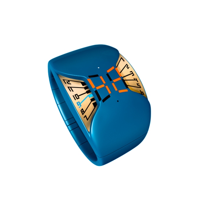
The inspiration for this watch comes from the look of circuit boards and microprocessors. Devindh likes the contrast between metal and synthetic and chose this as a starting point for the idea.
The watch design is meant as a sports/fashion piece with a modern twist. It is streamlined in shape following the bracelet/cuff pattern. The band is articulated and finished with a deployment catch. The case has 2 tiers. The upper tier has a ‘pinched’ digital display indicating minutes, and the lower tier shows the hours which are illuminated by LEDs. Two micro LEDs indicate AM/PM.


Beautiful design 🙂 Extravagant but not too brash. Nice colors. Nice materials. Nice digital display. Onle little thing: maybe you add corner LEDs to the big minute ones. They look a little too deplaced in comparison. If they would loog like the hours numbers, it would be even nicer. Very good work!
LikeLike
@Samukun: Thanks Sam. I tried to model the centre digital display so that it followed the contours of the watch as closely as possible, but it was very hard to do with subdivision surfaces. I think I would probably need to make a NURBS model of it in order to be ‘true’ to my original design. I look forward to seeing more work from you.
LikeLike
Oh I see 🙂 It is always easy for an outsider to criticize. Thank you for explaining.
I meant something like that http://ledmuseum.jthz.com/ssl190-6.jpg – the whole shape is not that edgy. What do you think?
The longer I look at this watch, the more I like it. Maybe I get used to the minute LEDs too, tehehe.
LikeLike
Thanks for posting the link. I see what you mean. I think you are right, and there is scope to alter the design so that the corners of the digits are less angular and follow the ‘imaginary’ curve from the case edge to the centre. The reason I chose to this digit ‘configuration’ is partly technical. What I mean by this is that I wanted the digits to appear ‘debossed’ from the surface. If the digits had corners as shown in your linked image I think it would leave very thin strands of case surface that would be fragile and prone to damage.
PS. I prefer people to express their honest opinion about my work. It really does not concern me if it is positive or negative criticism, just as long as a reason is given:)
LikeLike
Nice! I really like the shapes, and the contrast between the metal and plastic (I much prefer the black/gold version, but that’s just my taste). There’s just one thing I’d like to see changed, which Sam has already mentioned; the minutes display. There’s something about the geometric shape of the digital display that clashes with the soft forms of the plastic. Otherwise, a solid concept!
Funny how the three most recent posts (this, Sam’s and mine) all have the same basic theme, by the way…=)
LikeLike
Hi Anders S. I must confess that I was a bit surprised when I saw the similarities in design thinking between us. This means I will have to think harder for my next designs to try and avoid ‘overlapping’ with somebody else’s work:) I know it will be impossible to second guess the direction people’s designs will take, but it certainly makes things a bit more interesting. I look forward to seeing more of your work.
LikeLike
Well the minute leds stand out a bit, that’s true. It is a good point for the watch, when people who see it, already talk about the details. It means, they accept the watch as a whole. We all tolerate little flaws. It is too hard to meet the taste of everyone. Even tokyo flash doesn’t. I think this is a strong watch an I would buy it… Oh man, if tokyo flash makes my favorite watches, I am poor soon, lol
LikeLike
@Aphosno: Thanks..:)
LikeLike
I like the combine of supple plastic and electronic IC chip board! good work.
LikeLike
@said: Thanks:)
LikeLike