Design submitted by Peter from the UK.
Peter says: From the beginning of my involvement with this blog I have had a fascination with trying to show the time in 3D. One of my early design that did this was called “Rotor” which had an analogue watch hand that showed the minutes like a conventional analogue watch but the hours were shown in the vertical plane. This works and makes for an interesting concept, trouble is of course that this makes for a clunky form and would be difficult to make.


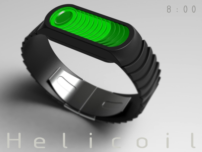
I started thinking of ways to show this time telling method using a flat LCD. I thought about using a 3D cube grid shape to show the time in two planes but this looked too blocky and convoluted. Then when I wasn’t thinking about it occurred to me that a helix would achieve the same thing but look more organic and elegant.
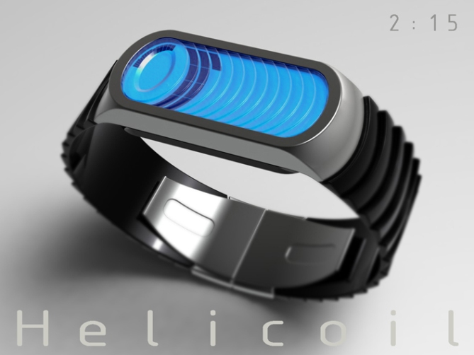
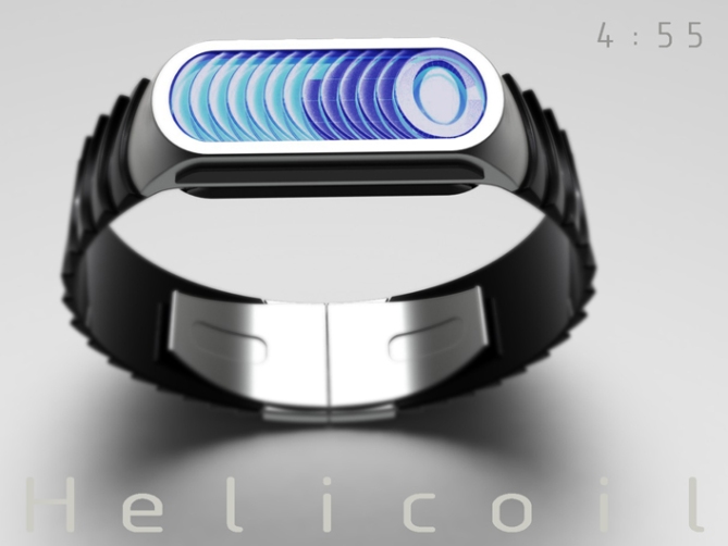
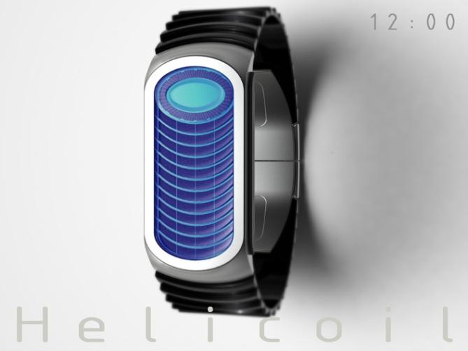
The time is told by one continuos helix or coil (like a compression spring). The top Coil is made up of 60 segments which describes the minutes, there are 12 other coils beneath. Each of these coils is made of 4 x 15 min segments and takes one hour to complete, equalling twelve hours in total. To read the time you simply read the amount of completed coils for hours and the incomplete coil for the minutes.


This design is very simple yet looks quite complex and artistic which may appeal to creative people. The time telling has a poetic feel which might appeal to the fairer sex. The proportions would be unisex, as is the form giving the design a wider appeal.
The simple complexity of the display sets this design from others, yet is based on tried and tested tech giving the watch viability.
[Animation File 4.3MB]


Cheers TF for adding this design to the blog too! 😀
LikeLike
The 3D effect works for me. Would be great to see this made. 5*/Y again, Pete.
LikeLike
Thanks a lot Nev! Cheers for the support! 😀
LikeLike
Looks very nice! 5y
LikeLike
Cheers very much DZ! I’m glad you likey sir! 😀
LikeLike
I like it, but it doesn’t grab me like the other one did… The 3D effect works well, although I’m not crazy about the elongated display. The strap fits the rest of the design nicely. I especially like the bevel angle, if you know what I mean…=) I have to confess I don’t quite see the point of dividing the hour markers in 4, apart from giving a quick and rough idea of the time. Anyways, that’s my two cents. Good luck!
LikeLike
The reason for dividing the hours into four besides for quick reference is to go along with the sping/coil/screw theme. If you look at the animation you will see the coil look like its turning and screwing for want of a better expression. Hopefully it will grow on you over time. Cheers for the feedback! 😀
LikeLike
screw-ing* blummin censorship
LikeLike
Ahh, I see! Didn’t look at the animation before, since I’m a lazy one, me…=) My only niggle with it is that it’ll be too slow to see the motion… Perhaps have second indicators along the hour indicators, that way it’ll have more movement…?
By the way, did you know that Heli-coil is a brand name? I’m guessing you might, on account of your line of work… Cool name, in any case…=)
LikeLike
Yeah I know heli-coils are thread inserts. I wanted to call it helix but I remember Heather submitting a design with that name. I didn’t mention before or in the text that this is a mkII. The original consisted of a constant spiral with 60 segments per coil and 12 coils. So the display would fill continuously as the day went on. But as you can imagine it made for a complicated and dense display. This version gives a similar effect but with fewer segments. The display could be animated when the time is not required or showing the seconds as you suggest. Maybe the minutes/ hours are shown by the outline of the segments which are filled by the seconds so the whole time is shown and is always animated. Plenty of options that’s for sure! 😉 cheers
LikeLike
Another watch Pete, it’s party time!
I see this watch as a series of coins or casino chips stacked.
Going to Casino, with a tie and tuxedo “Helicoil” arm, what class!
5 * / Yes, yes!
LikeLike
Thats a cool way to see the concept, I hadnt thought about stacks of chips or coins. Cheers for the association and the cool comment! 😀
LikeLike
I like this one Pete. It’s nice and easy to read, looks different and is, I imagine, relatively easy to make. Some good potential for cool animations like the one you’ve shown too! I gave you 5Y. Dunno why it’s only 3.3.
LikeLike
Thanks a lot Mushy, im glad you likey sir! The majority of my recent score seem a little low. All part of the course I guess. We have to remember that we have the creative hobby of submitting these designs, while others get some pleasure or meaning from unfairly berating them. Gotta get your jollies some how! lol
LikeLike
Another one I would love to see made 5/Y
LikeLike
Most kind sir!, you have one hell of a virtual collection now! 😀
LikeLike
I can image some nice animations here. This watch has a certain traditional Tokyoflash charme, creating interest with a simple pattern and a little geometric twist. Very cool. I’m not too overwhelmed but at the right price this one would be mine. Good luck Peter!!
LikeLike
Comprehensible feedback sir! lets hope the price will be right! 😀
LikeLike
Master Pete,
A brilliant and imaginative solution for a complex version like rotor.
I love it. My support for this concept
LikeLike
Most kind sir!, I’m glad you likey and thank you for the support! 😀
LikeLike
Fantastic idea. Looks like a tribute to Tokyoflash 🙂
LikeLike
Great comment Peter!, yeah it does have a old school TF feel to it, thats gotta be a good thing! Cheers for the support sir! 😀
LikeLike
I think this design is solid and not too complicated enough to make it really rare. I’ll consider buying if it listed in TF J dot com. Terms and conditions apply 😉
LikeLike
A very solid and uncomplicated critique sir! I thank you and hope to see you on TFJ dottoius commious! 😀
LikeLike
I specially like the “old cellphone pad” look of the display & the overall look. Very cryptic at 1st sight but easy to read. I like that it’s only showing the minutes and that there’s a bit of math involved. ( if the circle was divided by 15, there would be more math involved ) It would be nice to have the second.
At the beginning, I thought that the 15 minutes blocks should light-up left to right. Then, I realized that it’s going in the same direction than the circle on top. ( I think that you made the good decision, even if it’s a A or B choice & that the circle have to be clockwise ) I like the small cut at every 5 minutes.
My fav’s are the blue & green. I prefer the gray case/black band combo. ( the other way would also work )
I would buy, if the height was right.
LikeLike
I hadn’t really thought about the cell-phone key pad imagery (if you like that inspiration keep your eyes peeled for “Razor” when it hits the blog) yeah the direction of the “coil” of the blocks was determined by the clockwise direction of the minutes. They could be the other way around but wouldn’t suit the screw like animation. There is scope for development here imho. Thanks for the feedback Makko!
LikeLike