Design submitted by Cory from the USA.
Cory has thought about sun dial time as it’s been viewed for centuries and brought that concept into the digital age.
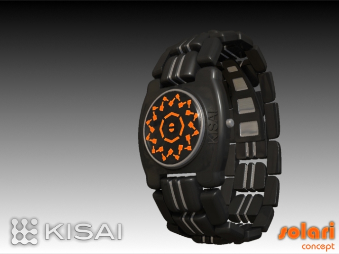
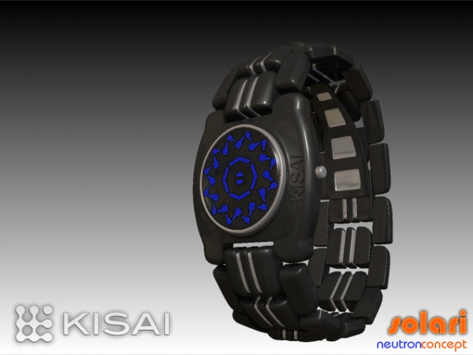
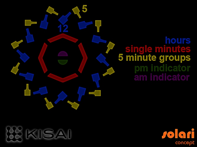
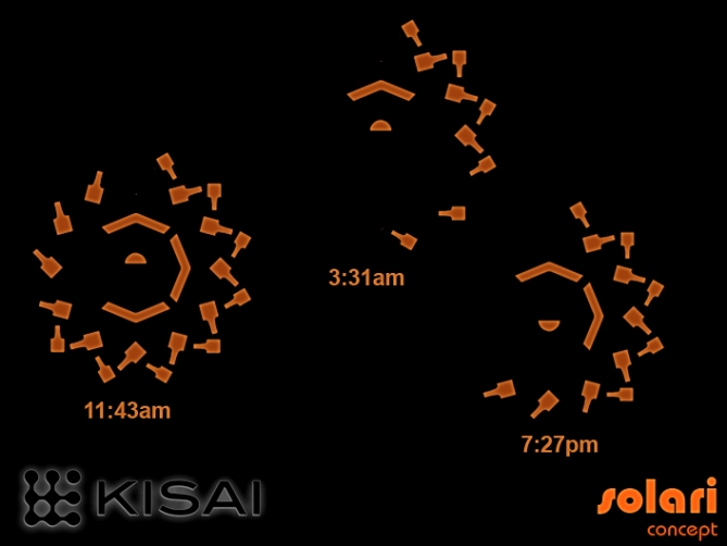
With a touch of a button, rays will light up the watch clockwise to display the time. Hours on the inner ring and minutes in groups of five on the outer ring. Single minutes are designated on the octagon in the middle, center AM shown as the upward facing semicircle while PM as the downward facing semicircle.
The shape is very reminiscent of the sun, the hours and minute groups form the rays, while the single minutes and AM/PM indicators form the orb.


The orange led version is, awesome!
LikeLike
Thanks! I’ve done a few more renders of it that I’ll post on my site and provide a link when I get home from work tonight. A few more example times, and a full turn around.
LikeLike
very very nice watch, but the kisai logo just ruins it, as Samukun said once; don’t be so worried about putting a logo.
LikeLike
Hmmm… duly noted, now that I look at Satellite, RPM, and Console, their logos are very discreetly placed. I’ll keep that in mind for my future attempts. Good feedback, Thanks Toys.
LikeLike
http://www.corydfarris.com/Images/solari_anim.gif
http://www.corydfarris.com/Images/solari_anim_small.gif
Took the logo off and rendered a full turn around of the watch.
LikeLike
Gave it a bit more of a chiseled edge to the face, and thinned down the band. Trying to get away from the bubbly look that the original renders had.
LikeLike
Great design and concept. S-Rank!
LikeLike
I like the method of telling time but the strap/face looks horrible honestly. I think it would look much better and get more sales if it was more sleek looking, kinda of like the Goku or Matrix concept watches.
LikeLike
Ah this one is beyond my taste. The thick and bubbly shape of case and straps for example. And the toy-ish expression of the display. The time telling systen is alright though. The execution of the watch is very well. This could be a watch, imaginable to be found in a store. Not for me, but for others 🙂 And yeah, don’t worry about placing a logo. If they produce the watch, you’ll have it more than enough. Until then let the design be pure.
LikeLike
Yeah, this was my first attempt at designing a wristwatch. I wasn’t entirely happy with the renders tbh. Most of my work thus far has been game art. Graphics rendering is somewhat new territory. Hope to get better with future designs though.
I posted more renders of it but it says ‘Your comment is awaiting moderation.’ and they have never posted… is there a certain criteria to posting links on here? thx!
LikeLike
Oh it seems you already posted some more links. One link is normally no problem. But to prevent spamming, there is a little barrier wich stops people from posting more. A message to Tokyoflash helps… or a little patience. So If you like to see all your images quickly, post them in one link.
Oh the renders themselves are cool. The more realistic, the more the people have to criticize 😉 The new geometry is more of my taste. It’s cool you react on what people tell you and produced another version. It is still your watch (very important) but nicer imho. But other people already liked your original, so it is your taste vs the masses’.
If you can handle critiques (hopefully constructive), then don’t hesitate and show us more or your skillz 🙂
LikeLike
I prefer to throw comment base on concept. I don’t really care about how you design the strap or how good is your rendering (which is awesome) because that’s not the purpose here. Basically the concept is solid. Hm… your animated gif looks very clean, howd u do that? uh off topic 😉
LikeLike
Well most of the people judge what they see. And people rate good looking things. Thats very wise of you to judge the idea. But tokyoflash watches are mostly a thing for the eye. Talking about purpose: This blog IS about discussing what is shown. But if you wanna talk about the base idea only, it is not new and not astonishing. So then, we need to talk about the interpretation of this idea wich is interesting but a little too strange looking but tolerable if wrapped in a hot shell. So then, what about the shell? I like the new models pretty much. So i give 4 stars for not being perfect 🙂
LikeLike
Being able to take critiques is part of being an artist. To be able to view a critique and incorporate the feedback into a better looking finished piece is the thing to strive for.
Thanks for the constructive criticism, I think it has resulted in a more polished design.
😀
LikeLike
As long as you keep the hours and the 5 minute bars different colors it’s perfect. It’s kind of hard to tell the hours and the minutes apart when they’re the same color.
LikeLike