
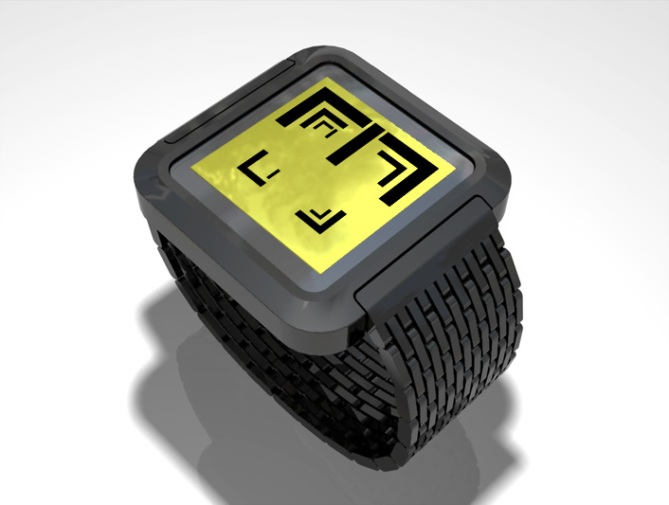
Design submitted by Logan from the USA.
This watch design is an always-on LCD with adjustable color LED. The time is shown in three nested layers, read from the outside inward. Hours are shown in the outer layer, tens of minutes in the middle layer, single minutes in the inner layer.
The diagram shows how to read 1-9, 0, 11, 12. This design is a distinctive concept that packs complexity.

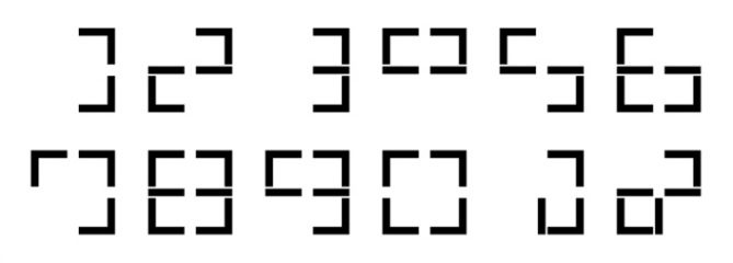


Ok, before I try to read it, the display looks very cool! The single images you have for the different times….wow. Such impression I wanted to give with my 3×3 watch: cool pattern and not just single indicators. Ok, now reading… Oh wow Logan! I really like it! Decimal numbers within a given LED grid. Why the one isn’t | and the four not 4? But you know what, it is ok like that. I like the 11 and 12 idea. Cryptic 12-5-9 display design. LCD on light ground is ok for me. Basic technology wich is totally sufficient. Tokyoflash chose a nice case for your display. I would prefer a bigger display and a thinner case border. But that’s details wich have to be discussed later. Good work!!!
LikeLike
Sam, 1 is not | because the | symbol does not appear in the inner layers. | is only part of the outermost layer, and only to handle 11 and 12. Yes, I could have put | in the inner layers, but I thought it would have become unnecessarily cluttered. But, the basic idea could certainly be tweaked.
LikeLike
I salute you Logan. It took me a while to get it but now I do, I like it a lot. Very clever indeed. The layout of the numbers is beautiful and cryptic at first glance. I have no doubt after a short time this design would be readable at a glance.
Would definitely look good in LCD and i’d like to see it in a more fitting case. I see this one only has a 2.2 rating so far. I think it might be too complicated on first glance for many people. I hope I am proven wrong. Good luck!
LikeLike
Thanks, Sam and Avatara! Glad you like this style. I guess it’s not for everyone, but it fits my image of Tokyoflash. As for the case, I think it might come down to the price point Tokyoflash would want to hit. Perhaps, because this is LCD, they could actually make it rather inexpensive compared to some of their other watches.
Anyway, thanks again for your encouraging words.
LikeLike
I fits the image of tokyoflash and even toykoflash has not so popular watches. This one looks a little shy but the display idea is great.
LikeLike
Hey Logan! I like the idea of using the shape of numbers and make it a little bit hard to uncypher. That’s always the best thing for tokyoflash to me.
I agree with Sam, you probably should have make your own case which would have fit perfectly the display. But I guess 3D is difficult…
I m not a big fan of the 12 and 11 myself. One step closer to real number’s shape would have be good maybe. But I m sure you are close to a very nice idea here!
Great job!
LikeLike
@said Thanks for your feedback. I wish I could have made a custom case myself, but my 3D skills aren’t quite up to par. I think Tokyoflash did a pretty good job considering.
LikeLike