

Design submitted by Francisco Lupin from Argentina.
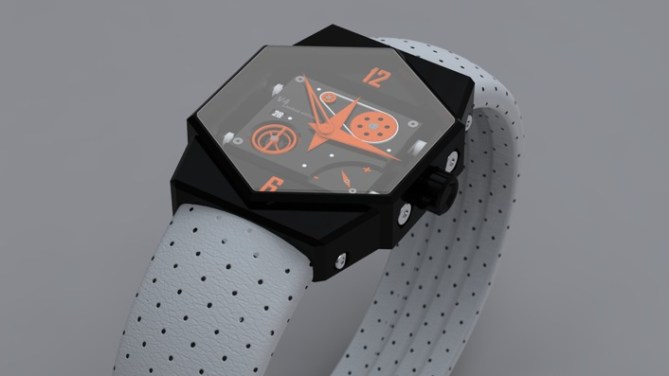
A concept watch design that combines steel and leather creating a contrast. The time is shown traditionally with analogue hands and there are various dials and cogs to add interest.
アルゼンチンのFrancisco Lupinさんの作品。
金属とレザーのコントラストをテーマにしたコンセプトデザイン。時刻の表示方法は通常のアナログ時計と同様。ダイヤルや歯車などのパーツが見える、繊細な表情をもったインターフェイスも特徴。
.


TahI like very much the ideea (even is not very Tokyoflashy).
I like it because is complicated, there are many features, the colours, the hexagonal shape.
The strap with black dots is very interesting. and it goes perfect with the black case and aluminiuim parts.
I don’t understand all the functions of the watch. Can be more specific ?
LikeLike
I agree with GabrielBB – not TokyoFlashy. Really, not very interesting. but looks quite nice. Wouldn’t buy, but 4 stars.
LikeLike
Agreed. It’s not Tokyoflash, but it’s interesting nonetheless. I do like the strap and it’s got kind of a Formula One feel about it. These concept submissions are really cool, well done to you Francisco!
LikeLike
Interesting design. I think I’d like band better if it were orange to match the cogs/watch hands.
LikeLike
Hmm not really Tokyoflash. But looks like a nice 3d image. What is unique about this design? Maybe non Tokyoflash customers would like this very much.
LikeLike
nice but not Tokyoflash to me. I don t understand why it is here actually!
LikeLike
It is a striking design. With the contrast of colours on the watch face and the strap, it stands out. I would add this one to my collection.
Even though it is not ‘Tokyoflashy’, it’s a very sharp design.
LikeLike
I like: Colors, band, complexity, face shape
Dislike: Nothing. Very cool.
LikeLike