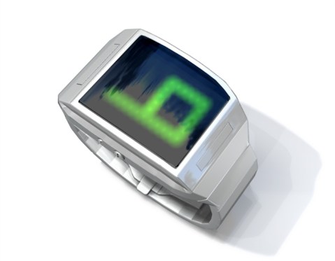
Design submitted by Logan from the USA.
Logan uses UV LEDs that emit no visual light for this watch design. The LEDs are never seen directly, but their UV light activates fluorescent paint that shows the time. Continue reading

Design submitted by Logan from the USA.
Logan uses UV LEDs that emit no visual light for this watch design. The LEDs are never seen directly, but their UV light activates fluorescent paint that shows the time. Continue reading
Design submitted by Carmine from the USA.
Inspired by travels to Alaska, the angular shapes represent the fractured nature of ice along the arctic ice flow. Gentle curves are drawn from the endangered Polar Bear while negative shapes are inspired by the majestic Blue Whale. Continue reading
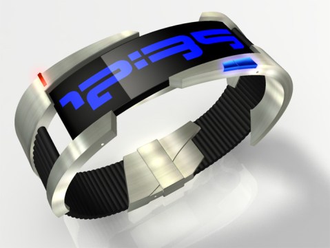
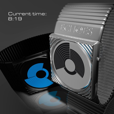
Design submitted by Sam from Germany.
This watch design is made of a hollow case with a light tube surrounded by a chrome ring and attached to a glossy plastic case and strap. The light tube is interrupted by a single and a double line, which are the minute and the hour hands of the watch. Continue reading
Design submitted by Anders from Sweden.
The idea for this unique watch concept came up when Anders was considering different ways to display numbers 0-9 that could be arranged around a clock face with four hands showing the time. Anders used numerals in Japanese characters for this watch. Continue reading
Submitted by Laszlo from Hungary.
Another beautiful concept from Laszlo here. He explains it as a “circular view of time”. There are two variations; a silver version for day time which uses LCD to show the time and a black version for night time that uses LEDs to display the time. As you can see, this design is clear and intuitive to read; 12 hours, 5 groups of 10 minutes and 9 single minutes in three separate segments make up the time. The pattern on the display changes constantly as time progresses. Continue reading
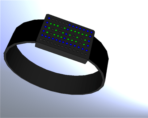
Design submitted by Heather from the USA.
Heather says: “I was inspired by the recent minimalist watch posted on the blog, as well as the R75 watch from Tokyoflash Design Studio.
“The display is simply dots arranged in a rectangular array, but using different colors. The large digits for hours (in blue) can be easily distinguished from the smaller digits (in green) for minutes. This design will most likely be rather large, and therefore will be more appropriate for men. The display of digits inside of other digits is different from many other designs posted so far.” Continue reading
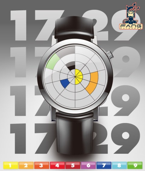
Design submitted by Stefano from Italy.
Stefano describes this concept as a watch design with Italian taste. Every number is depicted using coloured LEDs. As you can see from the main picture, four colours make up the four digits of time; 17:29 = 1=yellow, 7=blue, 2=orange, 9=green. Ideal for fashion lovers and those who like colour! Continue reading
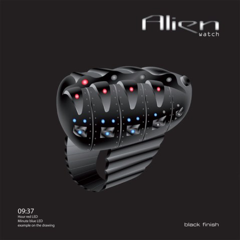
Design submitted by Patrick from France.
Patrick says “this is a response to my “Minimalist Watch” that was not, at that time on the blog (I thought it was really too simple). I had already sketched this “Alien Watch” in pencil, and I dared not to create a rendering on my computer. It’s completely out of tune with its exuberance of complex shapes.” Continue reading
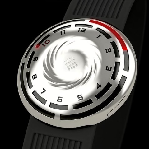
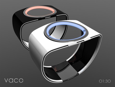
Design submitted by Adi from Israel.
With this watch design, Adi is trying to convey the cyclical yet chaotic movement of time with an innovative yet clear display of time. Continue reading
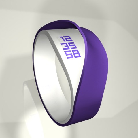
Design submitted by Genghis from France.
At first glance, this concept looks like a simple strap with a watch shape, but the secret is beneath the first strap. If you ‘peel’ the strap, you will see a classical vertical time display in LED. The LEDs are off when they are hidden by the strap. A simple sensor switches the LEDs on when peeling the strap. Continue reading
