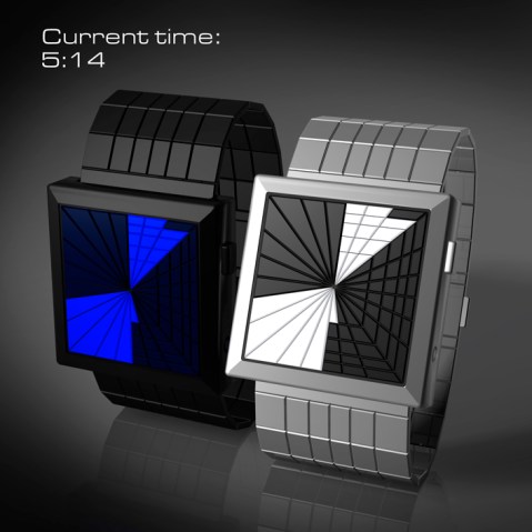
Design submitted by Laszlo from Hungary
Another fascinating concept from Laszlo here. It reminds us a little bit of the Kisai “Broke” watch from Tokyoflash with the shattered screen. Continue reading

Design submitted by Laszlo from Hungary
Another fascinating concept from Laszlo here. It reminds us a little bit of the Kisai “Broke” watch from Tokyoflash with the shattered screen. Continue reading
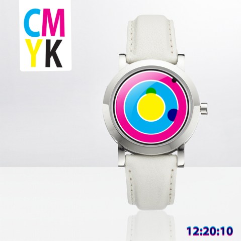
Design submitted by Stefano from Italy.
Another concept from Stefano that is both simple and fun. The strap and case are quite standard but the display is unusual and uses four a combination of colors to show the time. Hours are shown on the inner most ring by the yellow circle that overlaps the yellow and blue zones. Minutes are on the next ring out and are shown by the magenta circle that overlaps the pink and blue zones. Single minutes are shown on the outer most ring by the black circle. Continue reading
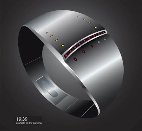
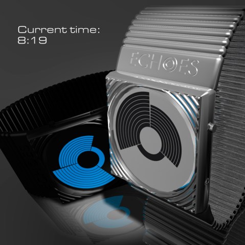
Design submitted by Patrick from France.
Patrick’s latest concept has “a futuristic shape and is for all those who love metal LED watch designs. The horizontal line of red LEDs is homage to the rising sun image.”
A design with a definite science fiction emotion within and a futuristic vibe. The time is quite simple to read but the number of LEDs used is minimal creating a very simple bracelet style design that isn’t too overpowering. Continue reading
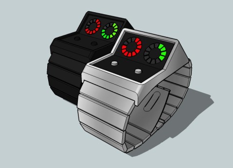
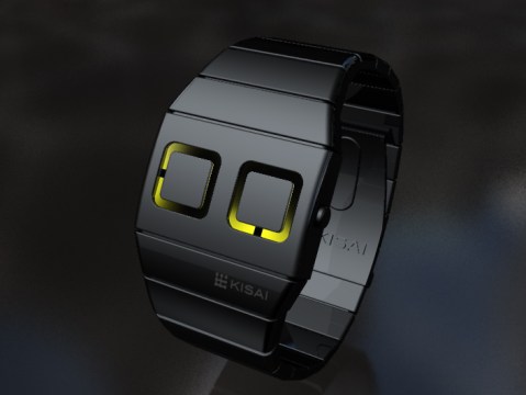
Design submitted by Adwin from The Netherlands.
Adwin says he I likes old synthesizers and computers so this was the inspiration for his design. The time is displayed in three stages: the red circle on the left shows hour blocks 1-12 and the green circle on the right shows 10 minute blocks and then single minutes. Continue reading
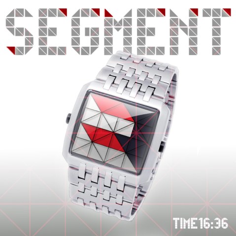
Design submitted by Stefano from Italy.
Stefano says “divide a square into 29 triangles and this is the ideal number to represent the time.” A geometric concept that divides the time into hour and minute segments using triangles. Quite a simple design that needs a little calculation to read, but we’re sure this wouldn’t take long once you get the hang of it. It appears that the display would be made up of either LCD cubes or digital tube LEDs with a silk screen over the top to show the triangular effect. Let Stefan know what you think about his design and whether you’d wear it. Continue reading
Design submitted by Kevin from the USA.
Kevin says that the idea for this concept came to him when he was thinking about the “tunnel” from a retro TV show called Time Machine. Quite a minimal design but with an interesting tunnel effect display with green LED lines moving in from the outside edges. Continue reading
A new concept design from the Tokyoflash Design Studio.
An analog watch concept from the Tokyoflash Design Studio. The metal case of the watch has two analog dials which indicate hours and minutes. Luminous paint behind the hands of the dials help to illuminate the time and add an interesting natural lighting effect.
Submitted by Laszlo from Hungary.
Another beautiful concept from Laszlo here. He explains it as a “circular view of time”. There are two variations; a silver version for day time which uses LCD to show the time and a black version for night time that uses LEDs to display the time. As you can see, this design is clear and intuitive to read; 12 hours, 5 groups of 10 minutes and 9 single minutes in three separate segments make up the time. The pattern on the display changes constantly as time progresses. Continue reading
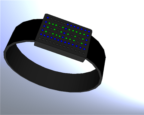
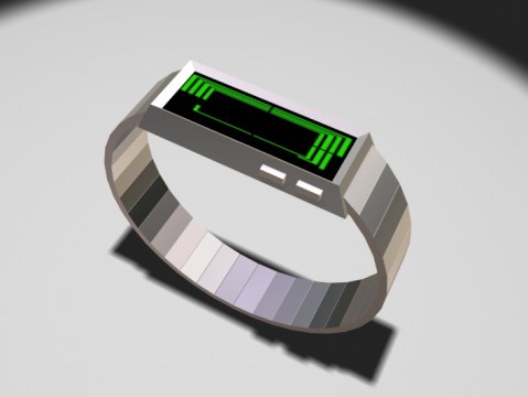
Design submitted by Heather from the USA.
Heather says: “I was inspired by the recent minimalist watch posted on the blog, as well as the R75 watch from Tokyoflash Design Studio.
“The display is simply dots arranged in a rectangular array, but using different colors. The large digits for hours (in blue) can be easily distinguished from the smaller digits (in green) for minutes. This design will most likely be rather large, and therefore will be more appropriate for men. The display of digits inside of other digits is different from many other designs posted so far.” Continue reading
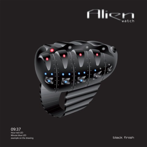
Design submitted by Patrick from France.
Patrick says “this is a response to my “Minimalist Watch” that was not, at that time on the blog (I thought it was really too simple). I had already sketched this “Alien Watch” in pencil, and I dared not to create a rendering on my computer. It’s completely out of tune with its exuberance of complex shapes.” Continue reading
