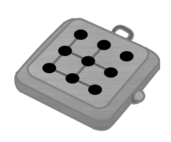
Design submitted by Heather from the USA.
Heather says: I was sketching square digits, and when I came up with these 3×3 digits, I realized that it would be possible to use the Kisai logo as an animated LED display, showing one digit at a time.

Design submitted by Heather from the USA.
Heather says: I was sketching square digits, and when I came up with these 3×3 digits, I realized that it would be possible to use the Kisai logo as an animated LED display, showing one digit at a time.
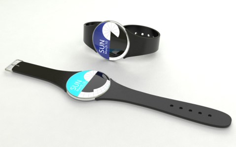
Design submitted by Erik from Colombia.
Erik says: I was trying to find a way to tell the time that is fast and easy. I thought the best way was to give hours a “cake”shape, form so anyone could just see it and know what is the time. With regards to the minutes I prefer ten minutes division at the bottom of the watch.
Design submitted by Sam from Germany.
Sam says: The inspiration for this watch comes from the multiverse hypothesis. It says, that there are parallel universes that represent alternative timelines. So everytime a decision has to be made, there are many options, many possibilities of how your path continues. One decision can lead to many ways as well as many ways can conclude into one decision. This relationship can be shown with parallel graphs that sometimes have connections. Continue reading
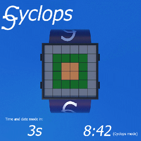
Design submitted by Dietrich from Australia.
“Cyclops” is a revamp of a previous design submission – the new design uses a square interface instead of a round one. Dietrich says: The original idea came to me when I was looking at designs on the Tokyoflash website and thinking that many of them are based on “codes” of some sort. Then I hit upon the idea of colour codes.
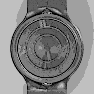
Design submitted by Peter from the UK.
Peter says: I wanted to design an elegant analogue watch using ribbons as a theme. The hands are in the shape of discs which have a ripple in them for highlighting the time and the strap is made of one continuous strip of material.
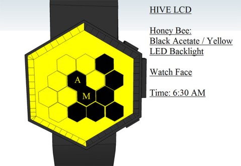
Design submitted by Andrew from the UK.
This LCD watch design concept is based on the interlocking hexagonal cells inside a honey bee’s hive. The time display is split into several time sections and divisions.
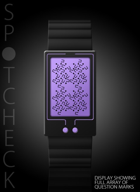
Design submitted by Lloyd from Australia.
“Spotcheck” is a fun and perplexing LCD watch design that displays the time and date via a bewildering and seemingly chaotic array of question marks.
Don’t worry though. Reading the time or date is easy. Just concentrate on the spots in the display and 4 digits magically appear. There’s also a “quick reveal” option so that you can just display the spots. Continue reading

Design submitted by Laszlo from Hungary.
This watch design has an LCD and LED version with bouncing dots effect.
It is fitted with an acceleration sensor which activates and displays the time for 5 seconds with a sudden wrist movement. Continue reading
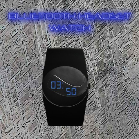
Design submitted by Clem from France.
The design for this bluetooth headset is simple yet modern. It doubles as a digital watch so you do not have to worry of losing it.
It’s main goal is to use technology as a jewelry accessory. Continue reading
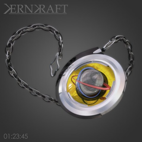
Design submitted by Anders from Sweden.
Anders says: I’ve tried to design it to sit somewhere between art deco, raygun gothic and steampunk.
It is a classic analog watch where the ‘pole’ of the globe indicates the hour, the thin end of the inner orbit marks the minute, and the outer orbit the seconds. This ensures that the display is constantly moving at a noticeable speed, giving a more dynamic impression. Continue reading
