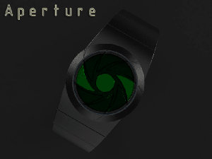
Design submitted by Peter from the UK.
Peter says: “I have recently done a couple of designs that looked a little like an eye which made me think more about Irises. Continue reading

Design submitted by Peter from the UK.
Peter says: “I have recently done a couple of designs that looked a little like an eye which made me think more about Irises. Continue reading
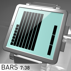
Design submitted by Laszlo from Hungary.
Laszlo says: “I’ve tried create a watch with large easy to read display. It’s the Bars. This is a 12-11-4 reading system (12 squares is the 12 hours, 11 squares is the 5 minutes groups and 4 squares is the single minutes), always on LCD watch concept. Continue reading

Design submitted by Laszlo from Hungary.
Laszlo says: “7 Holes is an analog watch concept with low production costs and an easy time telling method. Continue reading

Design submitted by Matt from Canada.
Matt says: “This is Ransū, which mean “random numbers” in Japanese. The idea is to have a grid of numbers and hide the time inside it. Continue reading

Design submitted by Heather from The USA.
Heather says: “I wanted to have a way to display the time while filling up all available space in a meaningful way. Continue reading
Design submitted by Dimitar from Bulgaria.
Dimitar says: A concept LCD design with a many circles. The timing interface that shows hours, groups of 5 minutes and single minutes 1-4. The 5 minute intervals change their color on every second.

Design submitted by Andy from the Ukraine.
Andy says: I decided design something new based on roman digits stylish watch
In this concept is used re-styling of Roman digits.

Design submitted by Anders from Sweden.
Anders says: I sketched an LED layout which would fit a sober, angular case. To add a bit of elegance (and hopefully some feminine appeal) I had the additional idea of letting the display shine through a panel of contrasting material, which could also be repeated in the links of the strap.

Design submitted by Patrick from France.
Patrick says: I wanted to make parallel bands like floors of a building.
The “Stairs-Watch” is rather a jewel watch as she plays with the reflections of the surrounding light, with a reading time very easy, yet cryptic at first.
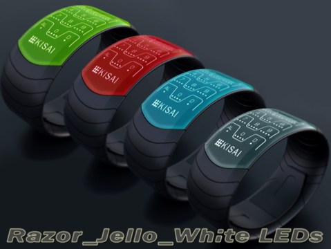
Design submitted by Peter from the UK.
Peter says: A few years ago before the advent of the modern smart phone, mobile phones were far more varied and styled. They weren’t dominated by a huge screen so had to be sleek and interesting in their own right. My favourite phone of this era was the Motorola Razr, it was a sleek thin clam shell style phone with two separate screens and a super sexy metallic key pad. The key pad looked uber futuristic (at the time) with its metallic finish, illuminated numbers and dividing lines and tactile feel. This is what inspired my “Razor” watch.
