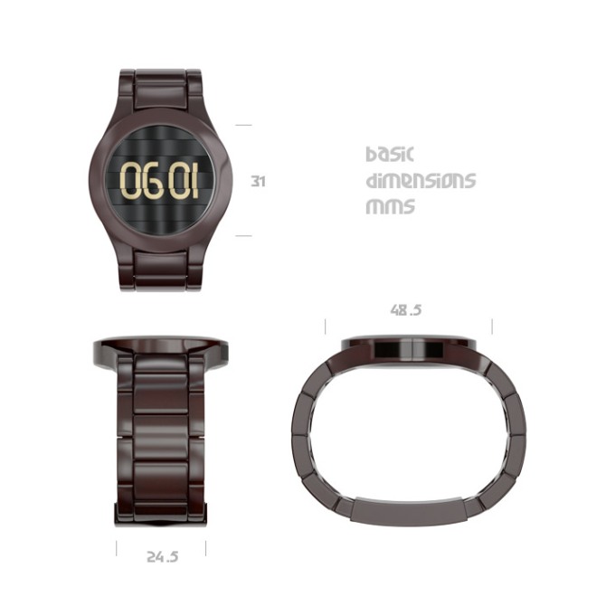
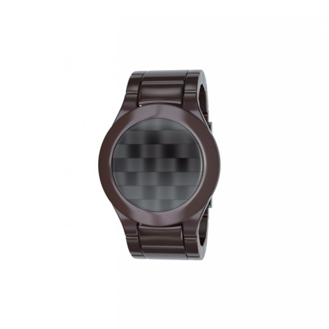
Design submitted by Devindh from the UK.
Devindh says: Project ‘ripple’. I watched a presentation on youtube from CES 2012 about the current state of e-paper devices (mainly from e-ink). One aspect of this technology that stood out for me is its ability to maintain curvature and still be legible/functional. I decided to create a design with this as the main focus.
The design is simple. The main face consists of horizontal strips of e-paper that are preformed into rippled surfaces. The idea is that any amount of ‘themes’ can be created for telling the time, these themes can be simple or cryptic. The functions are accessed via a touch strip that is positioned at the side of the watch.
I hope that any person interested in the potential of emerging display tech, as well as design, will find this watch appealing.
The textural aspect of this watch should help it stand out.


I quite like the idea of the ripple using the e-ink. As far as I know there is only black and white available now though I remember seeing red and blue samples at a trade show once. Not available yet in the industry. One limitation with E-paper is it can’t display the images quickly, so impossible to have seconds or a scrolling feature. There are also some limitations with how many segments that can be used. The contrast on some of the new e-ink is amazing, and no gaps between segments, which makes it a great technology to make seamless displays.
LikeLike
Hi TF:)
I must admit that the refresh rate issue is something that I didn’t consider carefully enough. I have some other e-papaer ideas that I’m working on, based on the other aspect of this technology that I found interesting, i.e. its ability to be cut into custom shapes.
LikeLike
When considering more than one piece of e-paper in the design keep in mind there has to be some space between each piece. Maybe 3-4mm
LikeLike
Ah…..thanks for telling me that. It will definitely change the way i approach the next ideas.
LikeLike
I think the ripples in the face look great and I like the basic idea. Im not sure whether these elements gel that well together tho. The idea has definatley got potential, if you could find a more fundemental way of using the ripples in the display ie the ripples could make yo the numbers when certain areas are darkened lightened etc. That would give the design more depth imho.
Either way its a nice concept will plenty of room for development! 5/Yes and best of luck! 😀
LikeLike
yo=up* lol
LikeLike
Hey Pete, thanks for sharing your opinion. I have a few more e-paper ideas that will explore other aspects of this tech, hopefully I will come up with something that takes things a step in the ‘right’ direction. Look forward to seeing more from you.
LikeLike
I cant say whether my suggestions are the “right” direction just my opinion, but there is potential here. I look forward to seeing your other ideas too! Keep up the good work! 😀
LikeLike
The font used on the dimensions sheet is ‘Garage Garbage’ by Zhalgas Kassymkulov, and is available at dafont.com.
LikeLike
Ok assuming it can only be monochrome and non-animated. I really like the waves and the idea of letting the gaps be lit up to illuminate the display. This is a great image, very stylish. The message option is also very nice. It would look less cool on a just flat display – the wavy strips make it so fashionable! So, even if I imagine a conceptual reduction, it’s a cool thing. Good luck with it Devindh!
LikeLike
Even with gaps 😀
LikeLike
Hey Sam. Thanks. I was going to make the display ‘woven’ with vertical and horizontal strips, but that seemed a bit too obvious, and also there are some trends in design at the moment that are exploring similar territory -(think nike woven sports shoes:) – Monochrome can be boring also, but the trend for Black/dark watches makes e-ink a perfect candidate for certain looks. Anyways, I know your mind is busy coming up with something extraordinary, and I look forward to seeing it.
LikeLike
I know what you mean with boring. But e-paper has it’s own flair and this is a way more creative way to use it than the phosphor watches. Monochrome, with a cool texture plus a cool light color. Thats it 🙂
LikeLike
This is certainly a unique idea. Nice to see the feminine colour of the case, which looks simple and classy.
Diane.
LikeLike