

At last, a concept design that is extremely simple to read. Hours, groups of 10 minutes and single minutes are shown in three sections; each line indicating an hour, a group of 10 minutes or a single minute. The date is shown in the same way. Within this simple display, the time is also shown in binary – great for those who like a challenge.
A USB rechargeable design that uses a combination of materials to create the case and strap; stainless steel merges into rubber and the e-paper display is embedded within.


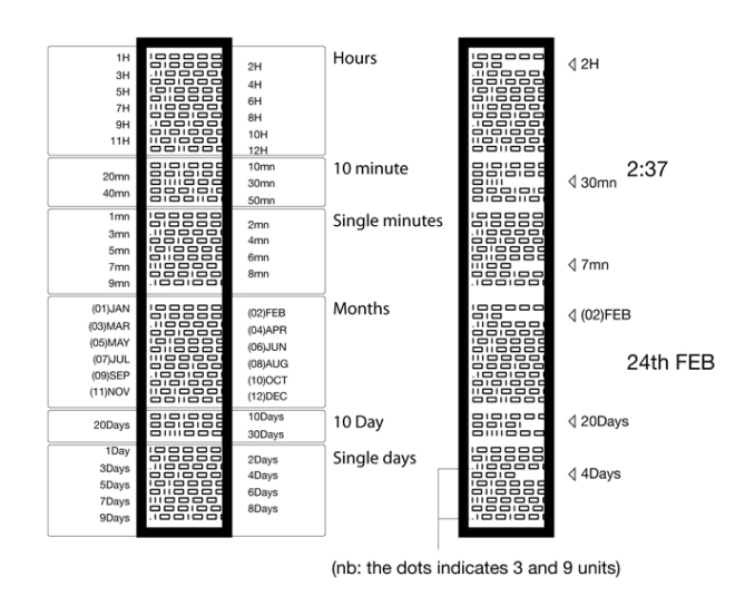


Cool concept but personally a little confusing. Took me a while to realize that rows with the actaul time has less zeros. I kept thinking this number is way too high. I wouldn’t mind taking a crack at this watch if it was ever made.
LikeLike
Very cool design. At first I thought it was difficult to tell time but if you look at it for 1 minute you will understand forever.
I like the USB recharge but would like to see more tech functions in it. It’s design is too beautifull to be “just” a watch ;-).
Would be high upon my wishlist anyway…
LikeLike
Yeah, my first impression was that it would be tough to read but it’s actually pretty intuitive; 12 lines for hours, 5 lines for 10-50 minutes and 9 single minutes. You would just need to get used to that. I do think it would look awesome to anyone who couldn’t read it. I’m also a bit fan of the case/strap. Love the combination of materials.
LikeLike
In principle, I like the idea but I find the execution has a few issues. For one thing, binary is traditionally written in right-to-left increasing order, not left-to-right as it is presented here. Also, I find that the font used might be too small to allow quick differentiation between lines. Using a monospaced font might help alleviate this issue and allow for a more symmetric and easy-to-read display. This might affect the placement of the dots (a column of just blanks or dots might be required), but I think it would really improve the display and bring it into line with what someone working in binary would expect to see. Finally, while I think the dots on the 3s and 9s are a nice touch, I think the 6s could also benefit from having a dot as well for quicker readability.
LikeLike
I think the design is brilliant, both in terms of shape and materials. I do not think the display is very readable though, especially at a glance. I know many fans of TFlash watches like the ‘mystery’ – myself included, but I think this is going too far with lack of readability. Perhaps this design could be kept, but have more than one option for displaying the time and date (I like a lot that it has date feature). It could be possible to have the ‘binary’ and also perhaps some other more readable option. This could be either on one watch or as 2 separate watches.
LikeLike
i love the idea… and yes, after the initial confusion and scepticism that it would be as “easy” as the description paragraph noted, i find the design pretty readable despite the binary infusion.
i do agree with squirrel though about the direction of the “binary flow”; it should be right to left. even my TiBiDa TokyoFlash watch goes right to left with its binary LEDs.
the metal with white is a sharp combination, and i can’t imagine it looking right with a non-metallic strap. curious how an inverted combo would look… black metal, black ‘paper’ with white lettering. is that even possible?
LikeLike
I really like the contrasting materials used… the hardness of stainless steel with the flexibility of rubber… the shiny bright of the steel with the flat darkness of rubber. I also think it’s really interesting how the display wraps around the wrist instead of just being on the top of the wrist.
I agree with TheSquirrelKing about the binary digits… the binary should be read right-to-left. And thus, the left side of the line should become the indicator.
Since empty space is being used as the indicator, I find the empty space between each time and date segment (i.e., between the hours, 10 minute, single minutes, months, 10 day, single days) distracts from seeing the empty space indicators. Perhaps consider putting a solid line between each time segment and each date segment so the empty space indicators are easier to see at a glance.
To expand on that idea, a double thin line (or a single thick line) could be placed between the single minutes and months to separate the time from the date, and a single thin line could be placed between all the other segments.
In general, I like the idea of rechargeable watch batteries via USB, especially if it means that more power can be used to produce interesting and useful features.
Speaking of useful features, I would like to also see some Bluetooth phone features in this watch, specifically the watch vibration when a phone call or text message is being received. For that matter, since e-ink is being used, you should be able to print the incoming phone number when a call is being received.
LikeLike
This is a great looking design, for sure.
I agree that some added functionality, such as bluetooth vibration, might be in order.
LikeLike
p.s.: It might look even more amazing if all the lines of binary data (except the one indicating the time) were moving constantly.
LikeLike
Chaka Khan I feel for you! Lay that thing on my wrist! Sweet as honey is all I can say.
LikeLike
hi,
does anyone know if this watch will be available or if it has made it to production?? i really like the design of this watch – i just hope it will be available and they can ship to the united kingdom!
The idea of moving binary data given by “eternally” would be really cool though!
Anyway reply back if anyone knows anything please.
LikeLike