Design submitted by Sam from Germany.
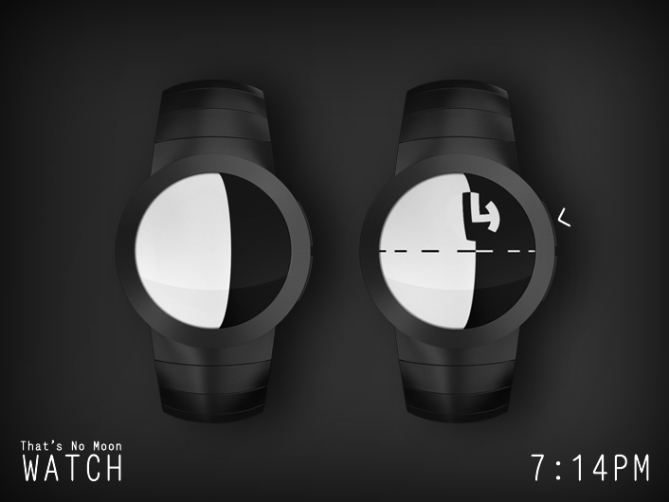
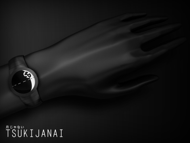
This watch concept is inspired the natural play of light and shadow on the surface of Mercury, the Moon and similar celestial bodies. The Saturn moon Mimas and the Deathstar from Star Wars were influencing the display design.The division line of bright and dark side, the terminator, is used to indicate the hours. As it wanders over the surface, the crescent changes throughout the day. The brightest condition, full moon, is reached at midnight, because the night time is mostly associated with the moon. The darkest condition, new moon, is reached at noon. To make the hours countable, the line perpendicular to the terminator, the equator, has been divided into twelve segments.


In reality, close to the terminator, light and shadow indicate the shape of the surface craters. This effect has been used to tell the minutes. A crater is also divided into a dark and bright half but since it’s mostly concave, it shows the opposite shade of the surrounding surface, being clearly visible that way. Both halfs show the two digits of the minutes.
Sam says: Thanks to the strong resemblance between Mimas and the Deathstar, I named the watch Tsukijanai, which means “That’s no moon”. This is what Obi-Wan said to Luke in Star Wars episode IV since the latter one thought, they were following an imperial spacecraft towards a small moon. Obi-Wan responded: “It’s a space station”.


The display has been kept as minimalistic and functional as possible without losing the strong impression of its inspirations. This is a watch for fans of astronomy as well as astrology and of course of science-fiction.


If this is feasible, then it is as close to a definite purchase as one of these watches can be for me.
LikeLike
ummm. YES YES YES AND PLEASE
LikeLike
This is fun, Sam! I’d definitely buy it. 5 Death Stars and Yes!
LikeLike
Thank you Toky for posting this one!
JWL, thanks for this statement. I believe e-paper could do it, but I tend to be optimistic.
Leon, thanks for telling 😀
Lloyd, hahaha cool thanks!
LikeLike
i was thinking it would have to be e-paper…as you know, i love the round digits you keep coming up with 😉
i have a bit of trouble counting the hours when it’s like 2 vs 3 or 8 vs 9. am i missing something that makes it easier?
LikeLike
No you’re not missing anything – counting it is. 2 vs 3? Thats a bit too tired 😉 I could understand 8 vs 9 but that’s just 4 vs 3 steps left of the 12 or 2 vs 3 steps right of the middle (6). Everyone has his/her own counting tricks I guess that sound more complicated when writing them down than they actually are.
I’m glad that the round digits appeal. You will see them again.
LikeLike
Kakoi! Demo hi no tokei ga hoshii n desu kedo. Samukun, sore ha joozu no dezainu da to omoimasu. Go *!!
Ditorikku Kun
(Ima kansai kuukoo ni imasu!!)
LikeLike
Well Sam, I had a similar idea to the drawing figures to indicate the time (TF does not publish me any more, I became “persona non grata” on the blog?)
It does not stop me from voting and this new project deserves 5 * / Yes!
LikeLike
hahahaha thats genius! lol Nice one Sam, looks good and the time telling works great! 5/Y Best of luck Sam, cos I am your father! 😀
LikeLike
DZ, wooow Kansai Kuukou no yane ga suki da *~* Kenchiku no gakusei da kara hehehe. Jouzu no dezain hm? Sou desu ne *sekimen (赤面) shimasu* Ditorikku-Kun, arigatou gozaimasu to ki wo tsukete!
Oh Patrick! I hopes I’m the only one with such an idea but I expected not to be. The hours as moonshade seems to be a simple idea but then the minutes have to be made too. There is a moon watch out there and I hope I’m different enough. I wonder what happens to your designs. Actually Tokyoflash is pretty open to any kind of concepts. Ok, the recent double post was an accident but maybe they try to avoid similar designs. I’m so glad that you keep coming and share your thoughts with us Patrick! Thank you for your vote 🙂
Hi Daddy, how was your breakfast injection xD Thank you Pete for the smile and the vote! I’m happy that it works for you!
LikeLike
This watch “That’s No Moon Watch” is unique, as all your projects, Sam cheer!
LikeLike
素晴らしいとクールなデザイン
LikeLike
ありがとうございます、ブレントさん( ゚▽゚)
LikeLike
The Force is strong with this one!
LikeLike
SPOILER ALERT
Hehe, but you need to know, young padawan, the midichlorians are actually electronic ink microcapsules.
LikeLike
Hey Sam, You know what would look nice, a wire frame version. Like an early computer game graphic, the sphere could be made up of curved horizontal and vertical lines. The shaded parts having denser lines etc or hatching. Just a thought 😀
LikeLike
I have a simlar idea in the works, but it’s not easy to make it look good. Thanks for the inspiration!!
LikeLike
If TF doesn’t make this watch, they’re making a mistake.
LikeLike
Thanks JP!
LikeLike
Good design, but not my cuppatea this one. 4*
LikeLike
Thanks Fir 🙂
LikeLike
It’s a nice idea. At first I thoght the crater used for the minutes was ruining it by always moving, but then I realized that it’s only moving once per hour. ( it’s still is a minor concern ) The minutes digits are nice.
LikeLike
Hey, thanks for checking! You can only get those with this hour-movement hehehe >:) If you like these numbers, wait for AEON…
LikeLike
I would love to buy this watch it would definitely sell especially if it is given a touch screen. I love how it combines this somewhat sundial method with phases of the moon then turns it digital.
LikeLike
Cool review Raziel, thank you!
LikeLike