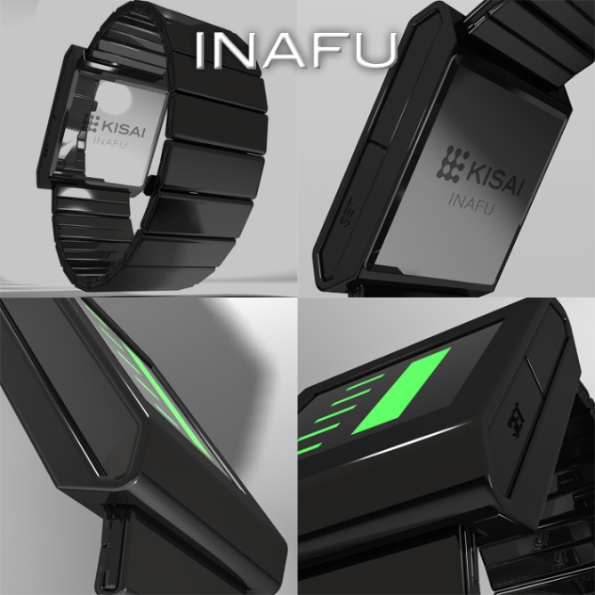
Design submitted by Laszlo from Hungary.
The basic idea of this watch design is a minimum number of LEDs to indicate the time.
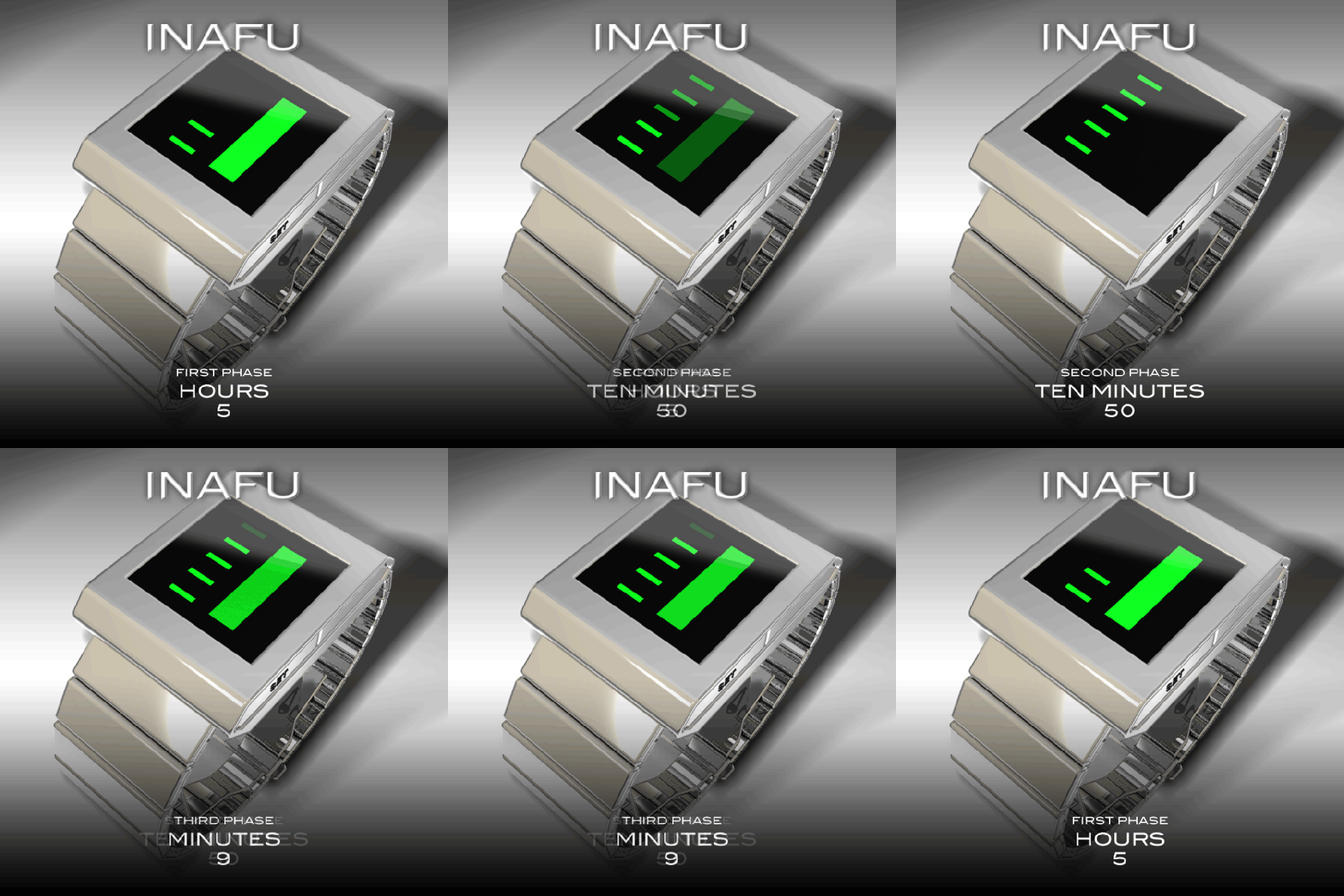
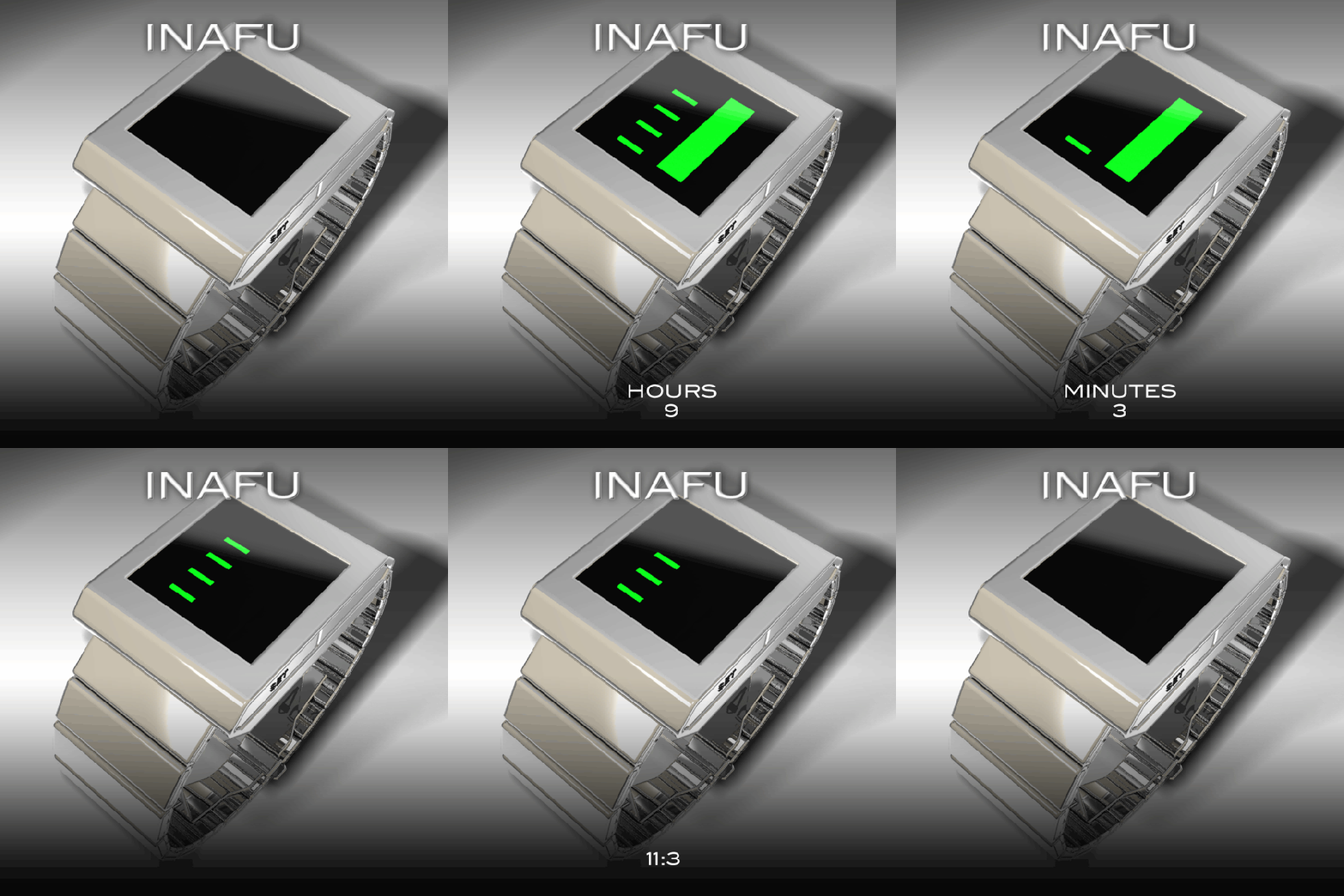
Six LEDs proved to be sufficient (in three phases as the Kisai Denshoku). The first phase indicates the hours, ten minute group in the second phase, and singles minutes in the last.


Laszlo, the display is nice — bold and abstract — but I’d prefer to have a smaller case with less bezel. Usually I like your cases and straps a lot, but this isn’t my favorite. (As for the minimalism concept, I’m all for it, but six isn’t the absolute minimum…with three stages and only on/off states, you can use just four LEDs, as in my Warsaw submission from long ago or, equivalently, a binary 12-5-9. However, this technicality doesn’t detract from the appearance of the watch, of course.)
LikeLike
i think it looks nice, very nice in fact.
however, i’m just not a fan of anything with “phases”.
i want to be able to look at my watch and tell the time quickly.
that’s just me though. *shrug*
LikeLike
Ok I love the case. Not only because it is hexagonal in the cross section, but because it’s stylish. The way, the straps are attached to it, using that inclined face, is very appealing to me.
I can see, why one wouldn’t like phases. A quick glance on a watch is basic luxury. But this is just shifted simplicity. The display looks super minimalstic, so the time reading has been phased. On other watches you have the single glance, but you can’t really say, it’s a quick glance. I like this time reading method, it’s clever. I own a Denshoku… it’s just 12 horizontal lines! Which brings me to the display appearance when it’s off…
It could be less empty. When the time is off, you wear “just” a big black screen on ur wrist… That’s a bit depressing. Not only for this watch, for every watch actually. The “on”-condition is often impressive, but that’s only some moments of the day. For me, the “off”-condition of a watch is important too. My suggestion: make it LCD, not LED, and let it be on all the time, switching between the three phases each 5 seconds. If it’s too slow, touch the display and the next phase comes. Then, a small indicator for the first phase would be wise, so you know where the time telling begins. Do you think, it’s a good alternative, Laszlo?
If I imagine this with always on LCD with busy display it’s a 5*/YES.
LikeLike
Or, let the display be the same material as the case (same color, same reflection behaviour). That would also be more applealing than an off screen. For me 🙂
LikeLike
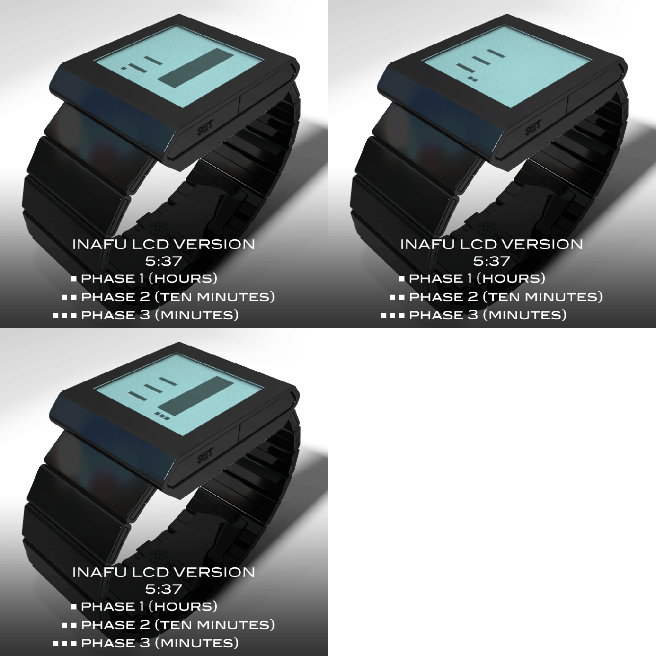
Thank you Sam. The LCD version is here: http://www.insideshirt.hu/inafu.swf
LikeLike
Like 😀 The small indicators are really good. And the interval too. If that’s on continuously, it’s a cool minimalistic watch. And people around you look at it and wonder.
LikeLike
I would have to agree with the comments above. I really like the chunky geometric case and the simplicity of the form. I’m not a big fan of phases either as my memory is rubbish. If you could display the whole time at once using a similar method id be in. 5 stars for case, 3 stars for display, on average: 4 stars from me.
LikeLike
Now this is cool…the case and bracelet look superb, rendering is out of this world. The display is simple and cool easy to read, 5 star yes!
LikeLike
A very good design, and quite ok concept.
LikeLike
Thank you Firdaus.
LikeLike
Where can i buy this watch?
LikeLike
Yes, it’s a good minimalistic watch. Nice design!
LikeLike
The LCD is a nice alternative, I prefer it to the LED. The small dots that indicate the phases do help keep track of the time! Even my brain can keep up now.
Would give you that extra star to make it 5 if I could.
LikeLike
I like minimalism but this is just some rectangles. If you would have used the shape of the case also for the display, it would be a more consistent design. But here we have a cool case and a boring display without any relationship. The LCD alternative is preferable, it’s less boring because there is always something going on.
LikeLike