Design submitted by Laszlo from Hungary.
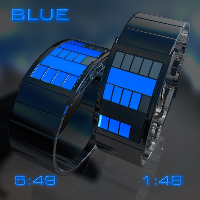
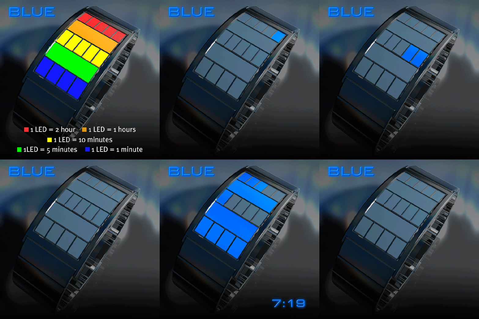
Laszlo says: “BLUE” could be a watch designed using LCD or LEDs. With high polished stainless steel case and strap, this concept displays the time like my older (Baransu) watch design. 5 LEDs in the first row show 5×2 hours, in the second row the 1 LED is 1 hour. 5 LEDS in the third row indicates 5×10 minutes, in the fourth row the LED is 5 minutes and in the fifth row the 4 LEDs is 4×1 minute.


kék ékszer geeky elemet. ez megfelel a legtöbb nő, aki él a modern városban. lenyűgöző hatalmas benyújtása Laszo;-)
sajnálom a rossz magyar
LikeLike
It’s a beauty. The case! The simple strap! The display is almost perfect (I would have used 5 parts for the last row, because I have a little neurosis 😛 the 5th light would’ve been the am/pm indicator). Blue and chrome is a very stylish combination. The time reading is a little difficult (hx2 h+1 minx10 +minx5 min+1… five mini calculations) but this has been done in favor of that simply styled display, so all is fine. I want it please.
LikeLike
Correction: in the first picture 1:48 = 1:43
LikeLike
Good looking watch. Simplicity is very appealing, and goes a long way toward keeping a design interesting.
I’m not a huge fan of the 5×2+1 timing method, as it takes too much calculation, and I’m a bit of a simpleton on the math side of things, hehe. Still, though 5*/y for design! gorgeous vision and implementation, sweet watch!
LikeLike
Nice 🙂 Hey Tokyoflash! How can i change my account picture ? Or I can’t change ?
LikeLike
You can 😀 Go to your profile (by clicking on your name next to “Logged in as”) then scroll down to the bottom and there u find the account picture (“avatar”) section.
Still like this watch!
LikeLike
TF do u have a vacancy for webmaster? U can employ Sam 😉
LikeLike
😀
LikeLike
I can’t change:( When i presing ”update profile” he throws me back to login page… Whats wrong ?
LikeLike
Nice choice of color, easy to read. A real jewel in the watch manufacturing.
LikeLike
I don’t know if this watch is too boring or just very cool and simple. I like the blue leds but I’m sick of flat rectangles. The straps are very nice. I like them that simple. No Kisai logo this time? 4*/y
LikeLike