Design submitted by Paul from the UK.
Paul says: “I came up with the idea for this watch design after talking to a friend, who had suggested a hexagon design. I wanted something using a similar shape and decided on a pentagon for the hours. It reminded me of an old childrens program called The Adventure Game. The money was hexagons and pentagons.
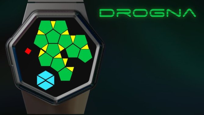
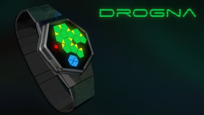
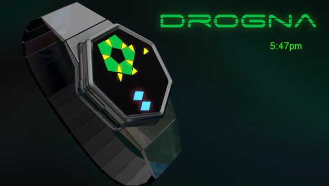
Ideally I would like to see this with “flick of the wrist” activation. My watch design is fairly straight forward to read; green pentagons = hours, yellow triangles = 5 minute groups, blue shapes = single minutes and the red diamond = AM.
I can imagine see everyone wearing my watch design. Although I feel my design fits in better with the stylish student group. I think that the case is stylish and exciting, the layout is unusual in design with an almost organic flow.”


Too difficult for daily use. Hard to read. For singularity seekers.
LikeLike
I love the heptagonal shape of the case. I have such in my sketch book, but no display yet 😉 Looks very cool and it is unusual. The display itself is a little too beyond for me. It is a simple 12-5-9 watch but displayed pretty confusing. But that’s me, others might like it puzzling. But besides that, the display cout look more balanced, less arbitrary. Anyway, my overall impression is good. If it would be in the store right now, I would get it, since it is still an unusual piece of work 🙂
LikeLike
Nice design on the case, but the actual method for reading the time is just a little too complex for myself…..
LikeLike
nice watch m8 duz it tell you the time
LikeLike
No it doesn’t speak! You have to read it!
LikeLike
cool
LikeLike
I like the case, but the display needs more work, it looks like it was designed by a 6 year old. needs to be more cool and futuristic to match the case.
LikeLike
Cheers for that! Where did I put my crayons?
LikeLike
The shape of the case is awesome! heptagonal geometry can be tough to work with, and I applaud a design that embarks on using 7 sides. The geometry for the LEDs is also interesting.
My critiques would be that there is a lot of empty space on the watch face, and that the colors tend to fight with one another.
LikeLike
Thank you Cory…..I agree about colors too…
LikeLike
arhhhh ehhhhhh ooooorrganic flow??? Can this watch emits poison? Very rare looking watch. I like it so much…. ehhh organic thingy inside 😉 something from the lab….. although I think my IQ capability requires me to read the time like how I observe microorganism through microscope… interesting Pawl
LikeLike
Very original case design ! the display is cool but a little bit difficult to read…
Nevertheless this is a nice stylish watch !
LikeLike
The display is not very difficult. It is just asymmetric, that’s all. The colors and shapes look a bit childish to me. I’m afraid that is causing this rating. The case is great on the other hand. Rework this watch, it’s worth it!
LikeLike
I like everything except for the yellow triangles. They look too random, like confetti dropped from the sky. It doesn’t look like there is any logical pattern to it. The artistic design is intriguing; I like the concept. This watch looks like something either the Romulans or the Gorn would wear from Star Trek. I think this design needs more work to make it easier to read.
LikeLike