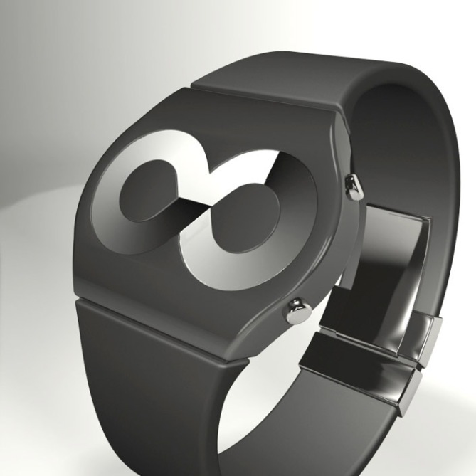
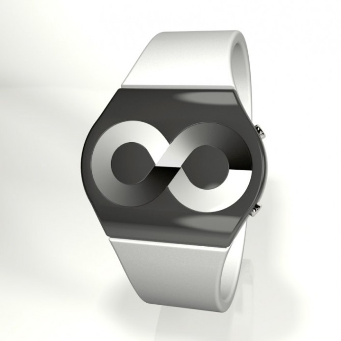
Design submitted by Genghis from France.
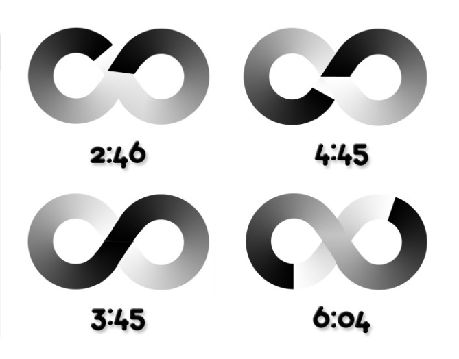
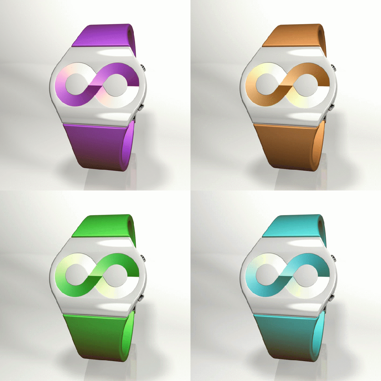
Genghis says “While looking at older entries, I realized that a lot of classical patterns or symbols were used, but not the infinity symbol. My initial idea was to use one circle for hours and the other one for minutes. But there were problem with the display in the “cross” area. The solution I found is a display with a gradient. It works for each display of time. This is easy to read and gives an unique looking to the watch. Electronic ink could be a good technology for this display and the watch is designed for both men and women. Many colors choices are possible.”


5* for making me go “wow” ! That is a very creative dual analog watch! I want that now 😀
LikeLike
I agree with sam. I would buy each color. One for each day of the week, lol. Easy to read. Exact as an analog watch can be. Lovely designed. Bought!
LikeLike
This is an awesome watch design. The display is perfect in terms of being unreadable to the uninitiated but easy once you know how. Looking at the display and trying to figure out how the time examples matched was like a little puzzle. I got it in a minute or less and instantly loved it.
Unfortunately I dislike the case shape. I guess it has to be something to fit the pattern on the display but it looks too normal. I really think you’re onto something here though Genghis.
Seems great for guys and girls and is analog. Wonder what kind of technology it would use to create that fading effect…
LikeLike
Very original idea, i would love to buy one…
LikeLike
I saw a watch like this before but slightly different.
http://gizmodo.com/5377161/dogne-watch-tells-time-in-terms-of-infinity-or-8
LikeLike
This looks so much bettter. It has a more refined design.
LikeLike
Thank you Daniel ! I’ve already seen this watch concept before and I tried to make something really different 😉
LikeLike
Very nice concept! The simplicity is also great! Good job!
LikeLike
The design is great. But the colour is abit limited for guy. I think..
LikeLike
It will be really cool if the whole watch can change color.
LikeLike