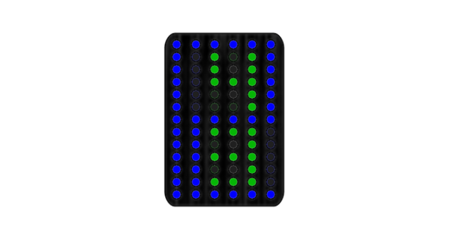
Design submitted by Heather from the USA.
Heather says: “I was inspired by the recent minimalist watch posted on the blog, as well as the R75 watch from Tokyoflash Design Studio.
“The display is simply dots arranged in a rectangular array, but using different colors. The large digits for hours (in blue) can be easily distinguished from the smaller digits (in green) for minutes. This design will most likely be rather large, and therefore will be more appropriate for men. The display of digits inside of other digits is different from many other designs posted so far.”
It’s a simple concept but it works so well and has a kind of circa 80’s computer appeal. It’s easy to read at a glance too once you understand how it works. How do you feel about this design? Is green and blue a good combination for you? Let Heather know how you feel about her design. The times shown in the examples below are


Thats a cool display. It is not too 80s. Red and green are pretty modern. Cool that your inspiration also came from that minimal watch posting. I wished that one had an easier reading. If case and straps are that simple in the final version, that would be a purchase for me.
LikeLike
I love this watch! It’s awesome – I would totally buy it!
LikeLike
ドットとデジタルの組み合わせでもいろいろとできるんですね。このブログでいろんなタイプの表示を見たけど、まだまだ他にもありそうで、なんか可能性を感じました。
LikeLike
I love this watch! its easy to read once you look at it closely. i would definitely buy it!
LikeLike
when does this watch come out????? its so cool! 🙂
LikeLike
This is a easier to read 1001101101 watch! I love it! even easier to read!
Great great heather!
LikeLike