

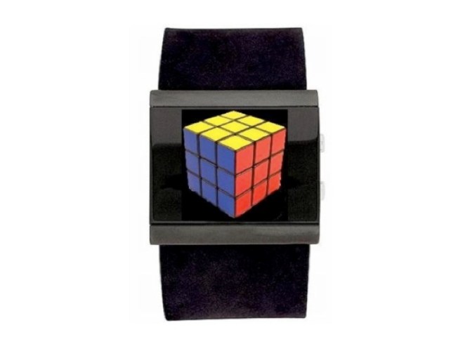
Watch Design submitted by Frank Rovekamp from Spain.
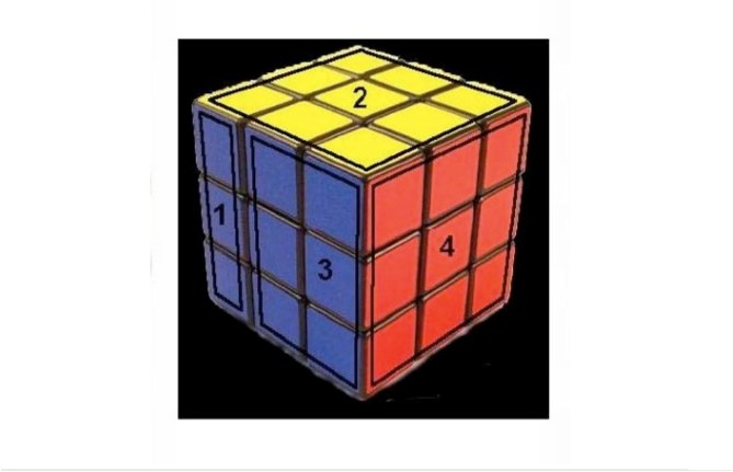
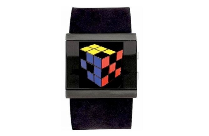
Based on the concept of a 3d cube image within the display, each visible side of the cube shows an element of time. The left section of the blue side shows the first digit of the hour (0, 1 or 2). The second digit of the hour is shown on the top of the cube in yellow (0, 1-9). The two right hand columns on the blue section show the first digit of the minutes (0-5) and the red side shows single minutes 1-9. You can see an example at the bottom that shows 15:55.
スペインのFrank Rovekampさんの作品。
3Dの立方体をテーマにしたインターフェイスが特徴。それぞれの面で時刻を表示します。ブルーの面の左側のエリアで時間の最初のケタ(0、1、2)を表示します。イエローの面で時間の2番目のケタ(1〜9)を表示します。ブルーの面の右側の二列で分の最初のケタ(0〜5)を表示します。さらに、レッドの面で分の2番目のケタ(1〜9)を表示します。下図の時刻表示の例をご覧下さい。


hmm, though I think the rubics cube was an interesting item, I would never ever be interested in wearing one on my wrist. Sorry. That maybe just me. Others may think differently.
LikeLike
Not bad, but since the rubics cube is a known thing, it doesn’t make the whole concept original. Not very Tokyoflash-y I would say.
LikeLike
Well put the isometric view of that cube in a hexagonal case then its quite an idea. But this design is too 80’s… where designers just combined shapes to make people look.
LikeLike
hmm, I’m not keen on this. Rubiks wristwear just doesnt excite me, sorry.
LikeLike
So geeky and sleek! I love it. I love that the casing and band are a cohesive color to make it sleek, yet the cube fulfills a nostalgic niche. I also love the the time is intuitively easy to read.
LikeLike