

Design submitted by David Brophy from the UK.
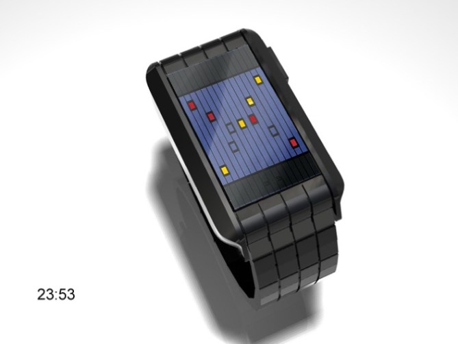
The interface of this watch design displays hours in yellow read diagonally from top right to bottom left: 1, 2, 4, 8, 16. A combination of numbers indicating the current hour. Minutes are displayed in red from bottom right to top left 1, 2, 4, 8, 16, 32. A combination of numbers indicating the current minute. Grooves on the strap match the lines running across the face.
Of course the concept behind this is Binary time telling, but in a wonderfully fashionable way. Chic geek I think they call it, but anyway, theres no denying its an attractive display with a mathematically minimal way to tell the time.
イギリスのDavid Brophyさんの作品。
このインターフェイスのデザインは、右上から左下の対角線上にイエローで時間(1、2、4、8、16)が表示されます。また、右下から左上の対角線上にレッドで分(1、2、4、8、16、32)が表示されます。それぞれ表示された箇所の数値をたすことで時間、分がわかります。ストラップのラインとインターフェイスのラインがマッチしたデザインです。


excellent job, David. the concept is simple and clear, and intriguing in the same time. I love the strap with lines, it goes perfect with the case.
Those tiny lines on the surface of the case gives a very ellegant vision to this item.
LikeLike
1, 2, 4, 8, 16? for hours? So Hundred hours? Prefer to have the regular 12 hour system. Don’t want to add 16+4=? Oh ya 20, 20: now add 32+8=?……………oh ya 40…..what was the hour again???? Push one more time as I forgot. 😉 Otherwise looks great.
LikeLike
Yeah the time is hard to read. But if you like a watch, you learn it and later you can read it within a second.
My taste: only 5% of the displaying rectangle are used for the indicators. If the unused area would be solar cells, it would have a justification. But just emptiness looks a little cheap. Maybe bigger LEDs would be nice. But that’s my taste 🙂
LikeLike
24-hour binary time – great stuff! I like the way how you kept the reading direction true to binary.
I much prefer LED watches using 24-hour system rather than 12-hour, its modern & conveys more information.
LikeLike
I like that but don t the light would be better if it match the size of the squarre of the strap? or maybe it is just my taste.
LikeLike