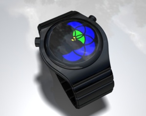
Design submitted by Logan from the USA.
Logan describes his “Arctime” watch design as a “Dissection of the clock into 1-3, 4-6, 7-9, 10-12 arcs, fit compactly into a square. Each arc has three segments not shared by other arcs, which are blue to indicate hours, yellow to indicate groups of 5 minutes, or green when an overlap is necessary to tell the time. The four small segments where the arcs intersect indicate single minutes, and their color can always be chosen (blue, green, or yellow) to be different than the hour and 5-minute segments.”
Design submitted by Logan from the USA.
Logan describes his “Arctime” watch design as a “Dissection of the clock into 1-3, 4-6, 7-9, 10-12 arcs, fit compactly into a square. Each arc has three segments not shared by other arcs, which are blue to indicate hours, yellow to indicate groups of 5 minutes, or green when an overlap is necessary to tell the time. The four small segments where the arcs intersect indicate single minutes, and their color can always be chosen (blue, green, or yellow) to be different than the hour and 5-minute segments.” Continue reading