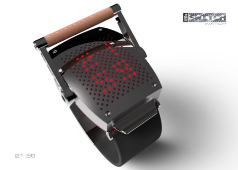
Design submitted by Patrick from France.
Patrick says: When I had presented my “Kuranku-Watch”, comments are deferred mainly on brittleness of crank (even if it activates only LEDs), thus for the “Switch-Watch”, the handle is much more “muscular”.

Design submitted by Patrick from France.
Patrick says: When I had presented my “Kuranku-Watch”, comments are deferred mainly on brittleness of crank (even if it activates only LEDs), thus for the “Switch-Watch”, the handle is much more “muscular”.
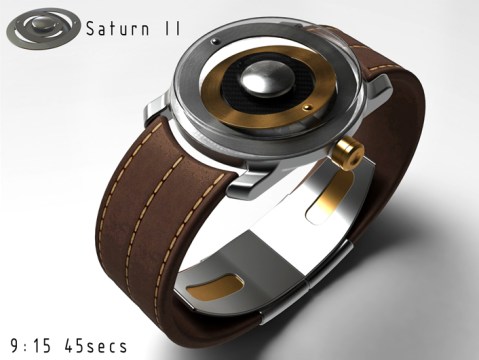
Design submitted by Peter from the UK.
Peter says: This is Saturn II, a re-design of my original Saturn concept. Saturn was one of my first concepts submitted to the blog. It never made it onto the blog presumably due to being a little adventurous from a technical perspective.
This version is a lot simpler than the original but still retains the original’s feel.
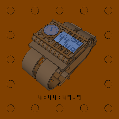
Design submitted by Matt from Canada.
Matt says: This is STEAM, because of the steampunk appearance. The idea for the display came while watching a movie, specifically a short animation of one of the producing company at his beginning. There was a gauge at the left followed by eight rectangles displaying changing numbers that eventually changed to the name of the company.
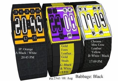
Design submitted by Andrew from the UK.
Andrew says: Babbage: Is inspired by Charles Babbage’s Difference Engine basically a mechanical computer designed during the Industrial revolution during the Victorian era by Charles Babbage. However this design uses no actual Mechanical or moving parts just digital representations of Moving Gears / cogs & drive shafts.
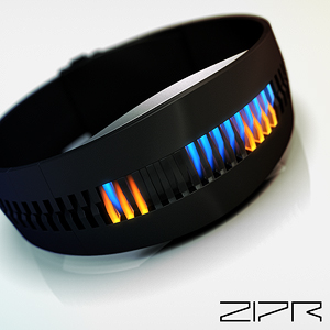
Design submitted by Sam from Germany.
Sam says: The inspiration for ZIPR came a long time ago when I was working on a hexagon binary watch concept that used transparent plastic blades to guide LED light. I thought about segmentation and interlocking back then but I forgot about the idea until recently.
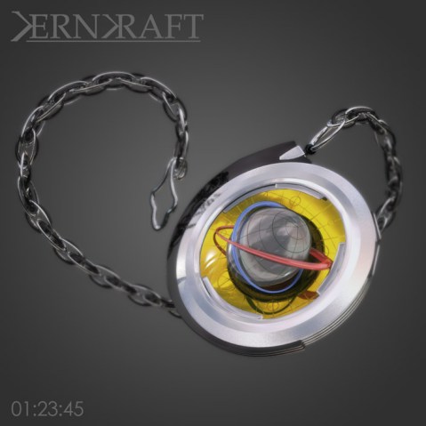
Design submitted by Anders from Sweden.
Anders says: I recently found this half-finished concept rattling about on my hard drive. I’d left it because I wasn’t sure if it was worth submitting, but when I found it there was a cry of ‘let the public decide’, so I finished it and here it is!
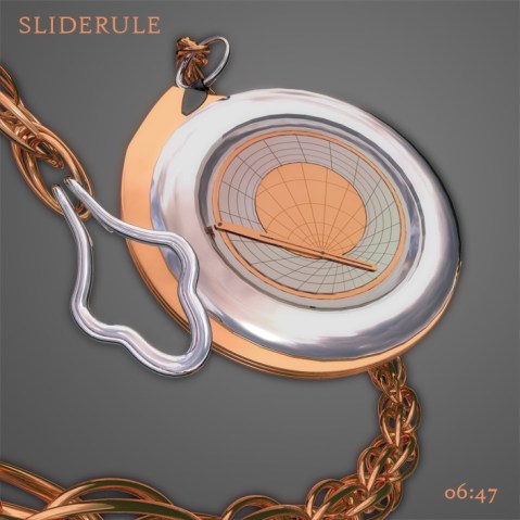
Design submitted by Anders from Sweden.
Anders says: I’ve tried to design it to sit somewhere between art deco, raygun gothic and steampunk.
It is a classic analog watch where the ‘pole’ of the globe indicates the hour, the thin end of the inner orbit marks the minute, and the outer orbit the seconds. This ensures that the display is constantly moving at a noticeable speed, giving a more dynamic impression. Continue reading
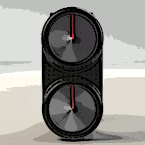
Design submitted by Peter from the UK.
Peter says: “This is “Scroll” and as the name suggests this design was inspired by the form of ye olde worlde rolled up parchment. The basic form consists of two round dials with scroll like discs for hands.
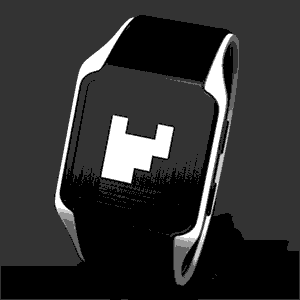
A new concept from the Tokyoflash Design Studio.
An original concept watch design that uses an e-paper display to present the time. The overall appearance of the watch is pure and simple. The white block in the centre of the screen display the time in binary (hours 1, 2, 4, 8 on the top row and minutes 1, 2, 4, 8, 16, 32 on the bottom two rows). Combinations of these numbers indicate the time. For example, if the 8 hour light was out and the 1 and 2 minute lights were out, the time would be 8:03. Continue reading
