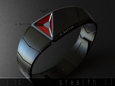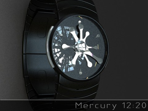
Design submitted by Peter from the UK.
Peter says: I wanted to come up with a back to basics analogue design with a hint of sci-fi which would be easy to make and traditional in its time telling. “Mercury” was born.
The time telling is traditional analogue using off the shelf movements. This twist in this case is that the hands and markers are organic in form and look like that they are a splat or splash of liquid metal or some kind of gelatinous alien lifeform.