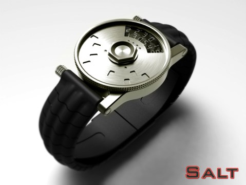
Design submitted by Peter from the UK.
Peter says: “This is “Salt” a design that combines a couple of features from some of my previous designs, namely “Disc” and “Subway”.

Design submitted by Peter from the UK.
Peter says: “This is “Salt” a design that combines a couple of features from some of my previous designs, namely “Disc” and “Subway”.

Design submitted by Sam from Germany.
Sam says: “The idea for the TESSERAE watch concept came when looking at my previously submitted concepts. It is a mixture of my NEON IO and the MAZE.
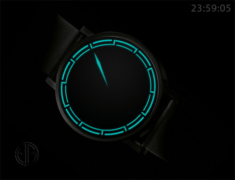
Design submitted by Pawel from Germany.
Pawel says: “For some time I was working on the idea of a digital watch display that looks like analog, exploring the possibility of placing digital numbers in the edge of an analog face. In this design I demonstrate the solution of combining frame bars with hour markers.

Design submitted by Peter from the UK.
Peter says: “This is “Actuator”, an evolution of my “Hybrid” design. The original Hybrid concept was popular when it featured on the blog in March 2012, but proved to be too costly to make and technically difficult due to the heavy metallic disc. This version uses a similar time telling method but gets around the technical issues. Continue reading

Design submitted by Peter from the UK.
Peter says: “This is “Raptor MkII”. People who are familiar with the original “Raptor” design will remember the racing car and spaceship like hints in the form. This version carries on that theme but in a more conventional layout and using a more regular screen/display to show the time.
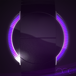
Design submitted by Sam from Germany.
Sam says: “I was sketching for a simple iconic image as a watch face and came up these two arcs. I like the simplicity and the futuristic style of their look.
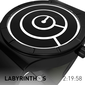
Design submitted by Laszlo from Hungary.
Laszlo says: “Lost in time… Find the path of the labyrinth and you found the time. Time is money. Low production cost. Powerful look. Favorable price. This is the Labyrinth watch. Continue reading
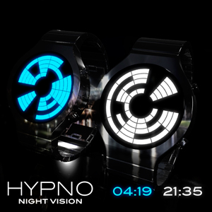
Design submitted by Laszlo from Hungary.
Laszlo says: “Hypno is an LCD watch concept.
You can choose from three different animations. They are visible as long while the time button is pressed. Then will appear in the display with the current time. The upper two digits show the hours, and the bottom two are the minutes. After the initial difficulties have been very easy to read.” Continue reading
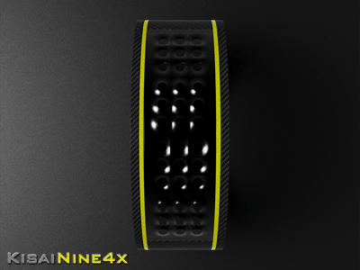
Design submitted by Peter from UK.
Peter says: The Kisai logo consists of 9 dots connected together with a few vertical and horizontal lines. This is a good basis for a simple LED array to create a digit . I decided to use four of these arrays to create “KisaiNine4x” (Nine meaning the number of dots per array and 4 x the number of arrays) “Strewth I can see the time from here!!” Continue reading
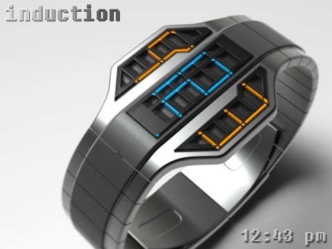
Design submitted by Peter from UK.
Peter says: This is “Induction” an evolution of an earlier design of mine called “Vent”. The basic premis with Vent was that the main part of the face of the watch featured a louvered grille that framed an LED array. The grille not only offered the display some shade from direct light but also dictated that the time be read from a specific angle. Continue reading
