Design submitted by Peter from the UK.
This is “Hypercube Analogue” an analogue version of the original Hypercube design that featured on the blog back in July 2012. Continue reading


Design submitted by Peter from the UK.
This is “Hypercube Analogue” an analogue version of the original Hypercube design that featured on the blog back in July 2012. Continue reading

Design submitted by Jordan from Canada.
Jordan says: Recently, I’ve been watching a lot Prison Break. Yesterday however, I watched the last episode and clicked away to the Tokyoflash Blog in sadness. That’s when it hit me: A wristwatch in the shape of a handcuff. Continue reading

Design submitted by Lloyd from Australia.
“Flipside” is a modern concept watch that displays the time and date in an unusual and enigmatic way using an LCD screen combined with LEDs. Continue reading

Design submitted by Sam from Germany.
This is a concept for an unusual interpretation of an analog watch. It works with a traditional mechansim but the display doen’t look traditional at all. Continue reading

Design submitted by Sarah from the UK.
Sarah says: I’m always torn between my geeky scientist side that loves sci fi and my awe of nature. A funky snowflake pattern with a sci fi feel to it seemed like a logical and interesting idea! Plus geometric patterns and blue lights appeal to me! Continue reading
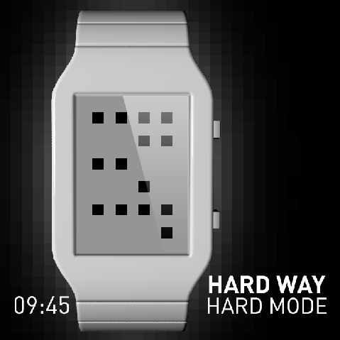
Design submitted by Laszlo from Hungary.
The hard or the easy way? The easy mode a simple digital mode, but the hard mode is very cryptic when you don’t know the solution. You can change the mode of the time telling method on this watch. The upper two digits indicates the hours and the lower two digits is the minutes. Continue reading
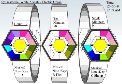
Design submitted by Andrew from the UK.
The following LED Binary sequential Watch is inspired by the condition synaesthesia: people who have this sensor condition see sound especially music notes as colour. Furthermore this is also how scientists in the film Close Encounters of the Third Kind communicate with a race of alien that speak a musical / tonal use different colour to represent different musical notes / words etc. Continue reading
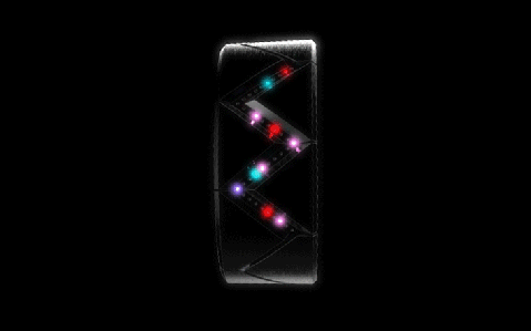
Design submitted by Sam F from the USA.
Sam says: A good timepiece should be stunning and attention-grabbing without being confusing. I was drawn to a concept that grouped lights by location, and realized that sorting the LEDs by color the design would be even more abstract and interesting, and stay simple to read. Continue reading

Design submitted by Peter from the UK.
This is “Hybrid MKII” a redesign of “Hybrid” which featured on the blog back in March 2012. Continue reading

Design submitted by Andree from Australia.
The c.r.y.s.t.a.l watch is based on the stereographic projection of a cubic crystal. Crystallographers use this projection to display three-dimensional crystal info (directions and planes) onto a two-dimensional surface such as paper. Continue reading
