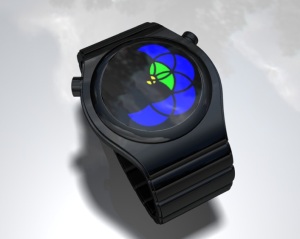
Design submitted by Maciej from Poland.
Maciej says: “I called it Sprocket. Sprockets, springs & other parts always remind me of traditional exclusive watches. It is a simple concept combining Tokyoflash technology with the complicated mechanism of traditional watch. The way of reading the time however is very Tokyoflash. We have three groups of LEDs; the central one is for hours, 10-minutes groups are on the left and single minutes are on the right. All together, this feel of dimension and the graphic at the back makes you feel like these sprockets are really working.”