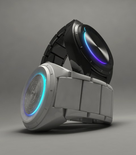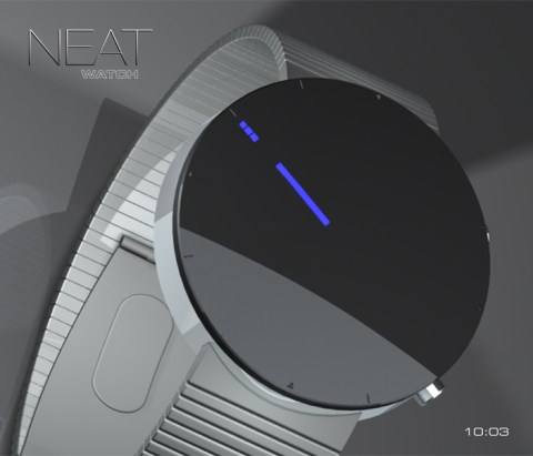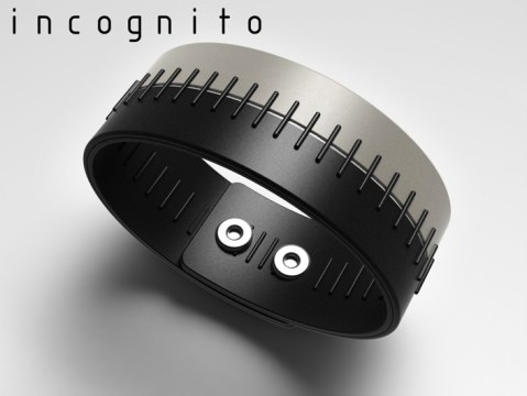
Design submitted by Peter from the UK.
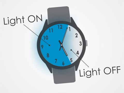
Peter says: It may come to a surprise to TF fans and blog submitters alike, but believe it or not not everyone wears watches. Many don’t particularly like them and prefer to wear jewellery or leather bracelets etc. For that reason I decided to design a simple concept based on a cuff style leather bracelet that looks and feels like a leather bracelet but has a covert LED watch built in, “Incognito” was born