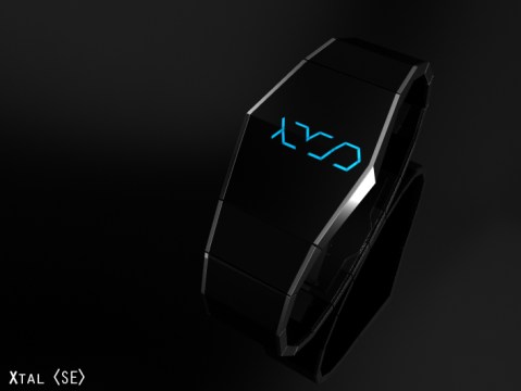
October 22nd, 2012
(English) Design submitted by Sarah from the UK.
Sarah says, “I came up with this watch design when randomly when opening a security lock at work. I was thinking… wow, wouldn’t it be awesome if a watch did that too? Read the rest of this entry »
October 16th, 2012
(English) Design submitted by Marko from Serbia.
Marko says: I was inspired by planet Saturn. Unlike traditional analog watch, Saturn watch displays only the digits to represent the time while the rests remain concealed under the disk.
Read the rest of this entry »
October 11th, 2012
(English) Design submitted by Fabio from Brazil.
Fabio Says: Minimalistic dial, based on radars. No buttons. Three concentric rings, each representing conventional clock hands. No buttons (the watch has to be minimalistic). The central ring represents the second hand and its movement attracts attention.
Read the rest of this entry »
October 1st, 2012
(English) Design submitted by Erik from Colombia.
Erik says: I was trying to keep the clock as simple as possible,so i started designing a segmented clock, first displaying numbers and then using shapes till i came up with this concept.
Read the rest of this entry »
September 27th, 2012
(English) Design submitted by Eivind from Norway.
Eivind says: I got my inspiration from classic science fiction, like 2001: A Space Odyssey and games like Mass effect and Deus EX. I liked the minimalistic design of the equipment and different tools. The style is simple, but it stands out. I also got inspiration from the popular products on the market today, like an iPhone or a pair of beats by Dr.Dre headphones.
Read the rest of this entry »
September 21st, 2012
(English) Design submitted by Djordje from Serbia.
Djordje says: Motivation of time, I wanted to achieve the effect of ease of watching at time, to understand better their own time.
Read the rest of this entry »
September 13th, 2012
(English) Design submitted by Sam from Germany.
Sam Says: Xtal is the result of some small sketches I made when having lunch. When I looked back at the paper, I liked the initial mystery of the numbers, the simple geometry of the watch and the general edginess of everything.
Read the rest of this entry »
July 31st, 2012
(English) Design submitted by Yoshi from Japan.
Yoshi says: This is my e-paper watch design called “Trinity”. I chose e-paper for this design because I wanted to create something you can wrap around your wrist with a bold design.
Read the rest of this entry »
July 23rd, 2012
(English) Design submitted by Devindh from the UK.
Devindh says: I called this design ‘Ebi’ because the eventual design reminded me of a lobster. The idea stemmed from my exploration of e-paper. I wanted to incorporate laser cut pieces of e-paper into a design, as this display technology lends itself to custom shapes.
Read the rest of this entry »
July 11th, 2012
(English) Design submitted by Sam from Germany.
Sam says: My idea for UNION was to unify all digits of the time display, that are the same, to save numbers and to create an interesting look. For example a 22 would become a big 2. This is where the fun started.
Read the rest of this entry »
July 2nd, 2012
(English) Design submitted by Sam from Germany.
I always liked neon tube displays in sci-fi movies. Back then, when CGI wasn’t used for every little thing. I liked the fact, someone actually built alien symbols of neon tubes, that really work! I was sketching for minimalistic, square based numbers that make a cool neon tube display.
Read the rest of this entry »
May 11th, 2012
(English) Design submitted by Laszlo from Hungary.
Laszlo says: This LCD watch concept use Lenticular FX to present the time.
Lenticular: as specially prepared graphics that are designed to work together with a lenticular lens to allow the viewer to see different images depending on the angle at which they view it.
Read the rest of this entry »
April 26th, 2012
(English)
Design submitted by Mattia from Italy.
Mattia says: “After millions of paper sheets full of sketches, I was looking at some Dieter Rams design work on my iMac… and the idea came to me! Read the rest of this entry »
March 1st, 2012
(English) Design submitted by Heather from USA.
Heather says: I wanted to develop some minimalistic digits that would appear cryptic, yet once learned are quite easy to recognise. I accomplished this by arranging various sizes of rectangular tiles to give the feel of classic digits. I call this display “MOSAIC”. Read the rest of this entry »