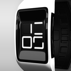
Design submitted by Yoshi from Japan.
Yoshi says: This is my e-paper watch design called “Trinity”. I chose e-paper for this design because I wanted to create something you can wrap around your wrist with a bold design.


Design submitted by Yoshi from Japan.
Yoshi says: This is my e-paper watch design called “Trinity”. I chose e-paper for this design because I wanted to create something you can wrap around your wrist with a bold design.

Design submitted by Devindh from the UK.
Devindh says: I called this design ‘Ebi’ because the eventual design reminded me of a lobster. The idea stemmed from my exploration of e-paper. I wanted to incorporate laser cut pieces of e-paper into a design, as this display technology lends itself to custom shapes.

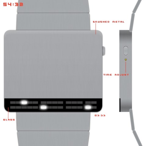
Design submitted by Sam from Germany.
Sam says: My idea for UNION was to unify all digits of the time display, that are the same, to save numbers and to create an interesting look. For example a 22 would become a big 2. This is where the fun started.
Design submitted by Sam from Germany.
I always liked neon tube displays in sci-fi movies. Back then, when CGI wasn’t used for every little thing. I liked the fact, someone actually built alien symbols of neon tubes, that really work! I was sketching for minimalistic, square based numbers that make a cool neon tube display.

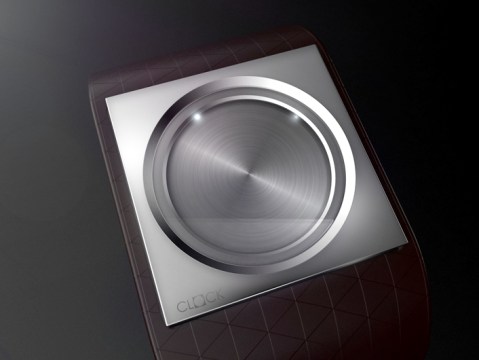
Design submitted by Laszlo from Hungary.
Laszlo says: This LCD watch concept use Lenticular FX to present the time.
Lenticular: as specially prepared graphics that are designed to work together with a lenticular lens to allow the viewer to see different images depending on the angle at which they view it.
Design submitted by Mattia from Italy.
Mattia says: “After millions of paper sheets full of sketches, I was looking at some Dieter Rams design work on my iMac… and the idea came to me! Continue reading
Design submitted by Felix from Germany.
Felix says: I’ve always wanted to make a jewel-like clock, which is minimalist and timeless.
The design elements should be square and circular. No decoration except for the strap. Timeless.

Design submitted by Heather from USA.
Heather says: I wanted to develop some minimalistic digits that would appear cryptic, yet once learned are quite easy to recognise. I accomplished this by arranging various sizes of rectangular tiles to give the feel of classic digits. I call this display “MOSAIC”. Continue reading
Design submitted by Ignacio from Spain.
Ignacio says: This design is a variation of another one that I am developing. The original idea is a watch with just one handle, and this design is a version of the same idea but with a more futuristic style. The time is displayed in two separate rings on the outside shows the minutes, and within the hour. Continue reading

Design submitted by Ignacio from Spain.
Ignacio says: The original idea came from my brother Jose. He showed me a sketch with 4 crosses and I helped to develop it and made the renders.
We thought at the moment it had to be a touchscreen. We also think that the screen is made of black mineral crystal lens (just like your watch Oberon), which can’t see anything until it is turned on.
