Design submitted by Sam from Germany.
Sam came up with the idea of stock market graph as a cool contemporary watch design representing the end of the financial crisis. There are two graphs which continuously move from right to left. Continue reading

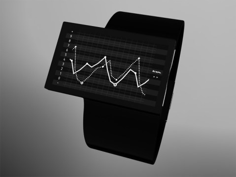
Design submitted by Sam from Germany.
Sam came up with the idea of stock market graph as a cool contemporary watch design representing the end of the financial crisis. There are two graphs which continuously move from right to left. Continue reading
Design submitted by Kevin from the USA.
Kevin says that the idea for this concept came to him when he was thinking about the “tunnel” from a retro TV show called Time Machine. Quite a minimal design but with an interesting tunnel effect display with green LED lines moving in from the outside edges. Continue reading
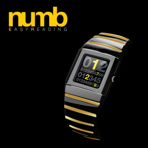
Design submitted by Stefano from Italy.
numbER is a digital watch design with a difference. The time can be read instantly and does not have to be calculated in any way. Stefano says “numbER is a simple way to read the time – in the best fashion way”, the point being, simple is best but can be displayed in an interesting format. Continue reading
Submitted by Laszlo from Hungary.
Another beautiful concept from Laszlo here. He explains it as a “circular view of time”. There are two variations; a silver version for day time which uses LCD to show the time and a black version for night time that uses LEDs to display the time. As you can see, this design is clear and intuitive to read; 12 hours, 5 groups of 10 minutes and 9 single minutes in three separate segments make up the time. The pattern on the display changes constantly as time progresses. Continue reading
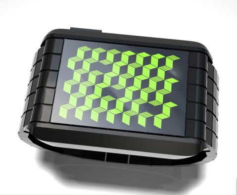
Design submitted by Logan from the USA.
This watch design is all about creating depth in a flat LCD display which is always on and with adjustable color LED. Continue reading
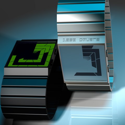
Design submitted by Laszlo from Hungary.
A simple time way to read the time, integrated into a simple case design. Laszlo suggests this design would use OLED to display the time but could alternatively use LCD blocks and then, like the Tokyoflash Rogue watch, could light up to highlight the time in green as on the example picture. Continue reading

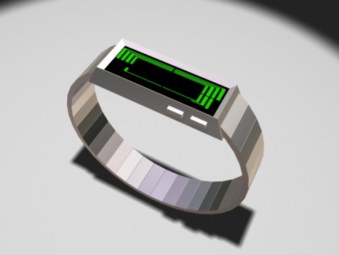
A concept that is quite different from other watch designs from the Tokyoflash Product Design Studio so far. A simple metallic bracelet that could be made in a variety of colors – and would be suitable for both guys and girls. The time display is integrated beneath the deep, curved lens and shows the time in a simple layout of shapes. Would you wear a bracelet style watch like this?
A concept that is quite different from other watch designs from the Tokyoflash Product Design Studio so far. A simple metallic bracelet that could be made in a variety of colors – and would be suitable for both guys and girls. The time display is integrated beneath the deep, curved lens and shows the time in a simple layout of shapes. Would you wear a bracelet style watch like this?

Design submitted by Lorenzo Gi from Sweden.
Lorenzo says: “As graphic designer I play with shapes and colors every day. The concept of this watch is intended to create abstract shapes with numbers and fonts. There is just a grid where hours and minutes are merged. It’s a minimal design in its shape, layout and functionality, in fact there is no AM and PM, just two colors, no date.”
Tokyoflash says: Here is a perfect example of how to make the display look unreadable to the untrained eye giving the appearance of something quite alien. We really like the 45 cuts on the corners creating a futuristic look. I think it would work best as an LCD watch as there are many segments and need to be close together to keep it’s appeal.
スウェーデンのLorenzo Giさんの作品。
以下はLorenzoさんの文章です。私はグラフィックデザイナーとして毎日、形や色と向き合っています。この時計のコンセプトは、数字とフォントで抽象的な形を作成して時刻表示をおこないます。時間と分の表示部分にはグリッドがあり、それらの形状、レイアウトは非常にミニマルなデザインとなっています。am/pmや、日付の表示はなく、ただ2色で時刻が表示されるシンプルなデザインです。
以下はTokyoflashのコメントです。この作品は、独創的でありながら、シンプルで読みやすいという、インターフェイスデザインに関するとてもよい提案だと思います。45°にカットされた表示部分がシャープな印象を与え、よりフューチャリスティックなイメージを感じさせてくれます。これらは、表示デバイスにLCDパネルを使用することで、忠実に再現することが可能だと思います。
