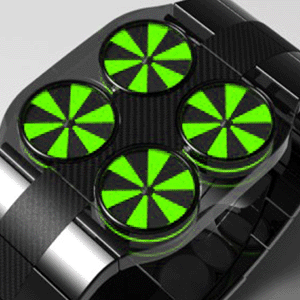
Design submitted by Peter from the UK.
Peter says: This is ‘Drone’. I wanted to come up with a new watch using elements of Turbine, I thought what could be better than one Turbine?………..four Turbines was my answer.

Design submitted by Peter from the UK.
Peter says: This is ‘Drone’. I wanted to come up with a new watch using elements of Turbine, I thought what could be better than one Turbine?………..four Turbines was my answer.
Design submitted by Heather (USA) & Laszlo (Hungary)
Heather & Laszlo say: Most, if not all, ladies’ fashion watches on the market right now are analog. The digital watches available are generally sporty and made of plastic or rubber with boring monochrome displays. Ladies’ watches have seldom been tackled on the Tokyoflash blog, so we decided to create a digital LCD ladies’ fashion watch.
Design submitted by Eivind from Norway.
Eivind says: I got my inspiration from classic science fiction, like 2001: A Space Odyssey and games like Mass effect and Deus EX. I liked the minimalistic design of the equipment and different tools. The style is simple, but it stands out. I also got inspiration from the popular products on the market today, like an iPhone or a pair of beats by Dr.Dre headphones.

Design submitted by Sam from Germany.
Sam says: I like the idea of letting something run around the wrist and adapt in the case region to tell the time.

Design submitted by Paolo from Canada.
Paolo says: I’ve always wanted a device like the one the Predator wears on his wrist. Illegible graphics count down some sort of time. Alien numbers… It just looks so cool.
So I decided to design a watch that resembles that device loosely and counts down in the same fashion every minute.
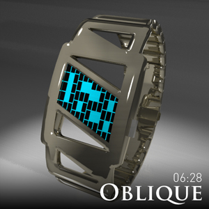
Design submitted by Laszlo from Hungary.
Laszlo says: GAPS (silver and ip black version) is a 12-5-9 always on LCD watch. The display background has a special illumination paint coating that is capable of providing continuous light output for 20 years. This significantly increases the battery life.

Design submitted by Colby from South Africa.
Colby says: The idea for the ‘Abandon’ came from a long time obsession with anything post-apocalyptic. Recently there’s been an abundance of movies, series and games which embrace nuclear fallout, zombie or robotic-alien themes. When challenged with the task of designing a watch, this was a strong influence.
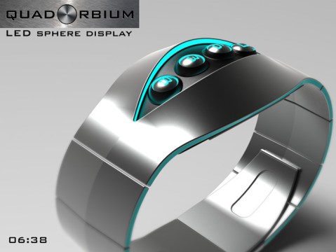
Design submitted by Peter from the UK.
Peter says: This is “QuadOrbium” The watch is loosely inspired by the humble bicycle combination lock.
The gyneric format of the inspiration tends to consist of four discs with numbers printed on them that your scroll untill the correct combination of numbers are displayed and the lock can be disengaged.

Design submitted by Djordje from Serbia.
Djordje says: Motivation of time, I wanted to achieve the effect of ease of watching at time, to understand better their own time.

Design submitted by Sarah from the UK.
Sarah says: This is my second attempt at designing a watch and has been a development of the previous snowflake idea, except this one is inspired by sunrises.
