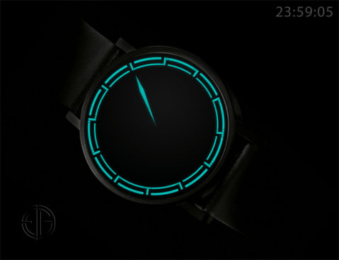
Design submitted by Sam from Germany.
Sam says: “The idea for the TESSERAE watch concept came when looking at my previously submitted concepts. It is a mixture of my NEON IO and the MAZE.


Design submitted by Sam from Germany.
Sam says: “The idea for the TESSERAE watch concept came when looking at my previously submitted concepts. It is a mixture of my NEON IO and the MAZE.
Design submitted by Pawel from Germany.
Pawel says: “For some time I was working on the idea of a digital watch display that looks like analog, exploring the possibility of placing digital numbers in the edge of an analog face. In this design I demonstrate the solution of combining frame bars with hour markers.
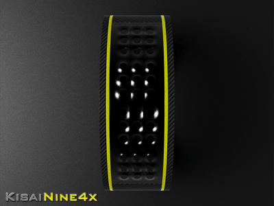
Design submitted by Peter from UK.
Peter says: The Kisai logo consists of 9 dots connected together with a few vertical and horizontal lines. This is a good basis for a simple LED array to create a digit . I decided to use four of these arrays to create “KisaiNine4x” (Nine meaning the number of dots per array and 4 x the number of arrays) “Strewth I can see the time from here!!” Continue reading
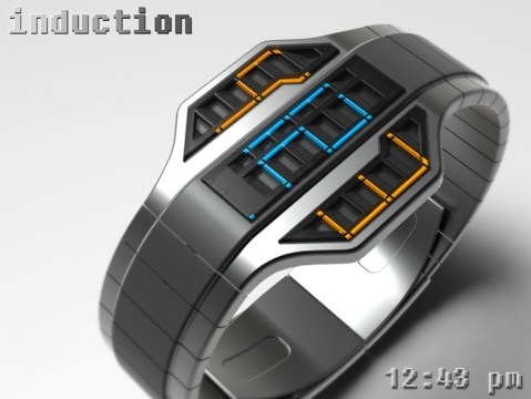
Design submitted by Peter from UK.
Peter says: This is “Induction” an evolution of an earlier design of mine called “Vent”. The basic premis with Vent was that the main part of the face of the watch featured a louvered grille that framed an LED array. The grille not only offered the display some shade from direct light but also dictated that the time be read from a specific angle. Continue reading
Design submitted by Heather from the USA.
Heather says: I wanted use a new case shape, so I decided on an oval display. I also wanted an LCD display with constant movement that catches the eye, so I made the seconds very prominent. Continue reading

Design submitted by Patrick from France.
Patrick says: Long ago I had this idea in mind and when I saw the “Intoxicated LCD Watch,” I said! “With Tokyoflash, anything is possible”. Continue reading

Design submitted by Lloyd from Australia.
Lloyd says: I love visiting aquariums and watching the fish and other aquatic creatures glide almost effortlessly around. I find it a great way to chill out. “Aquatica” is my attempt to recreate this experience in an LCD watch. Continue reading
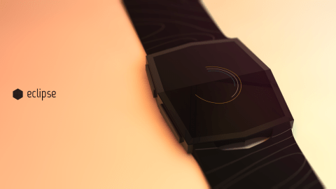
Design submitted by Andrew from the Netherlands.
Andrew says: Because I have always been fascinated with watches, I decided to try my hand at designing one myself. I really wanted to create something unique, that hasn’t already been done like a million times before. That’s when I came up with Eclipse. You can watch a small motion graphic about it here: https://vimeo.com/70057038 Continue reading

Design submitted by Matt from Canada.
Matt says: “This is Ransū, which mean “random numbers” in Japanese. The idea is to have a grid of numbers and hide the time inside it. Continue reading

Design submitted by Heather from The USA.
Heather says: “I wanted to have a way to display the time while filling up all available space in a meaningful way. Continue reading
